Opened 7 weeks ago
Last modified 37 hours ago
#49576 assigned defect (bug)
Menu Editor UI issues on med-large screens
| Reported by: |
|
Owned by: |
|
|---|---|---|---|
| Milestone: | 5.5 | Priority: | normal |
| Severity: | normal | Version: | |
| Component: | Menus | Keywords: | has-screenshots has-patch commit |
| Focuses: | ui, css | Cc: |
Description (last modified by )
Hello,
Just reporting two UI issues with the Menu Editor;
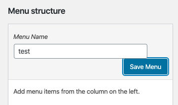
- On screens not quite on the medium breakpoint but not too wide you'll find the 'Save Menu' button falls directly below the Menu Name input.

*This is worst when the button is focused as the input overlaps the button.

- On larger screens when the input is beside the button you'll find the button is slightly larger.

*I've seen a few tickets flagging other parts of the UI for similar issues.
Thanks
Attachments (9)
Change History (23)
#3
 @
@
3 weeks ago
- Keywords needs-patch added
- Milestone changed from Awaiting Review to 5.5
- Owner set to audrasjb
- Status changed from new to assigned
#6
in reply to:
↑ 4
 @
@
11 days ago
Replying to man4toman:
It happens between 783px to 852px.
It happens to me at 783-852, and 961-976.
The patch fixed the first one, but not the second one... :(
#7
 @
@
11 days ago
- Keywords needs-testing removed
Thanks for your patch @man4toman,
I updated the patch, in 49576.1.diff:
- change media query’s values to
(min-width: 783px) and (max-width: 870px)to handle more use cases - some coding standards fixes
I think it's good to go now, thanks!
Adding a screenshot and commit keyword.
Cheers,
Jb
#9
 @
@
11 days ago
@JavierCasares Yes you right, I missed second one.
Thanks @audrasjb, updated patch works fine.
#10
 @
@
3 days ago
Thanks for the patches @man4toman & @audrasjb and for testing @JavierCasares. Testing the latest patch it's working nicely for myself on both the new menu and edit menu screens.
@audrasjb on my second item in the ticket should I break that into a unique ticket, should we handle here or is there another ui ticket out there that's handling that discrepancy between field and button heights.
On larger screens when the input is beside the button you'll find the button is slightly larger.
*I've seen a few tickets flagging other parts of the UI for similar issues.
Appreciated
#11
 @
@
3 days ago
We can remove button-large class name from Create/Save Menu, it fixes the heights issues.
But another thing will appears, the heights of two Create/Save Menu button will not be same.
#12
 @
@
3 days ago
Hey,
I think the button height issue should probably be handled separately, or in #48531, as it's something that is more visible since WP 5.3 CSS admin changes.
#13
 @
@
42 hours ago
Thanks for taking a look @man4toman, so this ticket can move forward I moved that secondary issue to #48531 as @audrasjb it seems like a better home.
Let's get that first issue committed here and can look into the other in that more appropriate ticket.
#14
 @
@
37 hours ago
Thanks @garrett-eclipse. Just to clarify, the vertical alignment issue wasn't introduced in WordPress 5.3.
For issues related to CSS it would be nice to always compare with previous versions to verify what is the original cause of the problem. As mentioned by @man4toman, the button has a button-large class that makes its height 32 pixels. It's taller than the input field. I don't see a good reason why this button should be large so I'd just remove the button-large class.
In WordPress 5.2 this was even more evident, see screenshot below. On 5.2 I can reproduce also the button dropping down the input and the focus style issue (though less visible).
I'd say 5.3 slightly improved the alignment. Regarding the general issue of vertical alignment between various form controls, it's a long-standing problem in the admin. Often, the root cause is that the CSS vertical-align property is used inconsistently across the admin on a case-by-case basis.
In the long term, case-by-case adjustments are just bad because they introduce a huge amount of inconsistencies that are really hard to fix. For some CSS sanity, exceptions and special cases should be removed. This issue was also noted in https://core.trac.wordpress.org/ticket/48420#comment:20
I'm at a point where a decision needs to be made. To make all form controls have by default a good vertical alignment (especially with visible labels or other text close to them) there are two possible options I can think of:
- use flexbox: however, this would require a wrapper element as a flex container thus a considerable amount of markup output should be changed, which is not ideal
- use CSS properties of the inline formatting context (inline-level boxes) like
vertical-alignI'd lean towards using vertical-align: middle for all form controls as it's able to align elements and text of different heights. However, this would imply that form controls shouldn't use top or bottom margins.
A decision wasn't made and this issue still need to be addressed across the whole admin.
Create Menu directly up against Menu Name input on med-large screens.