Opened 6 months ago
Closed 5 weeks ago
#47150 closed defect (bug) (fixed)
Insufficient contrast on empty field borders
| Reported by: |
|
Owned by: |
|
|---|---|---|---|
| Milestone: | 5.3 | Priority: | normal |
| Severity: | minor | Version: | |
| Component: | Media | Keywords: | has-screenshots wpcampus-report color-contrast form-controls has-patch |
| Focuses: | ui, accessibility | Cc: | |
| PR Number: |
Description (last modified by )
Moved from the WPCampus accessibility report issues on GitHub, see https://github.com/WordPress/gutenberg/issues/15275
- Severity:
- Low
- Affected Populations:
- Low-Vision
- Cognitively
- Platform(s):
- All / Universal
- Components affected:
- Media Dialog
Issue description
Some interface components in the "Featured Image" modal have
insufficient color contrast for their borders when empty, below the
minimum threshold of 3:1 for interface components:
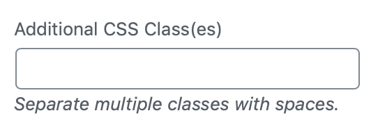
Caption, Alt Text and Description field borders: light-grey (#ddd) on lighter grey (#f3f3f3): 1.35:1
Sufficient color contrast is important for users who have low-vision or
are color-blind, because content with a low contrast ratio may be
difficult or impossible for such users to see.
Issue Code
    .media-frame input[type=email], .media-frame input[type=number], .media-frame input[type=password], .media-frame input[type=search], .media-frame input[type=text], .media-frame input[type=url], .media-frame select, .media-frame textarea {
        ...
        border-width: 1px;
        border-style: solid;
        border-color: #ddd;
    }
Remediation Guidance
Darken the border-color to create a minimum contrast ratio of 3:1.
Recommended Code
    .media-frame input[type=email], .media-frame input[type=number], .media-frame input[type=password], .media-frame input[type=search], .media-frame input[type=text], .media-frame input[type=url], .media-frame select, .media-frame textarea {
        ...
        border-width: 1px;
        border-style: solid;
        border-color: #8f8f8f;
    }
Relevant standards
- 1.4.11 Non-text Contrast (Level AA) https://www.w3.org/TR/WCAG20/#visual-audio-contrast-without-color
Note: This issue may be a duplicate with other existing accessibility-related bugs in this project. This issue comes from the Gutenberg accessibility audit, performed by Tenon and funded by WP Campus. This issue is GUT-44 in Tenon's report
Note: The grey backgrounds #f1f1f1 or #f3f3f3 are used in many other places in WordPress (e.g. Setting Pages, etc.) so I guess it would need some more exploration.
Attachments (11)
Change History (45)

This ticket was mentioned in Slack in #accessibility by afercia. View the logs.
5 months ago

This ticket was mentioned in Slack in #accessibility by afercia. View the logs.
5 months ago

This ticket was mentioned in Slack in #accessibility by nesshin. View the logs.
4 months ago
#6
 @
@
4 months ago
- Keywords needs-design-feedback added
- Owner set to audrasjb
- Status changed from new to assigned
In the screenshots above, 2 solutions I tested:
- Border color suggestion applied "as it" without editing the anything else
- Border color contrast patched and box-shadow removed
In my opinion, solution 2 is better visually.
We need some design advices here :-)

This ticket was mentioned in Slack in #design by karmatosed. View the logs.
3 months ago
#10
 @
@
3 months ago
The exmaple above was just using Gutenberg's border color, here's an example that also uses all the other input styles:
padding: 6px 8px;
box-shadow: 0 0 0 transparent;
transition: box-shadow 0.1s linear;
border-radius: 4px;
border: 1px solid #8d96a0;
#11
 @
@
3 months ago
This issue refers specifically to the Media modal, but I believe it applies to most of the Admin fields. WordPress uses the same field border color everywhere — regardless of whether its on a white background or a gray one. We'd likely want to update it in all cases. Here are a few screenshots of those Gutenberg-style fields throughout the UI:
#12
 @
@
3 months ago
See comment on this related ticket: https://core.trac.wordpress.org/ticket/47153#comment:1

This ticket was mentioned in Slack in #accessibility by audrasjb. View the logs.
3 months ago
#14
 @
@
3 months ago
- Keywords has-patch added; needs-patch needs-design-feedback removed
Let's start with the media modal form elements.
47150.diff adds Gutenberg styles to the media modal (see screenshot below).

This ticket was mentioned in Slack in #design by audrasjb. View the logs.
3 months ago
#16
 @
@
2 months ago
- Keywords needs-design-feedback added
Hi,
Adding needs-design-feedback keyword. That'd be great if the design team could validate 47150.diff so it could be committed. See screenshot above.
cc @karmatosed @melchoyce :)
As a reminder, this patch is only adding Gutenberg styles to the media modal (#47153 is adding it to the reste of the interface).
#17
 @
@
2 months ago
- Keywords needs-design-feedback removed
I'm approving assuming it's using the colours @kjellr suggested, which seems the case.
#19
 @
@
2 months ago
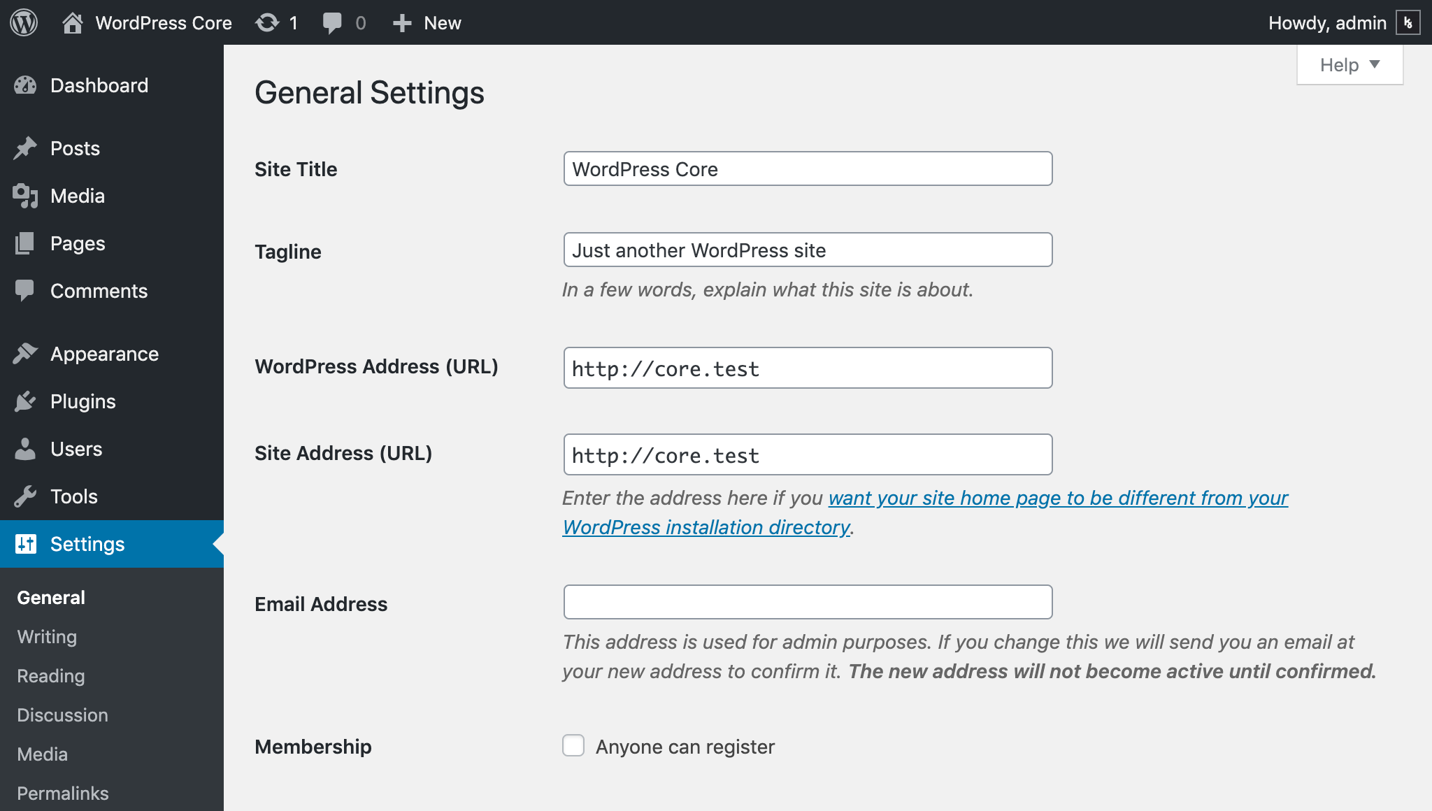
Worth noting WordPress core uses different shades of grey (see #35783, #40633, etc.) for its pages background, typically:
- legacy admin pages:
#f1f1f1 - media modal dialog:
#f3f3f3 - customizer:
#eeeeee
Non-text contrast must have a minimum contrast ratio of at least 3:1 against adjacent color(s). This includes user interface components.
The #8d96a0 color Gutenberg uses for the form controls borders is OK in the Gutenberg context because the background is white:
Luminosity Contrast Ratio: 3:1
https://jdlsn.com/color/?type=hex&color=8d96a0&color2=ffffff
It is not OK in core because the backgrounds are grey:
Legacy admin pages
Luminosity Contrast Ratio: 2.66:1
https://jdlsn.com/color/?type=hex&color=8d96a0&color2=f1f1f1
Media modal dialog
Luminosity Contrast Ratio: 2.7:1
https://jdlsn.com/color/?type=hex&color=8d96a0&color2=f3f3f3
Customizer
Luminosity Contrast Ratio: 2.58:1
https://jdlsn.com/color/?type=hex&color=8d96a0&color2=eeeeee
Furthermore, the core colors palette and the Gutenberg one are still different. There's been some prior work intended to reduce the amount of colors used in core but still there's work to do. It would be great to have some progress and finally have a unique colors palette. Not sure there's value in keeping two different ones, for design consistency, maintenance, and accessibility reasons.
I'd like to encourage an effort to unify the two different colors palettes in one, final, official set of WordPress colors. Seems to me this is definitely a job for designers :)
Legacy WordPress colors palette:
https://make.wordpress.org/design/handbook/design-guide/foundations/colors/
https://codepen.io/hugobaeta/full/RNOzoV/
Exploration on a new colors palette by Hugo Baeta:
https://codepen.io/hugobaeta/full/grJjVp
Colors currently used in Gutenberg:
https://github.com/WordPress/gutenberg/blob/61b133be4bd00c003c64ab6254e71f325fd3d7e8/assets/stylesheets/_colors.scss
That said, the core form controls need a grey darker than #8d96a0. One that guarantees sufficient non-text contrast with at least the three background colors mentioned above.
Amongst the current Gutenberg colors, #7e8993 seems OK. /Cc @kjellr @karmatosed

This ticket was mentioned in Slack in #design by karmatosed. View the logs.
2 months ago
#21
 @
@
2 months ago
Thanks, @afercia. We discussed this briefly in the #design triage today:
https://wordpress.slack.com/archives/C02S78ZAL/p1566835549342100
We tried out your proposed color — #7e8993, also known as $dark-gray-200 — and it should be fine:
Current, as shown in Gutenberg:
New, using $dark-gray-200:
---
I've opened a GitHub issue to propose this change on the Gutenberg end:
#22
 @
@
2 months ago
Hi,
In 47150.2.diff
- change
#8d96a0to#7e8993(dark-gray-200) forborder-color - use Gutenberg focus styles an media modal inputs
#23
 @
@
2 months ago
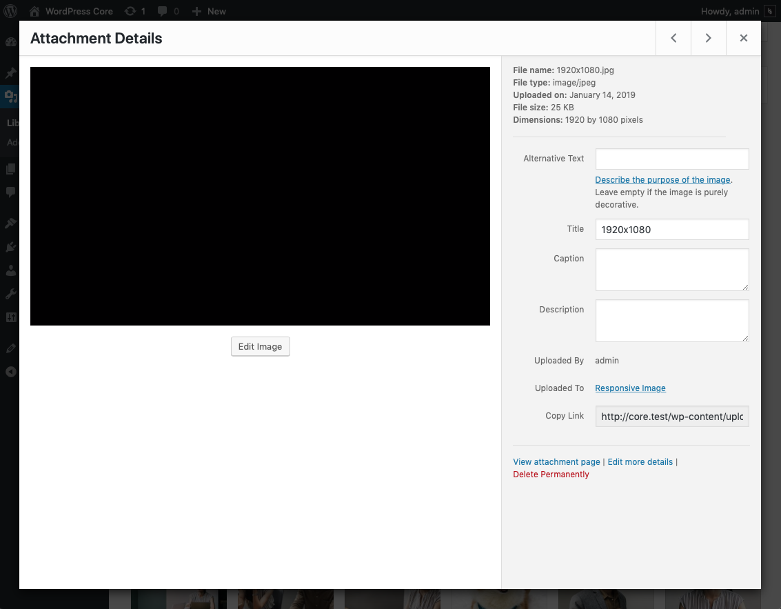
Thanks, @audrasjb. This does appear to work nicely on the Featured image screen, but I think this should really be rolled out more globally. If not for all fields at once, then at least for the other media-related fields. I'm not seeing it get picked up for the Attachment Details modal for instance:
Featured Image:
Attachment Details:
#24
 @
@
2 months ago
@kjellr thanks for your test.
Yes, that make sense but this modal is not part of the editor and would probably fit better with #47153 in my opinion.
However, we could totally handle both modals in this ticket it you prefer :)
#25
 @
@
2 months ago
Ah, yes. Thanks — I forgot that there was another ticket for that!
Since the solution to both of these tickets is the same — and this is a global change — I actually think it makes sense to close this ticket in favor of that more broad one. That way, if we change these styles during the course of implementing #47153, we won't have to go back in and readjust any styles that were previously deployed as part of this patch.
But in general, I think this fix works, and as long as they both make it in and are in sync by 5.3 I think we're good. 🙂

This ticket was mentioned in Slack in #core by pento. View the logs.
2 months ago

This ticket was mentioned in Slack in #accessibility by afercia. View the logs.
2 months ago
#28
 @
@
7 weeks ago
Just a brief update: The design team is discussing this issue along with a couple other relevant tickets here:
https://make.wordpress.org/design/2019/09/06/discussion-higher-contrast-form-fields-and-buttons/
Feel free to weigh in there if anyone else has thoughts. Once we have alignment there, we'll bring any related design changes back into this ticket. 👍

This ticket was mentioned in Slack in #core by audrasjb. View the logs.
7 weeks ago

This ticket was mentioned in Slack in #design by audrasjb. View the logs.
6 weeks ago
#31
 @
@
5 weeks ago
Just attached a super-minor update. 47150.3.diff updates the blue border color to #007cba to sync up with Gutenberg, and with the color used in the latest patch for #47153.

This ticket was mentioned in Slack in #accessibility by afercia. View the logs.
5 weeks ago
#33
 @
@
5 weeks ago
47150.4.diff refreshes the patch and removes outline-offset: -2px;, not recommended any longer for Windows High Contrast Mode.


