#42888 closed task (blessed) (fixed)
Add a "Show" button next to password fields on mobile
| Reported by: |
|
Owned by: |
|
|---|---|---|---|
| Milestone: | 5.3 | Priority: | normal |
| Severity: | normal | Version: | |
| Component: | Login and Registration | Keywords: | has-patch has-screenshots has-ux-feedback has-dev-note |
| Focuses: | accessibility, javascript, administration | Cc: | |
| PR Number: |
Description
It's become quite common for web services to display a Show button next to password fields when the user is using a mobile device. Several mobile apps do this too. The intent is to help the user ensure the password they've entered is correct when using the onscreen keyboard.
One example is on https://m.facebook.com (the Show button actually appears on any device when using that site). The Show button simply toggles the input type between password and text.
WordPress should add this functionality to the login screen, the user profile screen, and anywhere else where a password gets entered. This functionality already exists when adding a new user, if the user first clicks the Show password button.
Attachments (26)
Change History (101)
#2
 @
@
22 months ago
@Iceable is right, I also don't get the practice followed in /wp-admin/user-new.php to Show/Hide password. But this practice is followed on most of the web and most of the tutorials available for the practice teach the same practice as WordPress is using.
I dug into both /wp-admin/user-new.php and /wp-login.php but I don't think we can follow the current the practice in /wp-login.php which is used already in /wp-admin/user-new.php. Reasons why
- The current approach uses jQuery while /wp-login.php use/load jQuery. So, either we have to include jQuery in login screen or rewrite the approach in vanilla JS.
- The login screen uses <p> tags to as wrapper to the input elements. Now, I am not deeply aware of the standards but following the approach in /wp-admin/user-new.php will break HTML standards and again we'll have to rewrite the structure.
I think the best option here is to just create a simple input type toggle i.e. type="text/password" on login screen.
#3
 @
@
22 months ago
Great idea @johnbillion - I agree we should have a show button wherever we have a password entry field. I could see some users not wanting password fields ever visible - especially on the login screen - for security reasons (someone could easily see your password or photograph it) Do you think we should have some sort of hook to disable?
@Junaidkbr, @Iceable - As a bit of background, the current code that uses a hidden mirrored field and toggles visibility instead of toggling the field type from password to text was introduced for internet explorer 8 compatibility, see https://core.trac.wordpress.org/ticket/32886#comment:2. Sadly, IE8 considered the field type property read only. I was responsible for writing most of that code and I can only cringe apologetically and say it was required at the time.
Fortunately, we no longer need to support IE8 in core and can proceed with simpler code that uses the text/password type swap approach. We really should consider refactoring the existing code as well, the swapping fields approach works but creates some edge cases we have had to code around.
#4
 @
@
22 months ago
- Keywords has-patch dev-feedback added; needs-patch removed
Hi,
I tried a small workaround for this issue.
Here is my small first patch for it, a very first first workaround to see if my approach is good or not.
I will test it with differents configs now (I only tested it in Chrome/MacOS and Safari/iOS for the moment).
Cheers :)
Jb

This ticket was mentioned in Slack in #design by audrasjb. View the logs.
22 months ago

This ticket was mentioned in Slack in #core by audrasjb. View the logs.
22 months ago
#9
 @
@
22 months ago
This patch only covers wp-login? What about the other places that passwords are entered?
#11
 @
@
22 months ago
42888-2.diff 42888-3.diff is based on 42888.diff, with the following changes:
- Swapped
dashicons-visibilityanddashicons-hiddenicons: the first patch was using icons to describe the current state of the field ("dashicon-hidden" when the password is hidden). Since the icon is a clickable button, I think it makes more sense to describe the action (i.e. click the "dashicons-visibility" icon to make the password visible). This is also consistent with the buttons that already exist in other places.
- Changed
id="wp-show-login-pass"toclass="wp-hide-pw", for consistency with the already existing "show/hide" buttons in other places.
- Moved inline styles from first patch to
/wp-admin/css/login.css.
- Added some padding to the right password field. This prevents the password value and the icon from overlapping, in case of very long passwords.
- [EDIT] My bad, I forgot to have the
aria-labelattribute for the button to toggle betweenShow passwordandHide password. This is included in 42888-3.diff.
About other places where passwords are entered, as @audrasjb mentioned, this was a first iteration to test and validate the approach.
If I'm not mistaken, the only other places where passwords are entered are the ones below and they already have a show/hide button:
user-edit.php(User profile page)user-new.php(Add New User page)install.php(Step 1 of the "5-minutes install")
Though these are using the convoluted "IE8 friendly" implementation as @adamsilverstein explained in #3 (thank you for providing background by the way, this makes more sense now!).
So if the approach we are using here for wp-login.php is the way to go, we could take this opportunity to refactor them.
#12
 @
@
22 months ago
- Focuses accessibility added
Noticed a few things:
- The current patch wraps both the input field and the button in a
<label>element; this should be avoided as the label "Password" should be associated just to the input field. - On the other hand, some of the labels in
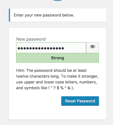
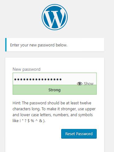
wp-login.phpwrap the associated control and also use aforattribute; this should be avoided: either use a wrapping label without for attribute or a not wrapping label with a for attribute. Never do both. As per the WordPress accessibility standards, a not wrapping label with a for attribute is preferred. Wondering if this would be a good opportunity to adjust all these labels. The login screen uses <p> tags to as wrapper to the input elements. Yeah, that's not a great example of good semantics. Paragraphs should be used to markup units of text separable from the rest of the content, not to wrap form elements. I guess the paragraphs were used form some styling purposes but I don't see a good reason to keep them.- Worth noting a similar button is already used in the Reset Password page and in the Installation pages (see screenshots below); these pages already use jQuery because it's loaded as dependency of the
user-profilescript (which also makes some useful strings available inuserProfileL10n); I don't see why jQuery shouldn't be used in the login page too, unless I'm missing something
As per the button content, from an accessibility perspective, some visible text would be preferable, as done in the Installation pages:
Note: in the Reset Password page, the button is actually a <span> element and should be changed to a button.
#13
 @
@
22 months ago
Thanks for the review @afercia: could you work on the requested changes @Iceable ?
#14
 @
@
22 months ago
Thanks @afercia for the review and pointers, these all make a lot of sense.
@adamsilverstein sure, not right now but I can try to work on this within a few days.
#16
 @
@
21 months ago
I restarted from scratch for 42888-4.diff with a more global approach to work on all password fields, and included more accessibility considerations thanks to @afercia 's comments:
- Used an actual
<button>instead of a<span>inwp-login.php(login form and password reset form)
- Added text (Show / Hide) next to the icon on login et password reset forms.
Note: this makes the button larger and the field smaller. It will be even larger for languages in which the words for "Show" and "Hide" are longer. Not sure whether this will be an issue or not, but if it is then maybe we can move the button below the field as opposed to on the right.
- Changed the
<p>tags around inputs with<div>.
I could have removed some of them completely (which actually makes no visual difference), but I thought some wrappers wouldn't hurt and may be useful in some cases.
- Used non wrapping
<label>'s' withforattributes for input fields.
- While I was at it, I also got rid of
<p>tags and adjusted<label>'s' in other forms inwp-login.php(lost password, register)
- Enqueued
user-profile.json the login form page, and modified the password fields related functions so that:- They also work for the login page so we don't need to write additional functions
- They use the "new approach" (toggling the field's
typebetweentextandpasswordinstead of using mirrored fields) for all password fields: login, password reset, add new user, edit user
Note: jQuery was not loaded on the login page before. It is now since it is a dependency of user-profile.js. I don't see it as an issue, but worth noting.
- Login and Password reset pages: added the
.no-jsclass to<body>, so we can use.hide-if-no-jsto hide the toggle button when JS is not available.
[edit] Just realized after uploading the patch that the button doesn't have the right height in Firefox. Changing line 94 in login.css from height: 100%; to height: 40px; fixes it.
#17
 @
@
21 months ago
- Owner set to Iceable
- Status changed from new to assigned
Assigning to mark the good-first-bug as "claimed".
#18
 @
@
18 months ago
- Keywords has-ux-feedback added; ux-feedback removed
I applied the patch using Grunt. It's my first time, so I may have done something wrong. If I tested the wrong way, please forget my comment here asap (I'll keep learning ;))
I used 42888-4.diff by @Iceable. See my short video for visual support.
I tested in Chrome on a macbook, version 66.0.3359.181.
- The text show is there, but totally at the right side of the browser screen.
- When I click 'show', the text changes to 'hide', but nothing happens in the password field, I still see dots instead of text.
I suppose the show/hide part was meant to be next to the password field instead of al the way to the right. But showing the password to check typing is a great improvement from a usability perspective, so I'd love to see this implemented.
#19
 @
@
17 months ago
- Keywords 2nd-opinion ux-feedback added
Thank you very much @boemedia for taking the time to try it!
I thought this patch would need a refresh as it is already 4 months old, though it still seems to apply and work correctly on my end. I just re-tested it on a Debian machine and on a MacOS one, both with a brand new VVV install.
Steps taken:
- Checked-out the latest commit from git://develop.git.wordpress.org/ on master (d3014a at the time of writing)
$ grunt patch:42888, then chose 42888-4.diff$ grunt build
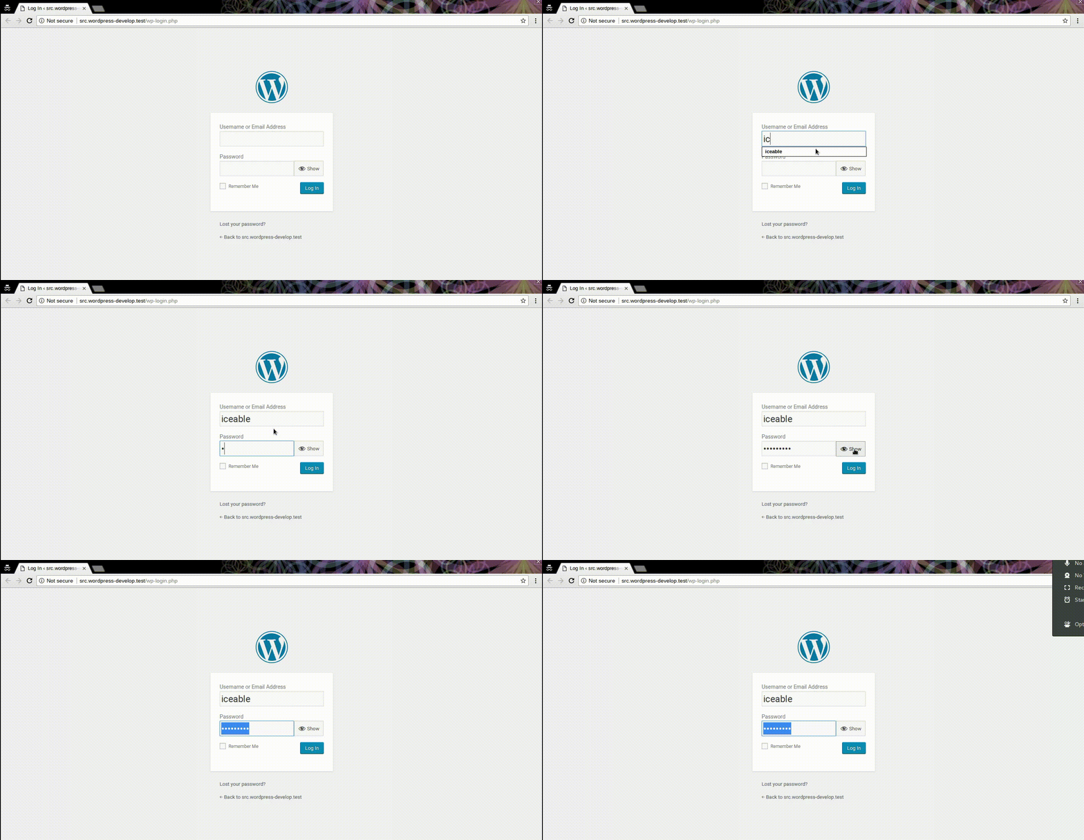
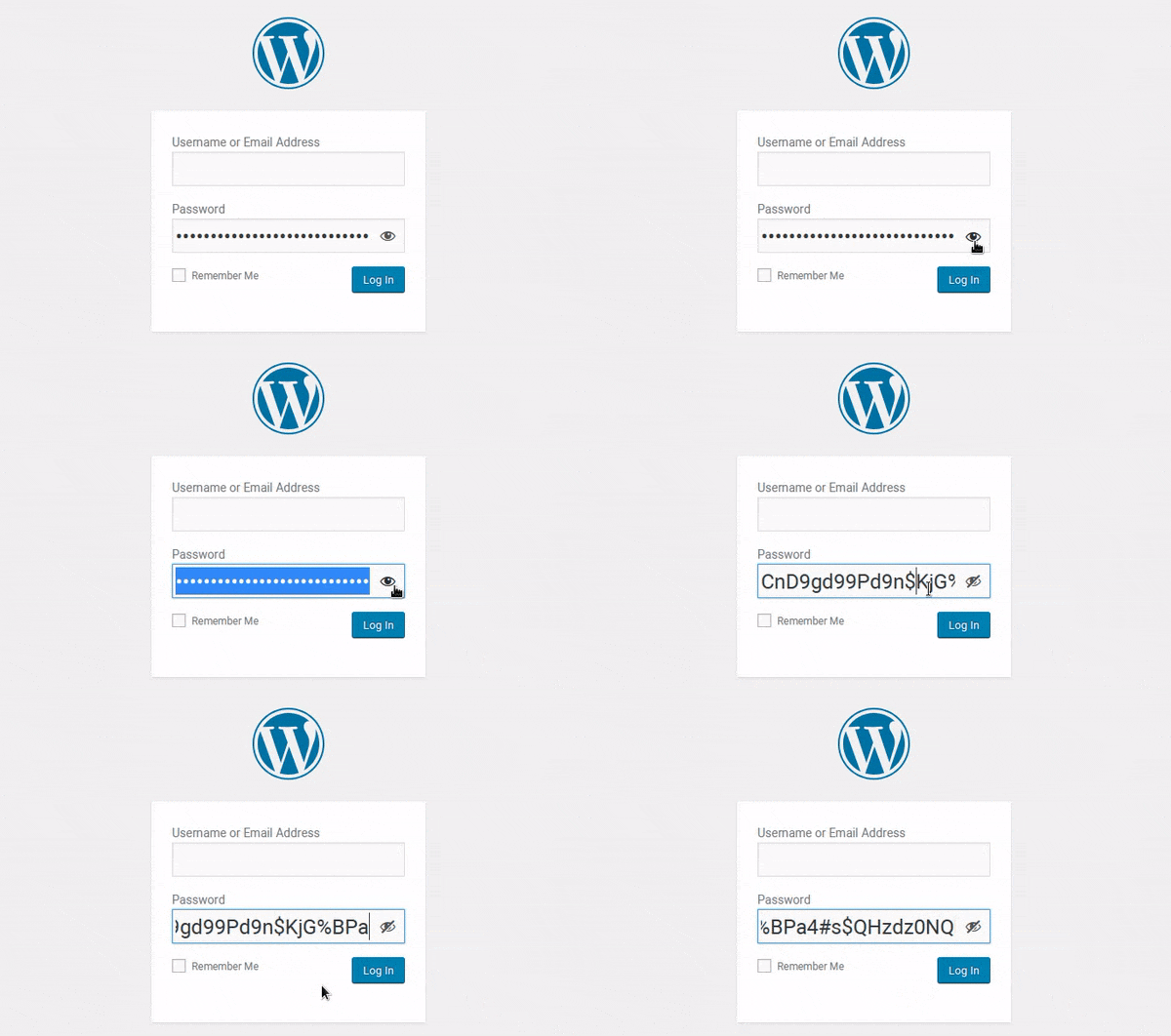
Here is a screencap of wp-login.php in Chromium 66.0.3359.117 (Developer Build) on Debian 9.4.
It also looks and works the same for me in Chrome 66.0.3359.181 (Official build) on MacOS.
Not sure whether there is something wrong with this patch that doesn't show on my end, or if something went wrong during your test.
Additional tests and/or 2nd opinion are most welcome.
#20
follow-up:
↓ 21
 @
@
17 months ago
@boemedia can you please give this another test following the steps @Iceable outlined? notably, use grunt patch and grunt build to make sure the patch applies to the correct code and is built into the build directory.. Also, since https://core.trac.wordpress.org/changeset/43309 you'll need to be testing by running WordPress from the build directory as well.
Thanks!
#21
in reply to:
↑ 20
 @
@
17 months ago
- Keywords has-ux-feedback removed
Me & @Iceable briefly sat together during WCEU contributor day. We checked this on both mine (MAMP) and his (VVV) local environment, but there was a difference in display. We couldn't quite replicate what caused the display being wrong on my install (we did use grunt build) because of time and wifi issues, I have to see if I can get VVV installed on my computer and test again. Maybe someone else can test on MAMP and see if they can replicate my issue?
Replying to adamsilverstein:
@boemedia can you please give this another test following the steps @Iceable outlined? notably, use grunt patch and grunt build to make sure the patch applies to the correct code and is built into the build directory.. Also, since https://core.trac.wordpress.org/changeset/43309 you'll need to be testing by running WordPress from the build directory as well.
Thanks!
#22
 @
@
17 months ago
- Keywords has-ux-feedback added; ux-feedback removed
With the help of @adamsilverstein (thanks a lot!), I installed a clean local dev environment and tested the patch again. It now works fine, and I think it would be a great improvement for usability.
Two things to take in consideration:
- with super long passwords (that seem to be trendy these days ;)), the box is not showing the full length of characters. The font size is rather large compared to the field size. Do we need to restrict the login and password box to this size, or could it be slightly bigger? That, combined with a smaller font size maybe?
- on mobile view, the 'eye' overlaps with the password field. Either give the 'eye' a white background, but ideally, here a bigger field size would be better too.
See my screenshots for clarification.
Additonial: with other languages, show/hide may be longer words and will take up even more space.
 @
@
17 months ago
Long passwords are partly hidden due to small field, large font and 'eye' taking some space
#23
 @
@
15 months ago
I have to apologize for the time it took me to get back to this - and thank you very much @adamsilverstein for your help and @boemedia for your feedback!
- I was also concerned with "show/hide" being long and even longer in other languages (comment:16), now that you mention it too I think it is better to remove it altogether and have just the icon, to reclaim some of the field's width.
- The text (show/hide icon) can instead be added as a
titleattribute of the<button>so it shows as a tooltip on mouse-hover. - I would not be inclined to change the field width: this would require to enlarge the whole form which everyone is used to - is this password field width a good enough reason to introduce such a change?
- Reducing font size would allow to show more characters, but would it still be ok for accessibility, especially on mobile?
(the two previous are actual questions, would appreciate feedback from designer/a11y expert)
- Good catch about the overlap! Some padding-right added to the field (equal to the width of the icon + clearance) will prevent this.
Patch 48222-5.diff slightly improves on the previous iteration by taking this into consideration:
- Icon only, also on desktop, text shows as a tooltip on mousehover.
- This also fixes the odd height issue of the button in some browsers.
- No overlapping with the icon if the password is longer than the field.
#24
 @
@
15 months ago
Tested 48222-5.diff and it seems to work well on my install.
Noticed few things though:
In Chrome (Win10) the reset password screen looks like:
where the eye-icon is pushed down.
It seems to come from height: 100% of .login .button.button-secondary, but I didn't dig deep into this.
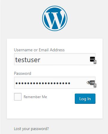
Also just for reference, the login screen with LastPass (password manager) enabled:
Noticed an empty style attribute in 48222-5.diff:
<div class="wp-hide-pw-wrap hide-if-no-js" style="
">
ps: the eye-icon is also available on desktop view, but the title of the ticket suggests it should only be on mobile.
#25
 @
@
15 months ago
Quickly looking at 48222-5.diff, one quick consideration:
in the last years, WordPress has been progressively removing title attributes from its codebase. It's important to not introduce new title attributes, as they serve no useful purpose, they're available only to mouse users, and thus they're not accessible. Also, it's important to avoid to use title and aria-label attributes with the same value, as the same information may be announced twice. All the title attributes should be stripped out from the patch.
#26
 @
@
15 months ago
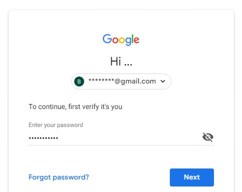
I noticed that the button toggle state is different from e.g. the Google Account login (only visible on mobile):
The hidden icon shows, when password is hidden:
The visible icon shows, when password is visible:
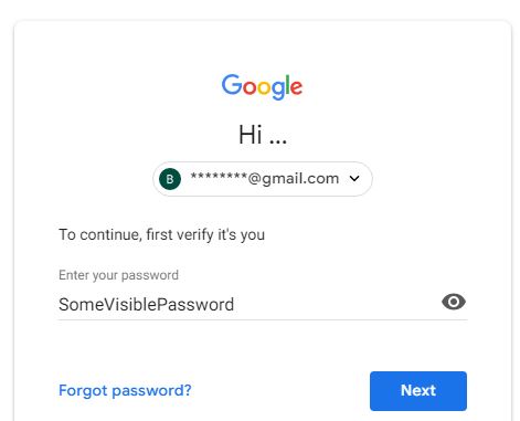
This is vice versa compared to the toggle state in 48222-5.diff.
#28
in reply to:
↑ 27
 @
@
15 months ago
Replying to joyously:
Is it an icon indicating state, or a button to change state?
On Google Account mobile login page, it's a button ( a div with role="button" + svg ) that we can click on to toggle it.
#29
 @
@
15 months ago
OK, but what is this one supposed to be?
It should be obvious. If it's not, make it so.

This ticket was mentioned in Slack in #accessibility by rianrietveld. View the logs.
13 months ago
#32
 @
@
13 months ago
- Milestone changed from 5.0 to 5.1
Moving to the 5.1 milestone due to the WordPress 5.0 focus on the new
editor (Gutenberg).
#33
 @
@
10 months ago
- Milestone changed from 5.1 to Future Release
I like this, but it looks like the patch needs some work before it's ready. Feel free to re-milestone it once it's close.

This ticket was mentioned in Slack in #accessibility by afercia. View the logs.
9 months ago
#35
 @
@
8 months ago
Pushing this ticket up as I wished I could see the password I entered a few times over the past few weeks. Gary mentioned this patch needs some extra work. Is there anyone available to give this some TLC? Happy to test once a new patch is up.
#36
 @
@
8 months ago
Related: #42853.
Worth noting when users reset their password, they get a link to the "new password" page. The password field in that page already has a "hide/show" button. #42853 is going to make a few improvements to that button, see screenshot on https://core.trac.wordpress.org/ticket/42853#comment:12
#37
 @
@
7 months ago
48222-5.diff no longer applies cleanly :( @Iceable do you have time to work on refreshing your patch?
#38
 @
@
6 months ago
I'm afraid I have very limited time available at the moment. I'll try to look at this in the next few weeks but cannot promise anything. If someone wants to take over in the meantime they are very welcome.
#40
 @
@
4 months ago
Updated the patch in 42888.2 while also fixing a few issues:
- Password generation was broken after applying the patch, now fixed
- Mobile view didn't have proper padding, fixed as per #42853
- Mobile view had hide/show titles on the button, removed them, keeping only the icon
- There was a bug on clicking cancel in profile page, the password didn't clear and that created unexpected behavior
Tested using Chrome/Safari on macOS, both mobile and desktop views.
cc @afercia @boemedia can you please retest ?
#41
 @
@
4 months ago
- Keywords good-first-bug dev-feedback 2nd-opinion needs-refresh removed
- Milestone changed from Future Release to 5.3
- Owner changed from Iceable to shadyvb
Thanks @shadyvb! I reviewed a bit the patch. In 42888.3.diff:
- phpcs fixes (indentation, yoda conditions, translators comment)
- general clean up
- restored the focus style on the toggle button
- added styling to the toggle button in the install page
- removed some wrappers: seems to me they're unnecessary
- made the "Remember me" label font size bigger
Question:
when the field switches to type=text, should we add autocomplete=off?
Some testing would be nice :) Please test also the install page, also in the responsive view.

This ticket was mentioned in Slack in #accessibility by audrasjb. View the logs.
7 weeks ago
#43
 @
@
7 weeks ago
- Keywords needs-refresh added
- Owner changed from shadyvb to afercia
Discussed during today's extra accessibility bug-scrub focused on the 5.3. release. Looks like the last patch is close, probably needs a refresh though.
Once refreshed, some testing would be nice :)

This ticket was mentioned in Slack in #accessibility by audrasjb. View the logs.
6 weeks ago
#45
 @
@
6 weeks ago
- Keywords needs-refresh removed
42888.4.diff refreshes and slightly improves the patch after the several changes in [45673].
Notes:
- The patch (as the previous ones) adds the button also on Desktop.
- When LastPass (password manager) is used, the LastPass icon overlies the button: this happens with all the input fields and there's nothing we can do about this. I'd tend to think its a LastPass responsibility.
Some testing would be nice :) Please test:
- the user new / user edit / user profile pages
- the login page
- the install page > step 1
- the reset password page
- am I missing something to test?
Note:
I think the .password-input-wrapper element can be removed from anywhere. Seems to me it was only used by validateForm() when submitting an empty password field. See [34068] / #33406. Basically the form can't be submitted with an empty password field any longer so I think the wrapper element and the related CSS can be removed.
@SergeyBiryukov when you have a chance: can you confirm this please? I'd greatly appreciate your review.
#46
 @
@
6 weeks ago
@voldemortensen hello (pinging you as component maintainer) @johnbillion hello: your review on 42888.4.diff would be greatly appreciated, when you have a chance.

This ticket was mentioned in Slack in #accessibility by afercia. View the logs.
6 weeks ago
#48
 @
@
6 weeks ago
Hey All, I might be missing a conversation in the ticket so apologies if this is already discussed.
I was wondering if we could add visible text to the button so that people using speech recognition software, people who say things like "Click show password button" can easily press it - otherwise they have to guess the label of the button.
If we moved the button outside of the input field, this would give the button more space for a visible label.
What are your thoughts?
#49
 @
@
6 weeks ago
@afercia @johnbillion Is getting this committed for version 5.3 still expected? With Beta 1 going out tomorrow, we need a resolution for this enhancement soon. Otherwise, we can move this to be considered for 5.4.
#50
 @
@
6 weeks ago
- Keywords needs-refresh added
@davidbaumwald thanks for the ping. It's in the accessibility team to-do list. I see the patch needs to be refreshed because of changes in the very latest days. Will refresh and commit.
#51
 @
@
6 weeks ago
- Keywords commit added; needs-refresh removed
42888.5.diff refreshes the patch. Differences:
- the
no-jsclass was recently added in [46192] - improves vertical alignment of the button icon by 1 pixel
Seems to me it's a good and self-contained improvement. I'd like to commit this for 5.3 Beta 1 so it can get more eyes and feedback.
@anevins you're right that icon-only controls are a known accessibility anti-pattern and visible text should be provided instead. This would require new design. Considering that also the buttons in the User edit / new pages display only an icon in the responsive view, I'd tend to think this should be addressed holistically for all these buttons. The next release cycle would be a good opportunity to audit these controls and improve them.
For now, I'd propose to get this change in core as it's an improvement. The base functionality (entering a password) is accessible to everyone. The visibility toggle can be improved but that's an additional feature that doesn't prevent the use of the password field. Also, the aria-labels associated to the button are simple enough and pretty intuitive:
- Show password
- Hide password
#53
 @
@
6 weeks ago
Was testing 42888.5.diff-with-long-password.JPG and it looks good.
But I noticed that the hide icon overlaps with long passwords: 42888.5.diff-with-long-password.JPG.
This seems to be the case for all devices.
#54
 @
@
6 weeks ago
@birgire thanks, good catch! There's a 45 pixels padding when the input is type=password but it misses when the input is type=text (password visible). Will add.
#55
 @
@
6 weeks ago
42888.6.diff adds the missing padding.
Also, some styles need to be applied only when JS support is on. Tested on both the login and reset password pages.

This ticket was mentioned in Slack in #accessibility by francina. View the logs.
5 weeks ago
#59
 @
@
5 weeks ago
42888.7.diff refreshes the patch after recent line numbers changes.
#62
 @
@
5 weeks ago
- Focuses administration added
- Resolution fixed deleted
- Status changed from closed to reopened
Removing paragraph tags and switching from <p> to <div> on the login screen is a potential regression for all themes and plugins that style wp-login.php. Is that necessary, and if yes, how was that tested?
#63
 @
@
5 weeks ago
Is that necessary
Not strictly necessary, other than they're slightly better semantically. Will revert the <p>s.
[Edit] sorry, bit tired :) I meant they're preferred to mark up _paragrahps_. Using <p> to wrap form controls, while technically valid, isn't great.
is a potential regression for all themes and plugins that style wp-login.php.
Right. Haven't considered. Bit unfortunate though, as the login markup isn't ideal.
#64
follow-up:
↓ 66
 @
@
5 weeks ago
- Keywords needs-dev-note added
42888.8.diff restores the paragraphs.
There are a few other markup changes anyways that need to stay for example a few wrappers.
Also a few labels that are now explicitly associated instead of wrapping labels, which improves accessibility. It would be nice for these minor changes to stay.
A quick dev note for these improvements should inform of these minor changes.
#66
in reply to:
↑ 64
 @
@
5 weeks ago
Replying to afercia:
Bit unfortunate though, as the login markup isn't ideal.
Yeah, but... Changing that may introduce layout CSS "bugs" and make the login screen unusable.
Also a few labels that are now explicitly associated instead of wrapping labels, which improves accessibility. It would be nice for these minor changes to stay.
Of course. They still may bring some minor visual inconsistencies, but far less than changing the HTML "blocks" tags.
#67
 @
@
4 weeks ago
I know we're a bit into beta now, but I hadn't noticed this feature, and would like to bring up the Edge browser, which has native support for toggling password fields back and forth like this.
I honestly just thought Chrome had implemented the same behavior when I looked at the login page, and thought nothing more of it
Although the two indicators do not overlap, it feels weird to suddenly have two icons which have similar behaviors, and different approaches which makes one affect the other, but not the other way around.
I've included login-edge.PNG to show the static view once you've started typing, and edge-core-password-toggle.gif which shows the behavior when clicking the buttons.
As can be seen, Edge just displays the text without changing the password field type, which maintains the core button that can then be clicked while already displaying the icon. You also have to remove the entire input field's value and start over for the Edge integration to kick in again after having toggled the field back and forth with the core implementation.
#68
 @
@
4 weeks ago
Thanks @Clorith ! Is that the old Edge or the new webkit-based one?
Maybe worth exploring if there's a proprietary, prefixed. -ms-something to target to hide that button.
An a related note, also Safari displays an additional button within the password field. It's the "autofill" icon, but that's not a great issue.
#69
 @
@
4 weeks ago
I don't think the new webkit-based one is out yet, but I know they're only using it for the rendering engine, and will retain all functionality they have currently moving forward. (it's the latest edition as of the feared Windows 1903 update that came out this month :) ).
Microsoft Edge 44.18362.329.0
Microsoft EdgeHTML 18.18362
Quick search, and it looks like there's an input::-ms-reveal { display: none; } which can be used.
#70
 @
@
4 weeks ago
- Resolution fixed deleted
- Status changed from closed to reopened
- Type changed from enhancement to task (blessed)
Thanks @Clorith !
This enhancement was merged in time for Beta 1. Reopening only to see if it's possible to fix the minor issue for Edge thanks to input::-ms-reveal { display: none; } as found by @Clorith.
#72
 @
@
4 weeks ago
42888.9.diff hides the Edge browser "Reveal password" native button.
#74
 @
@
3 weeks ago
- Keywords has-dev-note added; needs-dev-note removed
Adding has-dev-note and removing needs-dev-note keyword.
Related dev-note: https://make.wordpress.org/core/2019/10/10/wordpress-5-3-adds-a-show-button-next-to-the-password-field-on-the-login-screen

This sounds like the most straightforward way to do it.
The
Showbutton on the "add new user" page is doing it in a more convoluted way: there is onepasswordinput and onetextinput (hidden withdisplay: none;), each one mirrors the value of the other.Clicking the
Showbutton toggles ashow-passwordclass on the wrapper around these two inputs, which in turns hides thepasswordone and shows thetextone.I wonder if there is a good reason to do it that way as opposed to what Facebook does.