Opened 6 months ago
Closed 3 weeks ago
#47149 closed defect (bug) (fixed)
Tab structure does not use tab semantics
| Reported by: |
|
Owned by: |
|
|---|---|---|---|
| Milestone: | 5.3 | Priority: | normal |
| Severity: | normal | Version: | |
| Component: | Media | Keywords: | needs-post-mortem wpcampus-report has-screenshots semantic-buttons has-patch i18n-change |
| Focuses: | accessibility, javascript | Cc: | |
| PR Number: |
Description
Moved from the WPCampus accessibility report issues on GitHub, see: https://github.com/WordPress/gutenberg/issues/15287
- Severity:
- Medium
- Affected Populations:
- Blind
- Low-Vision
- Motor Impaired
- Cognitively Impaired
- Platform(s):
- Windows - Screen Reader
- Windows - ZoomText
- Windows - Dragon
- Mac - VoiceOver
- Android - TalkBack
- iOS - VoiceOver
- Components affected:
- Media Dialog
Issue description
In the "Featured Image" modal dialog, two links are used to switch
views (between the "Media Library" and the "Upload Files" panels).
These are coded as links with redundant href attributes ("#"),
which is not semantically valid, and does not convey the
currently-active link to assistive technologies.
The choice of button vs link has a significant effect on user
expectations for assistive technology users: links convey the
expectation that the browser will navigate to a different location or
page, which standard buttons do not. The difference also affects what
keys can be used within assistive technologies to navigate between the
elements, and which page summaries the element appears in (for example,
it won't show up in a list of all form elements on the page).
Semantic markup is vital for assistive technology users, to convey the
structure and relationships between information. When appropriate
semantic markup is not used, it may be more difficult for such users to
understand what the content means, and to comprehend the structure that
the visual presentation conveys.
Issue Code
    <div class="media-router">


        <a href="#" class="media-menu-item active">Upload Files</a>


        <a href="#" class="media-menu-item">Media Library</a>


    </div>
Remediation Guidance
The visual presentation of the content within the "Featured Image"
dialog is a tab panel. Using the [tab panel pattern]
(https://www.w3.org/TR/wai-aria-practices-1.1/#tabpanel) will give the
elements proper roles, and using aria-selected will allow users of
assistive technologies to know which tab is currently selected.
Recommended Code
    <div role="tablist" class="media-router">


        <button role="tab" aria-selected="true" class="media-menu-item active">Upload Files</button>


        <button role="tab" class="media-menu-item">Media Library</button>


    </div>
Relevant standards
- 1.3.1 Info and Relationships (Level A) https://www.w3.org/TR/WCAG20/#content-structure-separation-programmatic
- 4.1.2 Name, Role, Value (Level A) https://www.w3.org/TR/WCAG20/#ensure-compat-rsv
Note: This issue may be a duplicate with other existing accessibility-related bugs in this project. This issue comes from the Gutenberg accessibility audit, performed by Tenon and funded by WP Campus. This issue is GUT-58 in Tenon's report
Attachments (29)
Change History (121)
#3
 @
@
6 months ago
- Keywords has-screenshots added; needs-screenshots removed
Hi,
I'd like to propose a first workaround, based on this ressource: https://developer.mozilla.org/en-US/docs/Web/Accessibility/ARIA/Roles/button_role
I was not able to make a proper fix on this issue but I uploaded a testable JS fix above.
- add
role="button"attribute - add
aria-pressed="true/false"attribute - toggle
aria-pressedattribute when needed
Search for //JBA comments to see the changes I've done.
See also the animated GIF file to see the result.
Cheers,
Jb
#5
 @
@
6 months ago
- Keywords semantic-buttons added
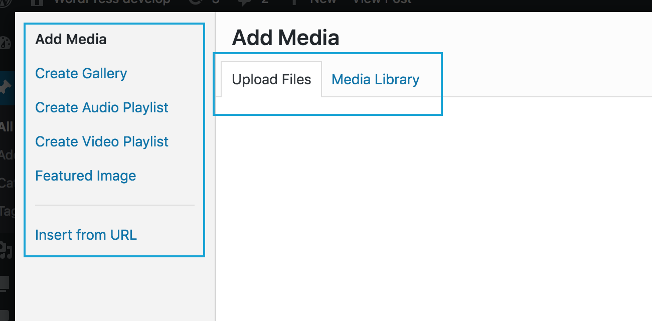
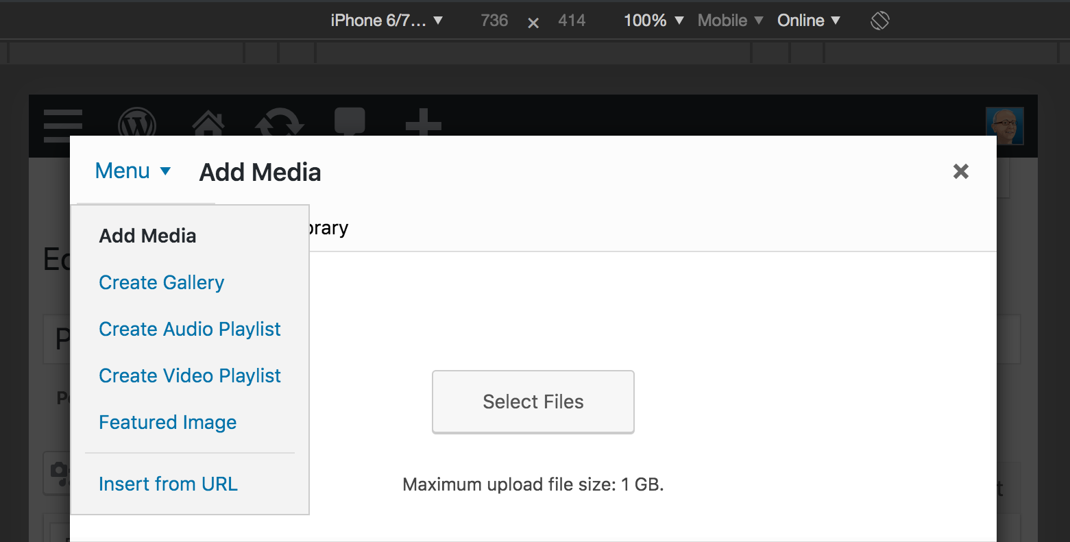
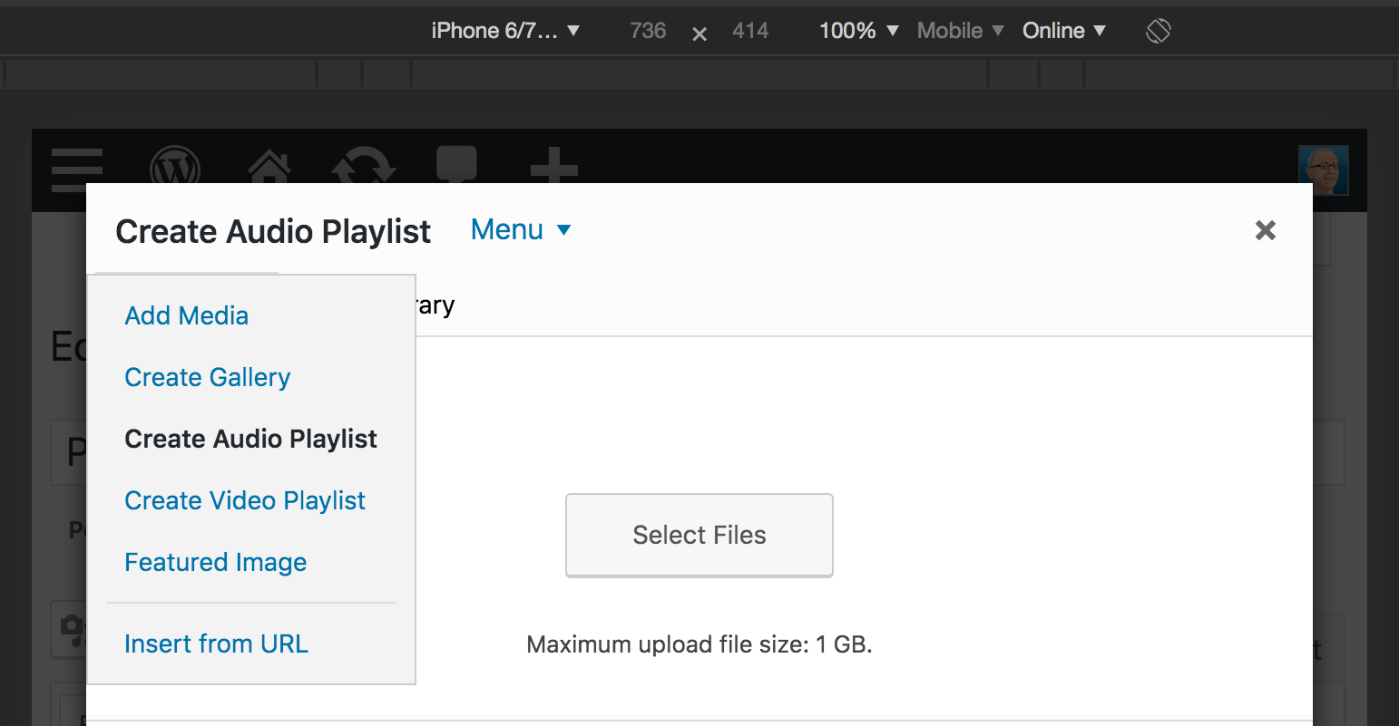
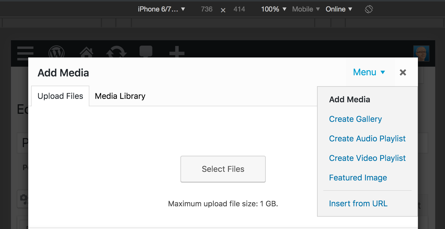
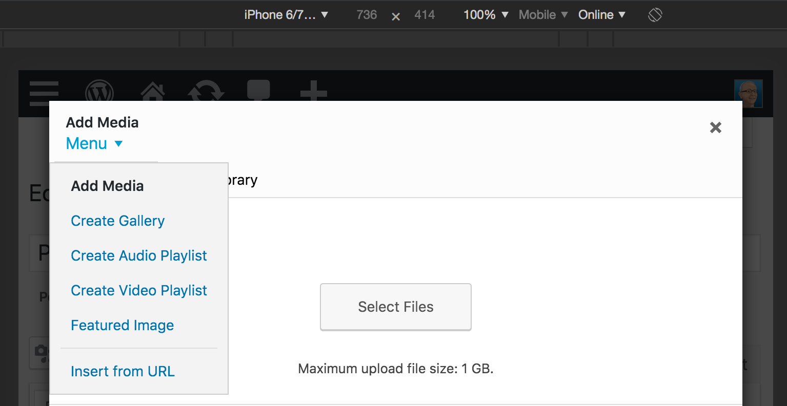
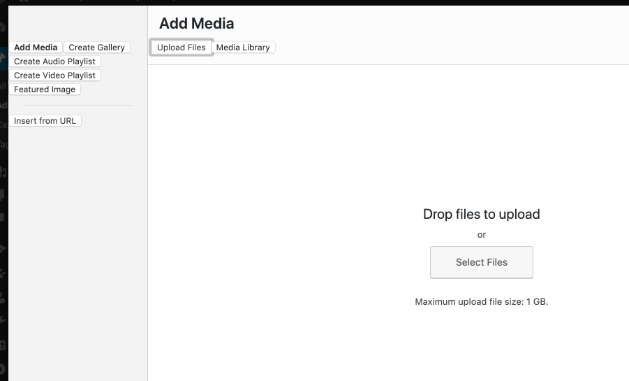
Worth noting this applies also to the menu items in the left sidebar of the media modal (the sidebar appears only in some of the media views). They're all <a href="#"> links, while they should be vertical tabs. However, in the responsive view the menu becomes a dropdown menu (see screenshot on the right), which makes things a bit more difficult to fix.

This ticket was mentioned in Slack in #core-media by antpb. View the logs.
5 months ago
#8
 @
@
5 months ago
Steps we need to take:
1) Investigate all instances of this tabs antipattern;
2) Implement the tabs design pattern with keyboard interactions as per the W3C's recommendation. Helpful examples: https://www.w3.org/TR/wai-aria-practices-1.1/examples/tabs/tabs-1/tabs.html
3) Test across all instances of the tabs.
#9
 @
@
5 months ago
Note: actually, an ARIA tabbed interface could be built also upon links (<a> tags) if only they were valid URL-fragment links pointing to a valid page fragment, see for example https://inclusive-components.design/tabbed-interfaces/
However, these are just invalid links <a href="#"> thus they need to be changed to buttons, see https://core.trac.wordpress.org/query?keywords=~semantic-buttons
#10
 @
@
5 months ago
- Owner changed from audrasjb to afercia
- Status changed from accepted to assigned
I'm looking into this and working on a patch. In the media views, the Menu view generates both the menu on the left sidebar and the horizontal menu (called media-router, not sure why):
The left menu should be a vertical ARIA tabbed interface as well, so it makes sense to change both menus. Worth reminding it's not just a matter of adding some ARIA roles. ARIA tabs need to implement a specific keyboard interaction pattern, see details in the ARIA Authoring Practices.
I'm almost done with the interaction part. The main problem now is to add the required roles and attributes
Both the menus and the content update "on the fly" and this makes difficult to add IDs referencing the correct views. I'd tend to think this part would need a workaround.
These are the parts that are a bit tricky to implement:
- Each element with role
tabhas the propertyaria-controlsreferring to its associatedtabpanelelement. - Each element that contains the content panel for a
tabhas roletabpanel. - Each element with role
tabpanelhas the propertyaria-labelledbyreferring to its associatedtabelement.
#11
 @
@
5 months ago
- Keywords has-patch dev-feedback added; needs-patch removed
47149.diff is a proof of concept. It implements a first part of the ARIA tabbed interface, ie. the keyboard interaction part. As said in the previous comment, there's the need to add roles, attributes, and IDs required for this user interface pattern to work properly. This second part is a bit tricky and needs some exploration.
The basic idea is to extend wp.media.view.FocusManager to make it a tool able to handle special cases of focus management (e.g. arrow keys navigation) and ARIA widgets.
WordCamp Europe 2019 is in a few days, it would be a good opportunity to collaborate at implementing the missing parts :)
Note: in this proof of concept styling is only partially implemented: when testing, please ignore the visual part for now.
#12
 @
@
4 months ago
Re: aria-controls, there's an important update. See this quick note by Steve Faulkner:
https://twitter.com/stevefaulkner/status/1138834162562019328
"If you encounter an element on a web page with a defined aria controls relationship, JAWS will no longer say "use JAWSKEY+ALT+M to move to controlled element" by default."
JAWS 2019 release notes: https://support.freedomscientific.com/Downloads/JAWS/JAWSWhatsNew
JAWS was the only known assistive tech to support aria-controls. Not to mention the actual usefulness of aria-controls was previously argued for good reasons.
#13
 @
@
4 months ago
See some initial design feedback on this related ticket comment: https://core.trac.wordpress.org/ticket/47145#comment:9
/Cc @kjellr @melchoyce
#15
 @
@
4 months ago
47149.2.diff refreshes the patch and improves styling. Still to do:
- correct association of the tabs with the tab panels
- make a decision on how the left menu should behave in the responsive view: currently, it switches to a dropdown but this doesn't fit so well with the ARIA tabs pattern

This ticket was mentioned in Slack in #core-media by afercia. View the logs.
4 months ago
#17
 @
@
4 months ago
- Focuses javascript added
- Keywords dev-feedback removed
47149.3.diff associates the tabpanel content with the active menu item in the left menu, so that the tabpanel is properly labelled. Also, cleans up things a bit. Still to do:
- associate the tabpanel with the "router" tabs: "Upload Files" and "Media Library"
- handle edge cases where the modal view hides the left menu, e.g.: the Image Editor
- make a decision on how the left menu should behave in the responsive view: currently, it switches to a dropdown but this doesn't fit so well with the ARIA tabs pattern, see screenshot below
#18
 @
@
4 months ago
It appears NVDA needs an explicit aria-selected="false" instead of the absence of the attribute, otherwise it will announce all the tabs as "selected".

This ticket was mentioned in Slack in #core-media by karmatosed. View the logs.
3 months ago

This ticket was mentioned in Slack in #core-media by anevins. View the logs.
3 months ago
#21
 @
@
3 months ago
Hey @afercia , just checking you're okay owning this for 5.3? If not, no pressure, we can get this reassigned.
#23
 @
@
2 months ago
- Keywords needs-refresh added; needs-design-feedback removed
I'm progressing slowly on this one, as there are some technical details to solve. Can own it.
Design feedback will be addressed in #47610, if need be. Removing the keyword.

This ticket was mentioned in Slack in #accessibility by afercia. View the logs.
2 months ago
#25
 @
@
2 months ago
Thanks for your work on this, Andrea!
I think that your proposed solution should work. Regarding the mobile view, I think that switching the dropdown into a disclosure widget will give the necessary affordance for the interface to make sense.
The fact that the H1 heading is being used to toggle that dropdown will definitely need to change - the control needs to be a clickable element, and the text should be a) constant and b) something that conveys what options are in that tab panel. I'm not honestly certain how to describe that, however - those choices are fairly diverse.
Something like "Media Tools"?
#26
 @
@
2 months ago
the control needs to be a clickable element,
Thanks @joedolson! I guess you meant keyboard operable? :)
#27
 @
@
2 months ago
Eh. Yeah, that's what I meant. ;) Well, literally, I meant "an element that is natively clickable", but yeah - not stated clearly.
#28
 @
@
7 weeks ago
- Keywords needs-patch added; has-patch needs-refresh removed
Work is progressing. I'm working on the menu toggle in the responsive view: the H1 heading is now just a heading and I added a button to toggle the menu.
I'd need some feedback on the best option for best visual order / DOM order. The styling is temporary, please focus on the order issue :)
Option 1:
- button placed in the most intuitive spot from a visual perspective
- unfortunately, the heading is between the toggle and the menu: in the DOM the menu doesn't immediately follow the toggle
Option 2:
- button placed after the heading
- DOM order is ideal
- visually: not great because button and menu are "disconnected"
- also: the heading text length varies depending on the selected view thus the button "jumps" horizontally when selecting a menu item
Option 3:
- everything moved to the right
- DOM order is ideal
- there's no "jump"
- maybe not great visually
- could be out of view at high magnification levels (proximity)
Feedback and suggestions for alternative options welcome.

This ticket was mentioned in Slack in #accessibility by afercia. View the logs.
7 weeks ago
#30
 @
@
7 weeks ago
Option 4, with some refactoring of the modal top part:
- heading and button stacked vertically
- visual order and DOM order match: heading > button > menu
- the heading doesn't necessarily need to be "big"
- of course the font sizes can be adjusted and some more white space added: this is just a quick in-browser editing to illustrate the idea

This ticket was mentioned in Slack in #accessibility by afercia. View the logs.
7 weeks ago
#32
 @
@
7 weeks ago
- Keywords needs-design-feedback added
Discussed during today's accessibility bug scrub. Option 4 was indicated as the preferred option. Needs feedback from the design team though.

This ticket was mentioned in Slack in #design by afercia. View the logs.
7 weeks ago
#34
 @
@
7 weeks ago
- Keywords has-patch added; needs-patch removed
Pending design feedback on the menu in the responsive view, 47149.5.diff is a functional patch that implements the ARIA tabs pattern on both the left menu and the Upload/Library menu (called the "router" according to the Media Views conventions).
The patch looks good to me and I'd greatly appreciate some accessibility testing. Some bits in the patch necessarily target DOM elements: maybe it could be improved in a bit more "backbonish" way. If anyone is willing to introduce improvements, that'd be very welcome. I tried to keep the DOM-related methods as much isolated as possible.
This patch is also a good step forward in making the FocusManager a more general and powerful tool to handle focus management in the media views.
To test, you may want to activate the Classic Editor plugin to easily access all the media modal views.
Please test desktop and mobile views on at least these cases:
The "Post" modal dialog:
- one of the main modal views e.g. "Add Media", "Create Gallery", "Create Audio Playlist", "Featured Image"
- on these views, test also switching the inner tabs "Upload Files" and "Media Library"
- test one or more of the sub-views e.g. "Edit Gallery", "Add to Gallery"
- the "Insert from URL" view is a special case because the "Upload Files" and "Media Library" tabs are hidden there thus the inner tabpanel shouldn't be present, please check
The "Set featured image" modal dialog:
- on this modal the main tabs are hidden so the main tabpanel shouldn't be present
The modal dialogs that open from the Customizer:
- e.g. Site Icon or Header Media (depending on the active theme)
The modal dialogs that open from Gutenberg:
- e.g. the Image block and the Gallery block
- for example, in the modal that opens from the Gallery block the main tabs have only one tab: this is specific to the Gutenberg implementation and can't be changed. The ARIA pattern works correctly even if it doesn't make much sense for just one tab.
Optionally: any other media modal dialog using a different "frame".

This ticket was mentioned in Slack in #accessibility by afercia. View the logs.
7 weeks ago

This ticket was mentioned in Slack in #design by karmatosed. View the logs.
7 weeks ago

This ticket was mentioned in Slack in #design by karmatosed. View the logs.
6 weeks ago
#38
 @
@
6 weeks ago
I think there is something either up with trunk or the patch today, I will paste in what I see running it. I do however, get a white screen without classic editor plugin on trunk. My thinking is that something is interfering with your patch @afercia. I will take a look again tomorrow, however if you could post screenshots for me I can maybe get around any local issues (although not sure it's my install yet).
#39
 @
@
6 weeks ago
Thanks @karmatosed. The patch works for me without Classic Editor. From your screenshot I can only see the styles are not loaded. Did you run grunt build? Or hard refreshed the page?
Regardless, design feedback would be appreciated specifically on the button to toggle the menu in the responsive view. See comments 28 and 29 with the 4 options and screenshots.
For accessibility we need the visual order match the source order and ideally this order:
- the modal title
- the button to toggle menu
- the menu
Based on that, option 4 looked the most promising to the accessibility team. I guess it would need some visual adjustment.
#40
 @
@
6 weeks ago
Thanks for the context @afercia. I have tested and got it working now, super weird but glad it's working after a fresh svn up, I had done grunt build so assume caught a bad build.
For those following along what I see now is:
Based on that I have a few iterations, I am not sure the side menu one is ideal from usability or a11y but adding incase. For me having menu on a new line does help some visual issues.
cc @melchoyce for a second design input here. Likely we do need styling for this but for now focusing on placing as styling can happen after beta 1.
#41
 @
@
6 weeks ago
I think we should center the title regardless of the direction we take, but here are two ideas:
- The title becomes the menu dropdown as well, since it's the same label as the selected menu item
- We update the menu title from "menu" to "media types" to be more explicit about what content you'll find inside the menu.
#42
 @
@
6 weeks ago
@melchoyce thanks for sharing feedback. A few, quick, considerations:
- Right now, the title is already the menu toggle: this is exactly what needs to be changed :) There's the need for a UI control (a button) that communicates _what_ it does, e.g.: "(choose) media types". Instead, in the current UI and in the mockup #1 it would communicate the currently selected item.
- The second mockup is better for accessibility except for the order. As outlined previously, visual order and source order must match. We need this order:
- Title
- Menu toggle
- The menu itself

This ticket was mentioned in Slack in #design by afercia. View the logs.
6 weeks ago

This ticket was mentioned in Slack in #design by karmatosed. View the logs.
6 weeks ago
#45
 @
@
6 weeks ago
My above attachment is rather large (sorry about that), but I think is a good middle ground to then iterate in beta 1. @melchoyce I would love to see your input on where this could be iterated as hope was ok but I took your work and found that middle point.
@afercia hopefully this can get in for beta 1 and then see that iteration.
#46
 @
@
6 weeks ago
Thanks @afercia. Does Media Tabs.png fill all the necessary criteria?
#47
 @
@
6 weeks ago
Thanks @karmatosed. @melchoyce interesting idea. I'm trying it. Two considerations:
- On intermediate viewport widths the modal sidebar is still visible on the right and has a gray background: the white tabs on the right don't look great with that gray background underneath :(
- On small viewport widths, there may not be enough room for longer translations. Worth reminding there's a sort of unofficial support for viewport as narrow as 320 pixels.
See screenshots below.
I genuinely like the idea. I can see the symmetry and how the white space helps. However, on the responsive views, this kind of horizontal alignments are always tricky (the 2 horizontally aligned buttons in the customizer come into my mind).
I have no strong preferences. Both the last mockup by @karmatosed and your one solve the order issue. Just let me know what is the design team preference :)
#48
 @
@
6 weeks ago
Could we change the tab background color between when "Media Types" is collapsed down into a menu, and when the grey sidebar disappears, so that it matches the sidebar background color?
For translations — can those labels wrap onto multiple lines, or are the heights hard-coded?
#49
 @
@
6 weeks ago
Could we change the tab background color between
Not sure I fully understand but everything is "fluid" there and it's getting a bit complicated :)
For translations — can those labels wrap onto multiple lines, or are the heights hard-coded?
Most of the elements there have fixed heights and are absolutely positioned... almost impossible to allow line wrapping unless we'd want a major refactoring of all the media modal :(

This ticket was mentioned in Slack in #design by karmatosed. View the logs.
5 weeks ago
#51
 @
@
5 weeks ago
- Type changed from defect (bug) to task (blessed)
The only part missing here is CSS adjustments for the media modal top part, which currently looks like in the screenshot below. Desktop looks like in the previous screenshots on this ticket.
I'd like to propose to commit this for WP 5.3 Beta 2, as the functional / JS part is ready since a few weeks. The small CSS adjustments can be iterated later.
#52
 @
@
5 weeks ago
47149.6.diff refreshes the patch against latest trunk.
#55
 @
@
4 weeks ago
Perhaps this is problematic feedback at this stage, but I'm feeling like "Media Types" doesn't communicate to me the options that are inside. Especially with Single image vs Featured Image vs Gallery, which are both the same "Media Type" of Image.
I like that it reduces duplicate headers, but as a user, it's confusing to me what I'd go into "Media Types" to find.
I'll think about alternate wordings or options, too, but wondered if anyone else had thoughts on this, or ways to make it clearer. I worry it'll make the other items much less discoverable.

This ticket was mentioned in Slack in #core-media by mike. View the logs.
4 weeks ago
#57
 @
@
4 weeks ago
Sure. This was noted in https://core.trac.wordpress.org/ticket/47610#comment:38 where a few suggestions were made. It would be only a string change. Suggestions welcome.

This ticket was mentioned in Slack in #accessibility by audrasjb. View the logs.
4 weeks ago
#59
 @
@
4 weeks ago
- Keywords needs-design-feedback removed
The only part missing here is CSS adjustments for the media modal top part
This has been addressed in #47610 see starting from comment:35:ticket:47610 and the screenshots there: the toggle button and menu are now centered.
About the copy: suggestions welcome.
#60
 @
@
4 weeks ago
Noticed an edge case where the ARIA tabs markup is rendered even if there are no visible "menu" and "router" tabs. Learned the state attributes contain information on the two menus and it's possible to additionally check for them to better determine when the ARIA tabs markup needs to be rendered.
47149.7.diff uses this approach to improve the related conditional checks and remove a no longer necessary conditional check.

This ticket was mentioned in Slack in #core by marybaum. View the logs.
4 weeks ago

This ticket was mentioned in Slack in #core-media by mike. View the logs.
3 weeks ago
#64
 @
@
3 weeks ago
We talked about this during Media triage, linked above.
@joemcgill mentioned that this area also gets used for non media related things, like in Shortcake.
Would it be possible to go with "Actions" instead of "Media Types", similar to @melchoyce's recommendation?
#65
 @
@
3 weeks ago
Would it be possible to go with "Actions" instead of "Media Types"
There's already a visually hidden heading "Available actions" placed before the bottom toolbar, see #47610. A toggle button named "Actions" placed in a different section would be a bit confusing.
I'd totally agree this toggle button (and the companion heading from #47610 would need a more generic name as the menu items relate to different actions. There are also "Edit" and "Cancel" actions in the sub views, see attached screenshot for some examples.
Maybe something like "Manage media" or just "Manage"?
Worth also reminding this toggle button appears only in the responsive view, while the heading is visible only on desktop.
I'm not sure I know what "Shortcake" is and what it does in the media views. Not sure other contributors or readers know as well. Can you please add some more details for reference and also for history when this ticket will be read a few years from now?
Regardless, I'm not sure core should base UI improvements on what plugins do in absences of a formal API or formalized UI patterns. :)
#66
 @
@
3 weeks ago
- Keywords needs-post-mortem added
- Type changed from task (blessed) to enhancement
Re: process, this ticket was supposed to be a bug fix to change some links into buttons so assistive technology may work better but has turned into an "arbitrary enhancement" for the media modal instead. Being an enhancement, it shouldn't have been committed during beta.
In addition, looking at the above screenshot the "Media Types" label/heading is confusing and degrades user experience (even if changed to "Actions"). What does "media types" have to do with "cancel gallery", and why would the menu need a separate title? The modal already has a title, in this case it's "Create Gallery", that states the purpose a lot better.
Imho this should be reverted.
#67
 @
@
3 weeks ago
Sure, @afercia -- here's a link to check out Shortcake.
The screenshots show the relevant use: https://wordpress.org/plugins/shortcode-ui/
#68
follow-up:
↓ 72
 @
@
3 weeks ago
- Type changed from enhancement to defect (bug)
@azaozz thanks for sharing your concerns.
Re: process, this ticket was supposed to be a bug fix to change some links into buttons
Not exactly. The actual point here is that the visual presentation looks like "tabs" but they weren't real tabs, not providing the expected semantics and interaction of the ARIA tabs pattern. Also reported by the WPCampus audit as "medium" severity, ie: not a minor thing. As such, this was a bug.
but has turned into an "arbitrary enhancement" for the media modal instead. Being an enhancement, it shouldn't have been committed during beta.
Being a bug, it can be committed at any time during beta.
Not sure what do you mean by "arbitrary enhancement". The change to ARIA tabs implied other changes including CSS especially for the mobile part.
Please notice the patch for this ticket was ready since weeks. See comment:34. Design feedback was a bit late and I had to wait for their feedback, That's why I opted to commit the patch and change this ticket from "bug" to "task (blessed)" to give design the time for feedback and iterate. See comment:51.
the "Media Types" label/heading is confusing and degrades user experience (even if changed to "Actions"). What does "media types" have to do with "cancel gallery", and why would the menu need a separate title? The modal already has a title, in this case it's "Create Gallery", that states the purpose a lot better.
There are two different things here:
- the "Media Types" heading pertains to #47610 see there for the good reasons to add more headings within the modal
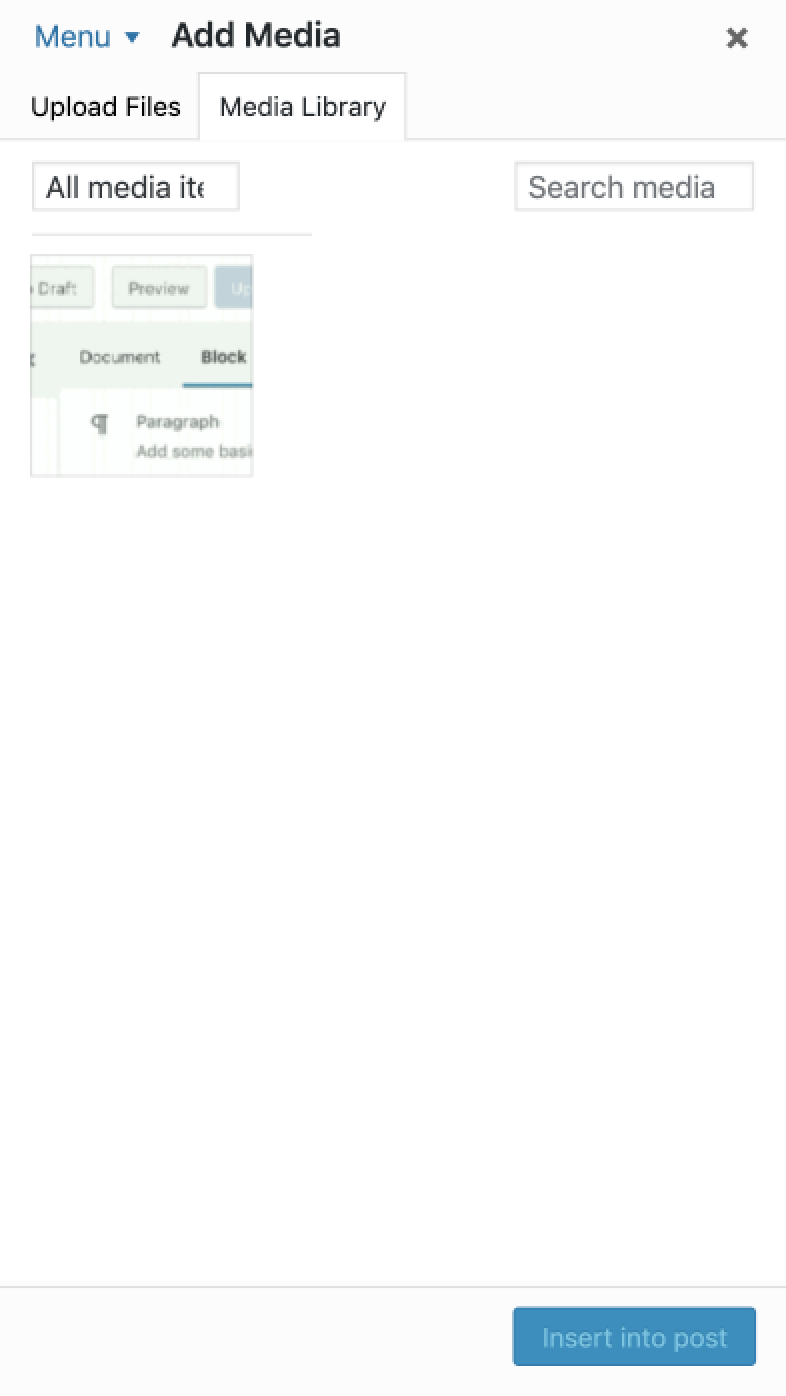
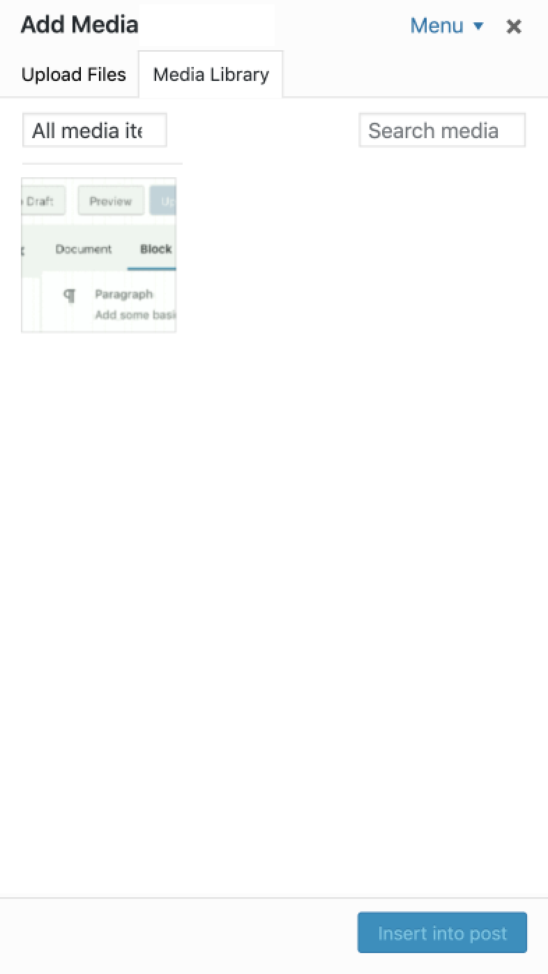
- the "Media Types" toggle button that appears in the responsive view to toggle the menu: this is a button and needs to identify the available action. As in "what happens when I click this button". "Create Gallery" (or similar) is not a proper text for this button simply because when you click the button it doesn't create a gallery :) It opens the menu. Also, initially the button text was "Menu": simple and effective. It was changed to "Media Types" after design feedback. see comment:41.
Re: the wording, I'd agree it needs to be improved for both the heading and the button. This was noted on this ticket and also on #47610. The current proposed text are the following ones. Please just let me know which one is preferred, I haven't got a final feedback so far.
- Settings
- Actions
- More...
- Manage media
- Manage
- Menu
For the button, personally I'd lean towards "Menu" because that's what the button does: it opens and closes the menu.
For the heading, it needs to identify what that section of the media modal is about. I'd lean towards "Manage media" but this should be discussed on #47610.
That said, I'd like to change this ticket back to "bug" because it's a bug not an enhancement.
#69
 @
@
3 weeks ago
@mikeschroder thanks for the link :) It took me a while to understand I had to test with the Shortcake plugin and at least the Shortcode UI Example plugin to actually see how it works.
So basically Shortcake reuses the media modal to insert and manage content that is not strictly "media". I'm not sure this is a good idea in the first place as many things in the media views and the media modal UI are specifically designed for media. Headings, visually hidden text, labels, can't take into consideration content different from media. The media views ar not part of a formalized API and, though they're extensible, they're still designed exclusively for media.
That said, as far as I see Shortcake uses two frames: the "add" one and the "edit details" one.
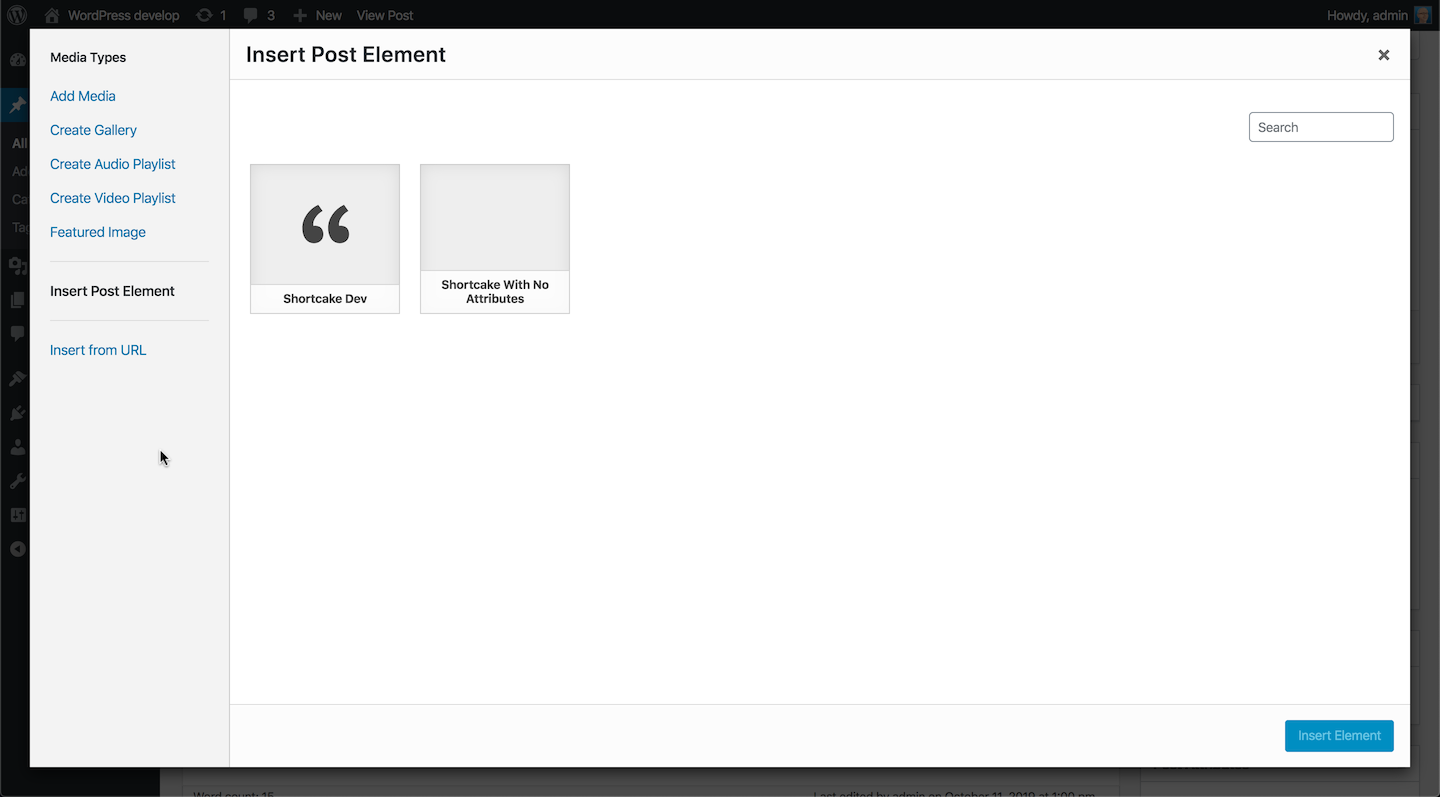
The "add" one adds an "Insert Post Element" menu item and content:
This is definitely not only "media". It's used to insert also shortcodes, or a Facebook post, or a Pullquote etc.. To me, it doesn't seem appropriate and contributes to a bad user experience in my opinion. Regardless, I still agree the toggle menu button and the heading need a better text.
Aside: the ARIA tabs pattern works correctly also with the "Insert Post Element" menu item.
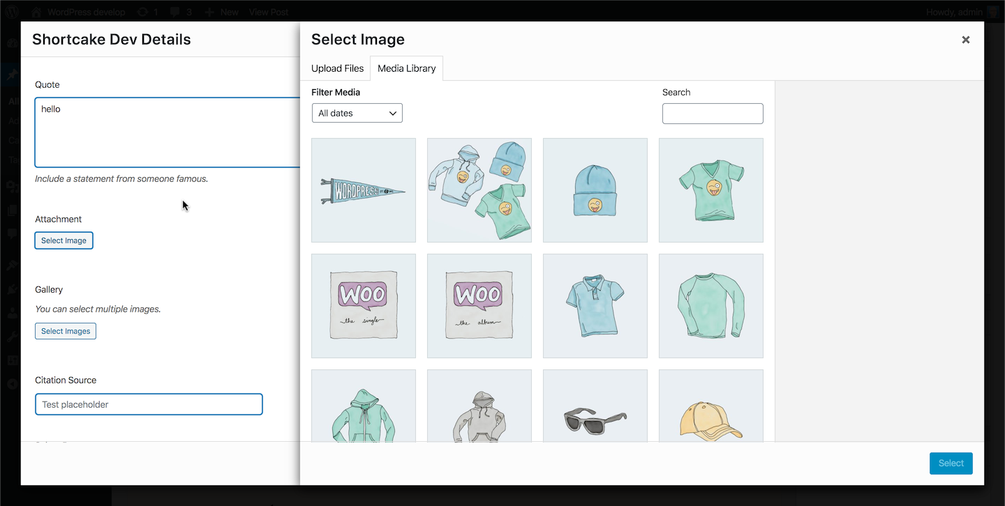
In the "edit details" frame it's interesting how Shortcake allows to open an additional modal from the main modal (see screenshot where I shifted one of the modals to reveal the underlying one). Not sure this is good UI and UX:
Notice on the left the inputs and buttons with the new styles look OK.
It is important to note that in the "edit details" frame the heading, toggle button, and menu are hidden with display: none thus they're not a problem. This is because the ARIA tabs implementation and the heading take into consideration the hide-menu state of the frame view.
Lastly, Shortcake uses select2 to replace native <select> elements. The new CSS conflicts a bit with the select2 one and there's a minor visual glitch but select2 is still functional and can be used without any breakage. The minor CSS glitch should be addressed on the Shortcake side.
Worth also noting that it doesn't seem to me Shortcake is so actively maintained. For example, when typing into the "Select Page" field the popup placement is wrong: the instructions popup and the suggestions popup appear completely out of place, also on WordPress 5.2:
Screenshot from WordPress 5.2:
Overall, I don't see serious breakages in Shortcake produced by the admin CSS changes.
Re: improving the button and heading wording: I'll take the responsibility to prepare two patches: on this ticket and on #47610.
#70
 @
@
3 weeks ago
- Keywords i18n-change added
47149.8.diff changes the text of the toggle button that appears in the mobile view from "Media Types" to "Menu". This button does only one thing: it opens and closes the menu so the text needs to communicate what the button action is. I'm avoiding to use the verb "toggle" because of #34753.
See screenshot below.

This ticket was mentioned in Slack in #accessibility by afercia. View the logs.
3 weeks ago
#72
in reply to:
↑ 68
 @
@
3 weeks ago
Replying to afercia:
Being a bug, it can be committed at any time during beta.
I agree, part of the code committed here is to fix a bug that is clearly described in the ticket description. But later another (larger) part was added which is an enhancement.
Adding enhancements to "bug fix" tickets just to be able to commit them during beta is not good :(
From pure "coding" point of view the facts are that these additional changes were added far too late in the development cycle and there is not enough time to properly test them and ensure they do not bring regressions.
#73
 @
@
3 weeks ago
Sure. I'd just like to note again that a functional patch was ready on 09/18/2019, which is almost one month ago and 5 days before beta 1. I could have committed that patch on the same day because it solved the accessibility bug and was acceptable from a design perspective.
For respect of other teams I asked for design feedback. They asked for some CSS changes. To me, they were not strictly necessary. At this point I'd think it's very important for the future to discuss how to improve the cross-teams collaboration process in order to avoid important bug fixes and improvements are de facto blocked by other teams.
#74
 @
@
3 weeks ago
P.S. can I commit 47149.8.diff which only updates one string?
#75
 @
@
3 weeks ago
@afercia 47149.8.diff looks good to me. I'm only wondering about adding contextualisation/translator comments or not.
#76
follow-up:
↓ 80
 @
@
3 weeks ago
I agree with the text changes in these two tickets. (I was planning to post this and the images on the other.)
"Actions" makes more sense than "Media Types" for that heading (especially on the Audio and Video screens), and "Selected media actions" makes sense in place of "Available actions" (plus "Menu" would be better for the current "Media Types" button in ticket #47610). Though there may be a more appropriate text string, I struggle to think of one.
@azaozz If I understand your complaint correctly that you mainly do not want that specific heading to be visible in this release, we could edit the text strings and use the "screen-reader-text" class (for now) to improve the experience for assistive technology users. Then we could revisit whether/how the Actions heading should appear in a future release.
(I don't like how much the heading looks like the current tab button text, but I prefer it to all-uppercase text and I would prefer visible headings in general.)
And yes, adding context for translators would be helpful :)
#77
 @
@
3 weeks ago
I don't like how much the heading looks like the current tab button text,
I'd agree the styling could make the heading less prominent :) Normal font weight and the default font size used within the media modal could help. The current styling just implements the design feedback provided on #47610. I guess it's a bit late for one more round of design feedback, screenshots, etc. but I wouldn't be opposed to try it.
#78
 @
@
3 weeks ago
47149.9.diff adds translation context.
#80
in reply to:
↑ 76
 @
@
3 weeks ago
Replying to sabernhardt:
@azaozz If I understand your complaint correctly that you mainly do not want that specific heading to be visible in this release...
Yes, the word "Actions" doesn't seems to improve anything in that context.
Also, why the "double" heading, could be confusing? And why the "main" heading is less important (smaller) than the menu sub-section heading?
#81
 @
@
3 weeks ago
If I'm not wrong, "Add Audio" is used by the Audio widget modal and it's a button, not a heading.
Re: the styling, please ask the design team :)
If it was up to me, I'd make that heading use a normal font weight to make it less prominent. Maybe also a smaller font size. Same for the filters heading.
 @
@
3 weeks ago
If this UI was made with HTML, those would be headings and they're less prominent than the items
#83
 @
@
3 weeks ago
While I don't love the all-caps and would like to see us change them all in the long-run, for now using that particular h2 styling would match the other sidebar h2s, and the lighter color helps de-emphasize it.
#84
 @
@
3 weeks ago
@melchoyce thank you, but as mentioned in the tickets for the headings (this one is about the ARIA tabs), all-apps should be avoided as it a) doesn't help readability b) screen readers may announce it as an abbreviation, speaking out letter by letter.
https://core.trac.wordpress.org/ticket/47610#comment:23
All uppercase should generally be avoided and this is a good opportunity to change it.
#85
 @
@
3 weeks ago
b) screen readers may announce it as an abbreviation, speaking out letter by letter.
Does that still happen when something is converted to caps using CSS?
#86
 @
@
3 weeks ago
Does that still happen when something is converted to caps using CSS?
Yes (weird, I know).
#88
 @
@
3 weeks ago
Yep, bit annoying.
Worth also reminding the conversation on this Gutenberg issue, where the consensus is to start using sentence case and then iterate / propagate in core: https://github.com/WordPress/gutenberg/issues/16764
#89
 @
@
3 weeks ago
@afercia RC1 is set to be packaged in a few hours as soon as a few more blockers are cleared up.
Can you please briefly summarize the status? Is there anything else required for this ticket? If not, can this be closed out in favor of follow up tickets?
@azaozz Do you consider an answer to your question a blocker for RC?
#90
 @
@
3 weeks ago
@desrosj thank you for the reminder. I'm very well aware of the deadline :) From a functional perspective, this ticket is complete and can be closed.
On the latest comments, some concerns were expressed about the "prominence" of the new heading in the left sidebar. Happy to implement any design feedback to make it less prominent. Some feedback from the design team would be appreciated, otherwise I guess we can iterate in the next release cycle.
If I can suggest a possible option:
- not sure why the active items in the left sidebar are black in the first place
- interactive elements in WordPress are blue, that's a well established convention
- I'd like to propose to keep the active item blue (and bold)
- Unbold the new headings
This way, the heading would be less prominent. See attached screenshot.
#91
 @
@
3 weeks ago
47149.10.diff implements the above suggestions. Please just let me know if there's any objection to commit. Thanks.


Comment from the GitHub issue: https://github.com/WordPress/gutenberg/issues/15287#issuecomment-488441147