#42022 closed defect (bug) (fixed)
Customize: Fix date time control defects
| Reported by: |
|
Owned by: |
|
|---|---|---|---|
| Milestone: | 4.9 | Priority: | normal |
| Severity: | normal | Version: | 4.9 |
| Component: | Customize | Keywords: | has-patch |
| Focuses: | ui | Cc: | |
| PR Number: |
Description (last modified by )
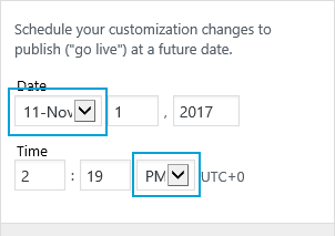
See attached image. “Day” should be replaced with “Date”.
Located in "Customize" —> click the cog next to "Publish" —> click "Schedule"
- The control should be able to be re-used for multiple settings (currently it can't).
- Changes to the setting should sync into the control.
- The
defaultValueparam should be replaced with using the value that is provided to the setting when instantiating (see #37964). - The time portion the control should be able to be optional.
- The
maxlengthis not appropriate fornumberinputs. - “form elements label are not explicitly associated with for/id attributes as required by the accessibility standard for any new code in core.” (via @afercia)
- “the preview link contains a few error that are easily catchable just validating the HTML, most notably: a label element can contain just one labelable element” (via @afercia)
- “In the template, there are a couple inputs with attributes with a double quote at the end” (via @afercia)
Attachments (13)
Change History (41)
#3
 @
@
2 years ago
- Description modified (diff)
- Keywords good-first-bug removed
- Owner set to westonruter
- Status changed from new to accepted
- Summary changed from Customizer: Change "day" to "date" in scheduling to Customize: Fix date time control label
- Type changed from enhancement to defect (bug)
#4
 @
@
2 years ago
- Summary changed from Customize: Fix date time control label to Customize: Fix date time control defects

This ticket was mentioned in Slack in #core-customize by westonruter. View the logs.
2 years ago
#7
 @
@
2 years ago
Thanks for the PR. I see at the moment it doesn't address the main issue:
“form elements label are not explicitly associated with for/id attributes as required by the accessibility standard for any new code in core.”
This is a requirement of the current WordPress coding standards and should be implemented.
42022.diff far from being a real patch, serves the purpose to highlight what needs to be done.
If fixes also a few missing labels (also in other places in the Customizer) and avoids to print out empty labels. Again, please remember that any form input needs to be labeled.
Todo: find a better label text for AM / PM
<label for="date-time-ampm" class="screen-reader-text">AM / PM</label>
since it is visually hidden, it can be expanded with some more meaningful text.
There are many other pending a11y issues in the Customizer and I'm a bit surprised that, after so many recent improvements, very basic things like valid and semantic HTML are so overlooked. I haven't seen so much progress in this regard, and I'd really like to see more focus on producing at least valid HTML. Hopefully, semantic HTML.
Some examples of how the Customizer controls generate always a <label> element even when they're not meant to contain form controls...
<label for="custom_logo-button">
	<span class="customize-control-title">Logo</span>
	<div class="customize-control-notifications-container"></div>
</label>
<label for="site_icon-button">
	<span class="customize-control-title">Site Icon</span>
	<span class="description customize-control-description">The Site Icon is used as a browser and app icon for your site. Icons must be square, and at least <strong>512</strong> pixels wide and tall.</span>
</label>
<label for="header_image-button">
	<span class="customize-control-title">Current header</span>
</label>
<label for="background_image-button">
	<span class="customize-control-title">Background Image</span>
</label>
This kind of HTML is, honestly, something that WordPress shouldn't, ever, output, for any reason.
Software that read the HTML to assist users in using WordPress, have big troubles when trying to report so poor HTML to users. The information conveyed is just wrong and our communication to our users just fails.
Aside:
- colors like
redshouldn't be used. WordPress has an official color palette and only colors from the palette should be used - please avoid using named colors e.g.
white, this makes very difficult looking for occurrences of colors through the codebase - please avoid docblocks used as inline comments, for example this:
/**
 * Find all invalid setting less controls with notification type error.
 */
is just an inline comment but wrongly uses the double asterisk.
#8
 @
@
2 years ago
Note: not sure if the preview link input field should be labeled... to my understanding, it is used just to copy the link to the clipboard. If so, we should evaluate a way to make it completely invisible to assistive technologies.
#9
 @
@
2 years ago
@afercia Thanks, I've merged your patch into the PR and tried to resolve conflicts: commit.
Other changes are:
- Restore control title
- Let each control instance's IDs be unique/random
- Use Meridian instead of AM / PM
See PR for all changes: https://github.com/xwp/wordpress-develop/pull/266
#10
 @
@
2 years ago
@sayedwp Here's a plugin that I've been using for testing the control: https://gist.github.com/westonruter/ca1a77f9309af4ab258573cee5ed9d30
Some additional thoughts:
We could eliminate the defaultValue entirely if we instead instantiate the control in JS and pass in the wp.customize.state( 'selectedChangesetDate' ) as the setting once we have #37964 implemented. The control then could be registered entirely in JS and not in PHP at all, and that would avoid us having to create a settingless control to then later link it with another Value.
In the same way, with #30738 we could also add the changeset status control with JS and have it linked to the selectedChangesetStatus value, instead of having to create a secondary Value to sync with. We may want to make an array of all of the allowed statuses for changesets, in addition to their saved/unsaved labels. Eventually I could see this as being something plugins would want to be able to filter, and it would be cleaner than having the choices for the status in one place and the translation labels in another place.
#11
 @
@
2 years ago
Is the value test really needed in the preview link input field?
<input readonly class="preview-control-element" data-component="input" value="test" >
#12
follow-up:
↓ 14
 @
@
2 years ago
When clicking the preview link, it opens in a new tab but there's no indication it is going to open a new tab. All links that use target="_blank" or a like in this case a named browsing context keyword:
target="06abf282-e641-4862-bf60-121cac815ffe"
ned to inform users a new browser tab will be opened. The standard text for this currently used in core is:
__( '(opens in a new window)' )
not sure if in this case it needs also a rel="noopener noreferrer" attribute, see for example #36809 and #37941.

This ticket was mentioned in Slack in #core-customize by westonruter. View the logs.
2 years ago
#14
in reply to:
↑ 12
 @
@
2 years ago
Replying to afercia:
not sure if in this case it needs also a
rel="noopener noreferrer"attribute, see for example #36809 and #37941.
Good question, but I do not think so. What is seen here is the same as the post preview link in the edit post screen which outputs HTML like:
<a href="http://src.wordpress-develop.dev/?p=1080&preview=true" target="wp-preview-1080">
#16
follow-up:
↓ 17
 @
@
2 years ago
@westonruter noticed add_control( new WP_Customize_Date_Time_Control ... doesn't pass a label to the template, any reason to keep it in the template?
<span class="customize-control-title">
	{{ data.label }}
</span>
Maybe in case it gets reused/extended?
The labels for
custom_logo-button
site_icon-button
header_image-button
background_image-button
are still not correct, maybe this should be handled in #33085 ?
Lastly: on IE 11 and Edge, some fields need a slightly bigger width (different system font, takes more space). Maybe should be tested also on Linux? (at least one distro?)
#17
in reply to:
↑ 16
 @
@
2 years ago
Replying to afercia:
@westonruter noticed
add_control( new WP_Customize_Date_Time_Control ...doesn't pass a label to the template, any reason to keep it in the template? Maybe in case it gets reused/extended?
Yes, that is why it should be kept. See this example plugin which can then make use of it: https://gist.github.com/westonruter/ca1a77f9309af4ab258573cee5ed9d30
The labels for
custom_logo-button
site_icon-button
header_image-button
background_image-button
are still not correct, maybe this should be handled in #33085 ?
Yes, let's handle them there. That's the more appropriate place.
Lastly: on IE 11 and Edge, some fields need a slightly bigger width (different system font, takes more space). Maybe should be tested also on Linux? (at least one distro?)
Good catch. I think the problem here is also that these select dropdowns should have an auto width and not a fixed width, as they can be translated after all. I've fixed that in 3bd6bf3. Look good?
#19
 @
@
2 years ago
@afercia I just noticed a style regression in the nav menu name field after r41670. Compare two previous screenshots.
#21
 @
@
2 years ago
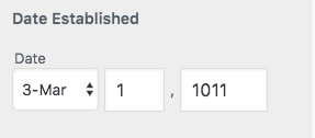
Note the "Date" is now a fieldset legend, and it identifies all the 3 date fields. It shouldn't be removed. Mayeb consider to remove the bold "Date Established" instead.
#22
 @
@
2 years ago
@afercia the “Date Established” is the label of the field. I think that the “Date” above the month should get screen-reader-text applied to it if not include_time. Thoughts?
#23
 @
@
2 years ago
- Resolution fixed deleted
- Status changed from closed to reopened
Seems like there is too much extra padding between the label and the fields still in hide-date-when-time-not-included.png
#24
 @
@
2 years ago
@westonruter
the “Date Established” is the label of the field.
Maybe in Customizer terms is a "label", not an HTML <label> and if it's rendered as a <label> it shouldn't. A <label> is associated to one form field, not 3. That should be just text or the fieldset legend.
#25
 @
@
2 years ago
@afercia That's right. In the Customizer API, a control has a label property which normally gets rendered as a <label>. But in the case of this control which has compound inputs, there isn't one input to link the label to, so a <span class="customize-control-title"> is used instead. For Customizer controls, the label is really just a synonym for title.


WIP pull request: https://github.com/xwp/wordpress-develop/pull/266