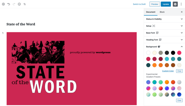
During the State of the Word at WordCamp US 2019, Matt Mullenweg shared that Gutenberg was used to create his slides and the presentation was powered by the Slides plugin. Using WordPress to power a slide deck isn’t an obvious choice, so we wanted to showcase the process and give some tips for making slide layouts using Gutenberg.
This post is co-written by Ella and Tammie, who (along with Mel, Mark, Enrique, Q and a cast of supporters) helped create this year’s State of the Word slide deck.
How it Started
Ella Van Durpe was selected to speak at JSConf and ReactEurope and wanted slides for her presentation.
In the past, she’d used Reveal.js to create slides and enjoyed the freedom to create anything using HTML, CSS and JavaScript. These languages were comfortable, familiar, and also can be published on the web in their native format.
For these new presentations, she wanted to use Reveal.js again but didn’t feel like writing all the HTML by hand. Creating blocks of content visually, without having to actually write any code, which can be published natively to the web, is exactly what Gutenberg was built for.
The plugin was prototyped quickly, with hardcoded styles on the slides and zero options. At the end of each presentation, Ella shared a brief demo of the Gutenberg-based slides and the audience was amazed.
As WordCamp US approached, Ella suggested that her plugin be used for State of the Word. Since it was such a hit with her audience members, it seemed like this would be a great chance to share it with the WordPress community as a whole.
How it Works
Technical information
The plugin registers a custom post type called “presentation” and a new “slide” block. The slide block is a sort of enhanced “Group” block, which is restricted to the root of the post, but you can put any other block inside it. As a result, you have a post filled with only slides at the root and slides filled with content. This maps perfectly to the Reveal.js markup, which requires content in HTML section elements.
Since these slides each have their own design, the theme styles are disabled and styling is set from each slide. A custom presentation template is provided by the plugin to render the custom post on the front-end.
Then Ella added options to style the slides. For example, she added options to control the slide background and font, at both the document level and individual slide level. She also added Reveal.js options, which allow you to change the transition style and speed. Lastly, she added a custom CSS field to allow style overwrites.
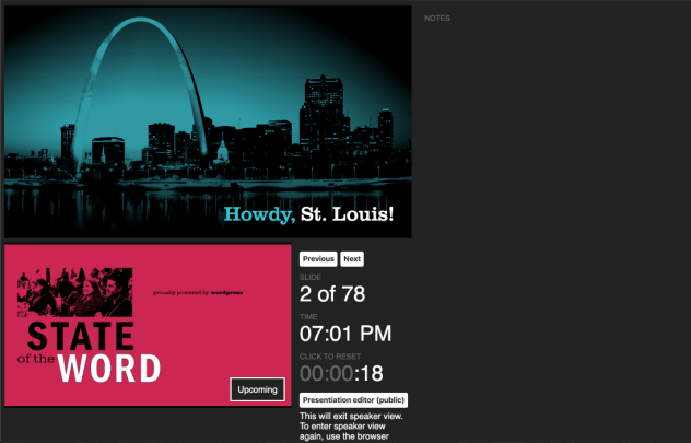
For the State of the Word, she also added speaker notes and a speaker view.

How it’s Designed

The inspiration for the slide designs came from Blue Note album covers (which were also the inspiration for the 2011 State of the Word slides). These album covers inspired the recent “About” page in WordPress core and the starter content for the new Twenty Twenty theme. This style consists of strong, geometric shapes and simple forms with clean lines. Photography and bold typography are at the heart of this look.

Various color palettes and font pairings were explored before selecting the best combination for the presentation.

A strong photographic element was needed for the slides. Past WordCamps are a great source of photos, so we dug through years of photo galleries to find just the right shots. With colors, fonts, and photos, we laid the foundation to build the deck.
Tips for Making Gutenberg Slides
Tip One: columns are your friends
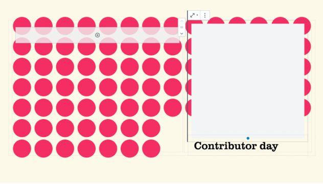
If you want slides with a precise layout, use columns. As you can see here, we used a 3 column layout to center content within a slide:

Tip Two: spacer blocks are useful
Want to really unlock the power of columns? Combine them with the spacer block! We used spacer blocks to position content over background images, like in this slide:

Tip Three: test on large screens
It’s important to preview and test your slides as you go. Make sure to design for the size and aspect ratio of the projector you’ll be using and do a visual check in presentation mode from time to time.

Tip Four: check your videos
A good demo video is integral to showcase new features. Joen Asmussen has a great post on creating effective demo videos.
Lessons learned
I’d love to make the art directed compositions easier to create.
Mel Choyce-Dwan
As Gutenberg evolves, one big improvement is that art direction will get easier. Even with the improvements this year, creating some layouts in Gutenberg was trickier than expected. For the more complicated compositions, we relied on SVGs. Eventually, the need for hacks will dissolve away, and a new world of exciting possibilities will open for everyone.
Browsers offered one of our biggest learnings in this presentation, more than they would if you use Keynote or Powerpoint, for example (tools most of us have used). Often, we found that what we created in the editor varied a when viewed full-screen. We were able to mitigate this by updating the plugin to use a fixed size, instead of using the entire browser window.
Wrapping it up
If you would like to check out the State of the Word, you can watch the video and read all about it in a post.
The Slides plugin is not only available on the plugin repo, but you can also get the code from GitHub and help translate.