#42215 closed defect (bug) (fixed)
Some minor UI issues in theme's panel in small screen
| Reported by: |
|
Owned by: |
|
|---|---|---|---|
| Milestone: | 4.9 | Priority: | normal |
| Severity: | normal | Version: | 4.9 |
| Component: | Customize | Keywords: | has-patch |
| Focuses: | ui | Cc: |
Description
1. "Filter Themes" button goes down in small screen.
2. "Preview and Install" button is not vertically aligned with the same space on top and bottom in small screen.
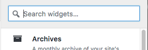
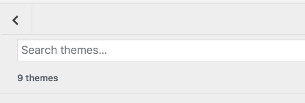
3. This is more of a suggestion that the search should match the widget search style.
So this should have an icon
like this
4. The navigation arrow not vertically aligned in small screen
Attachments (4)
Change History (16)
#1
 @
@
2 years ago
- Keywords needs-patch added
- Milestone changed from Awaiting Review to 4.9
- Owner set to celloexpressions
- Status changed from new to assigned
#3
 @
@
2 years ago
This is looking really good @Mahvash Fatima, thanks for adding your patches.
I noticed some things that still needs to be tweaked:
- The background behind the "live preview" button on smaller screens. When the buttons become larger at one of the small screen media queries, the background behind them pushes up into the border: https://cloudup.com/c2_cwJab15E
- There also seems to be a period where the border on the sidebar disappears, along with the "help" icon and toggles: https://cloudup.com/iMEku6VEKJ2
@celloexpressions would you also be able to give this patch a review?
#4
 @
@
2 years ago
42215.1.diff and 42215.diff look like a good first pass. I think we need to refine the adjustments a bit more - the buttons still look a couple of pixels too low or high in some places.
The background behind the "live preview" button on smaller screens. When the buttons become larger at one of the small screen media queries, the background behind them pushes up into the border: https://cloudup.com/c2_cwJab15E
We may also want to move the buttons below the theme names - it doesn't look like there's enough space there currently one you get down to phone sizes.
There also seems to be a period where the border on the sidebar disappears, along with the "help" icon and toggles: https://cloudup.com/iMEku6VEKJ2
It looks like there are conflicts (likely due to other changes) between 600px and 640px being the width breakpoint where we switch to a single-column layout with a toggle for the preview area. Themes are using 600px currently, which used to be what the customize sidebar used as well. That seems to have changed recently, causing this bug. However, the sidebar also has a max-width of 600px. So that other change should probably be reverted, or otherwise revisited, to ensure that the single-column layout is used starting at 600px everywhere.


I found one more issue in theme's panel on small screen. There is no padding on the right side in theme list. 42215.1.diff is to fix that.