Opened 3 years ago
Closed 23 months ago
#3046 closed task (fixed)
WordPress.org/about page outdated
| Reported by: |
|
Owned by: |
|
|---|---|---|---|
| Milestone: | Priority: | high | |
| Component: | General | Keywords: | neso ui-feedback ux-feedback |
| Cc: |
Description
The contributors in the sidebar of https://wordpress.org/about/ are outdated. The sidebar should be updated to reflect the current leadership team.
Attachments (1)
Change History (170)
#2
in reply to:
↑ description
 @
@
2 years ago
The content on that page in general could use an update. Also some more modern styling of that page overall couldn't hurt.
#4
 @
@
2 years ago
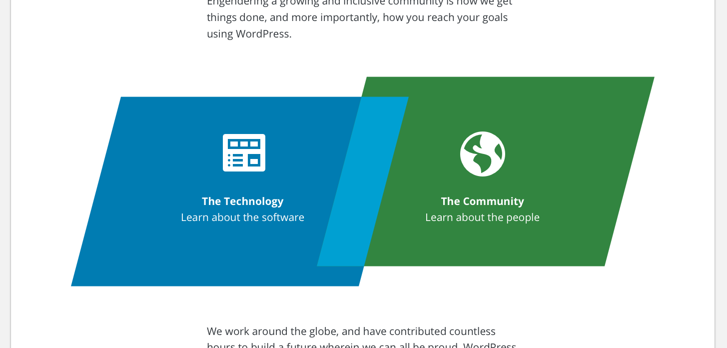
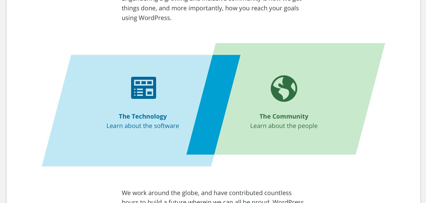
- Keywords neso added
- Priority changed from normal to high
If those new sites were added to the wporg-main theme first, it would make it easier to share them with Rosetta sites later (in case we decide to do that). It also wouldn't be terribly hard to convert those page templates into static files if needed.

This ticket was mentioned in Slack in #meta by obenland. View the logs.
2 years ago
#6
 @
@
2 years ago
- Keywords ui-feedback ux-feedback added
I've put together some thoughts and design work to run by everyone.
Information Architecture & Content
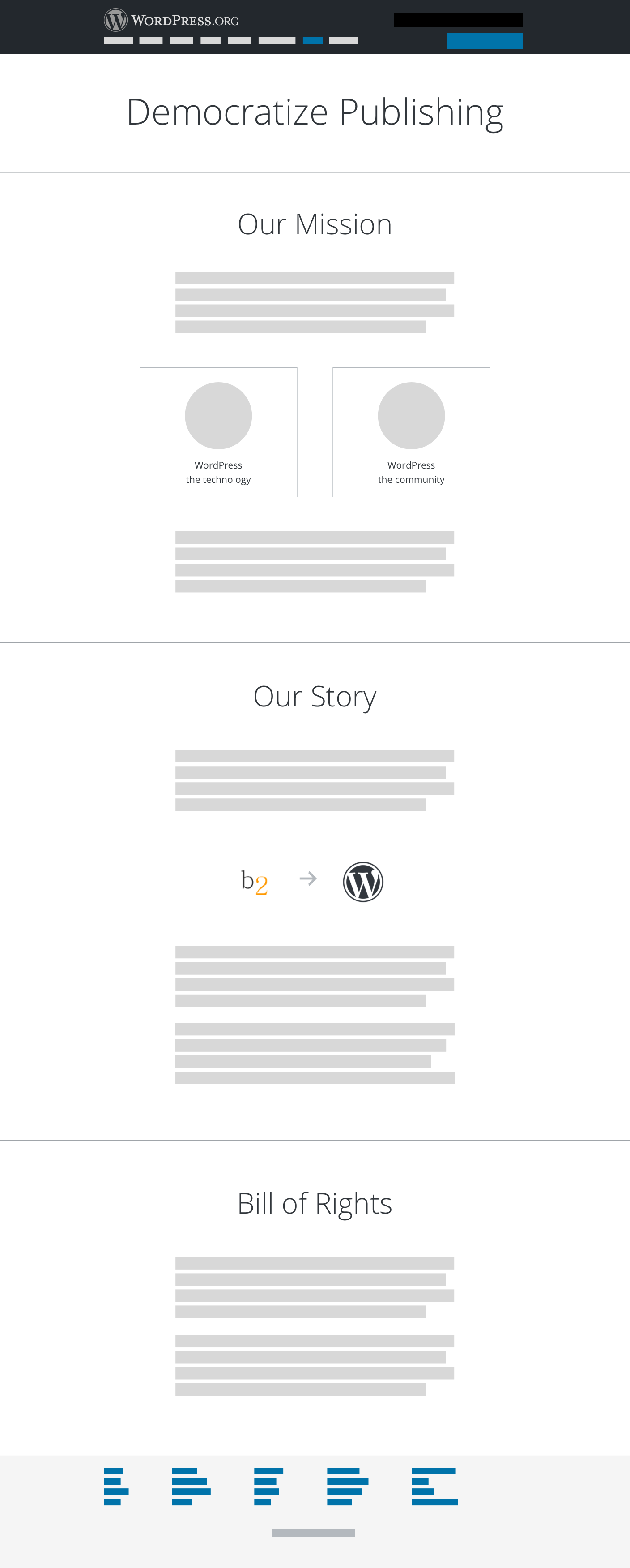
I wanted to organize the content in the whole About section, but that might be further out. So for now I envisioned the About page as a way to talk about both the technology AND the community. These two are what makes up the whole of WordPress. I propose 3 sections: Our Mission, Our Story, the Bill of Rights.
This page is geared to engage new people learning about WordPress, and strengthen the purpose of WordPress for those already active in the community. By splitting into two sections of Technology & Community, I hope to guide people into their sections of interest.
Our Mission - Talks about Democratizing Publishing.
Our Story - Talks about how we got here.
Bill of Rights - Talks about the 4 freedoms.
The two cards in the Our Mission section (ie. Technology & Community) will guide readers to:
- Technology -> Downloads page
- Community -> Get Involved page
Feedback
- Are these the right pieces of content to show on the About landingpage?
- I need help with the wording of "Technology" & "Community." I think "Community" works well, but I'm struggling with the correct wording for the software.
Wireframes
#7
follow-up:
↓ 16
 @
@
2 years ago
Moving forward into mockups.
Design thoughts
I wanted to stay inline with the current redesign efforts and styles, but I also want to introduce something a bit brighter to engage people emotionally. The content does much of that, but I've attempted to try some color variations and animations as well.
Colors
We have a base set of colors listed here: https://make.wordpress.org/design/handbook/design-guide/foundations/colors/
I thought about creating analogous colors off of each of the base colors for some brighter variety. These don't all have to be used, but I wanted to experiment here and see where it lead me.
Mockups
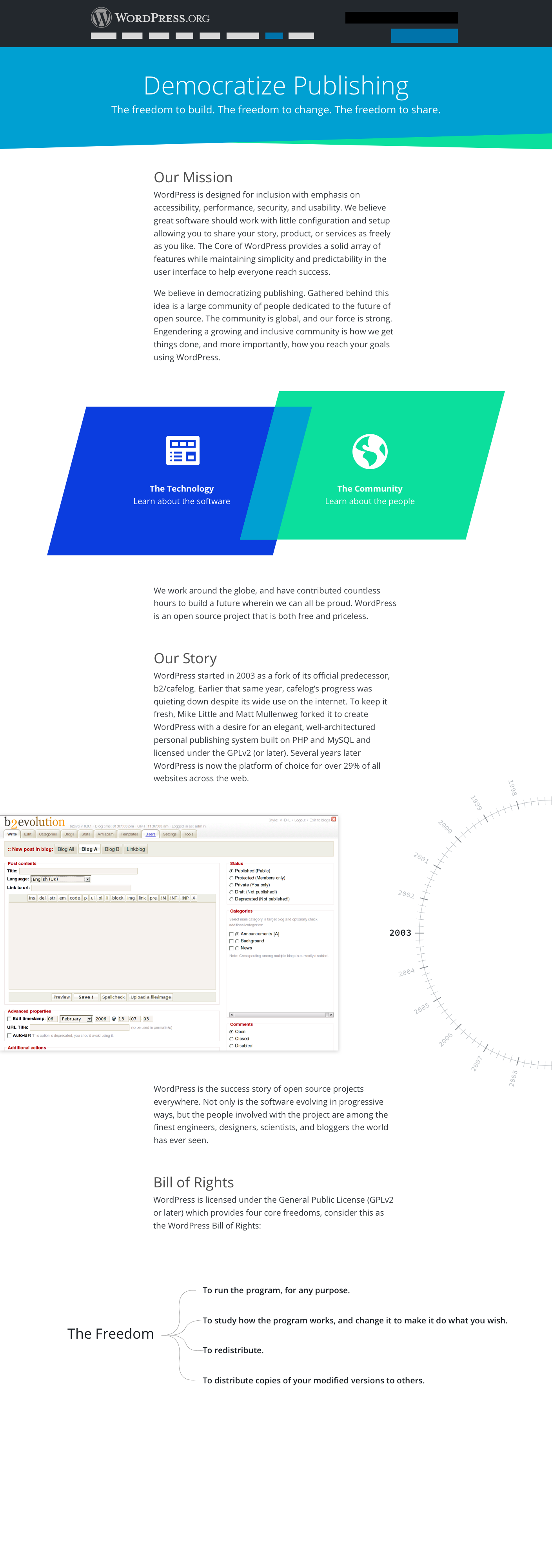
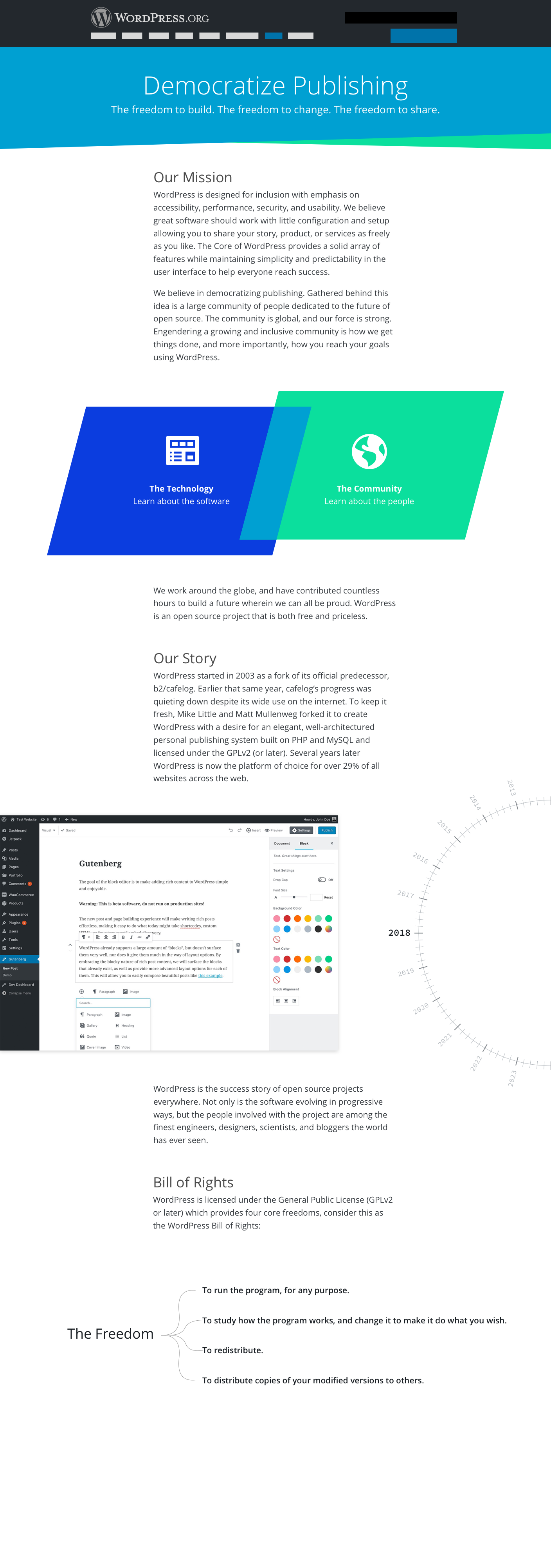
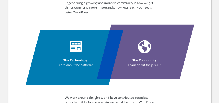
The mockups incorporate the analogous colors, add some geometric shapes, and play with animations. The shapes, in a way, was an effort for me to show two things (technology & community) overlapping, or integrating, to create one common thing. It's represented in the color and shapes.
- The header uses the lighter blue in our base color set, but adds some angles as well.
- The header also includes some text as a nod to the freedoms.
- Our Mission is a compilation of existing text and some new wording.
- The two skewed rectangles link off to their respective pages as mentioned in my earlier comment.
- Our Story includes both existing text and new text sharing some of the history.
- The screenshots of the Editor and the dial on the right side are animated on scroll. As the reader scrolls down the dial turns from 2003 to 2018. Each time the dial hits a new year, the screenshot of the Editor changes to show that year's editor. I think it's a fun way to show the history of WordPress and how far we've come. The last screenshot flip ends with Gutenberg in 2018.
- Finally the Bill of Rights, which I believe is hugely important, is displayed on the page in a way that is dynamic and interactive. On click of one of the freedoms, I was thinking, would then expand to show more links to pages that either talk about that, or something. It's an interactive tree on desktop, but static in mobile.
Feedback
- How do you feel about the colors and shapes?
- Do you have any edits for the content? Does the tone and voice feel right?
- Is anything missing that you think should be included on the About landingpage?
#8
follow-up:
↓ 23
 @
@
2 years ago
I like the shapes and most of the colors, though I think I'd prefer the header blue to be the same color as the rest of the page we redid recently, for consistency. Happy to experiment with shapes and a second color though.
I really like the idea of a dial, though we should make sure to have relevant screenshots for each year. We also need to keep in mind that that will be something that will need to be updated and maintained.
Would he hijack scroll to move the dial only when hovering over the dial, or similar to a parallax effect when scrolling the page?
What will The Technology and The Community pages look like?
#9
follow-up:
↓ 10
 @
@
2 years ago
First up, exciting to see this take shape.
I have a few thoughts on seeing this basing around the feedback you ask for:
- Colors: I'd be a little careful about how analogous we go as it can cause visual issues with a lot of people. I am sure we can balance.
- I think that light blue on header needs to go back a little to be readable, right now unless you have amazing vision that's a little light against the text.
- I'd note the same point above on 'community' and the green. We can be bright and legible.
- Do you have an example of that dial working somewhere? In seeing it on a flat mockup I am having some negative experience reactions. I would like to judge as close to an example as possible to be fair to it as a concept.
- I feel as the design goes towards the bottom the potency of it fades. Maybe revisit the freedoms section?
- Please can we not hijack any scrolling ever, even on dials. That's not a great experience for anyone. I am sure we can do better.
#10
in reply to:
↑ 9
 @
@
2 years ago
Thanks for this feedback!
Replying to karmatosed:
- Colors: I'd be a little careful about how analogous we go as it can cause visual issues with a lot of people. I am sure we can balance.
I'd love to balance this more... any help is appreciated.
- I think that light blue on header needs to go back a little to be readable, right now unless you have amazing vision that's a little light against the text.
I totally agree. A11y needs to be adhered to. I need to double check the color contrast here.
- Do you have an example of that dial working somewhere? In seeing it on a flat mockup I am having some negative experience reactions. I would like to judge as close to an example as possible to be fair to it as a concept.
I don't have a prototype yet. I can try to get one soon.
- I feel as the design goes towards the bottom the potency of it fades. Maybe revisit the freedoms section?
I've tried several variations of the freedoms section. I can post those for comparisons.
- Please can we not hijack any scrolling ever, even on dials. That's not a great experience for anyone. I am sure we can do better.
I'm totally against scrolljacking. My proposed animation doesn't hijack any scrolling at all. We're safe there. Again, I can probably get a prototype up in the near future.
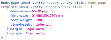
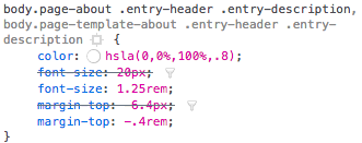
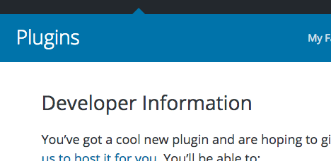
#11
follow-ups:
↓ 14
↓ 27
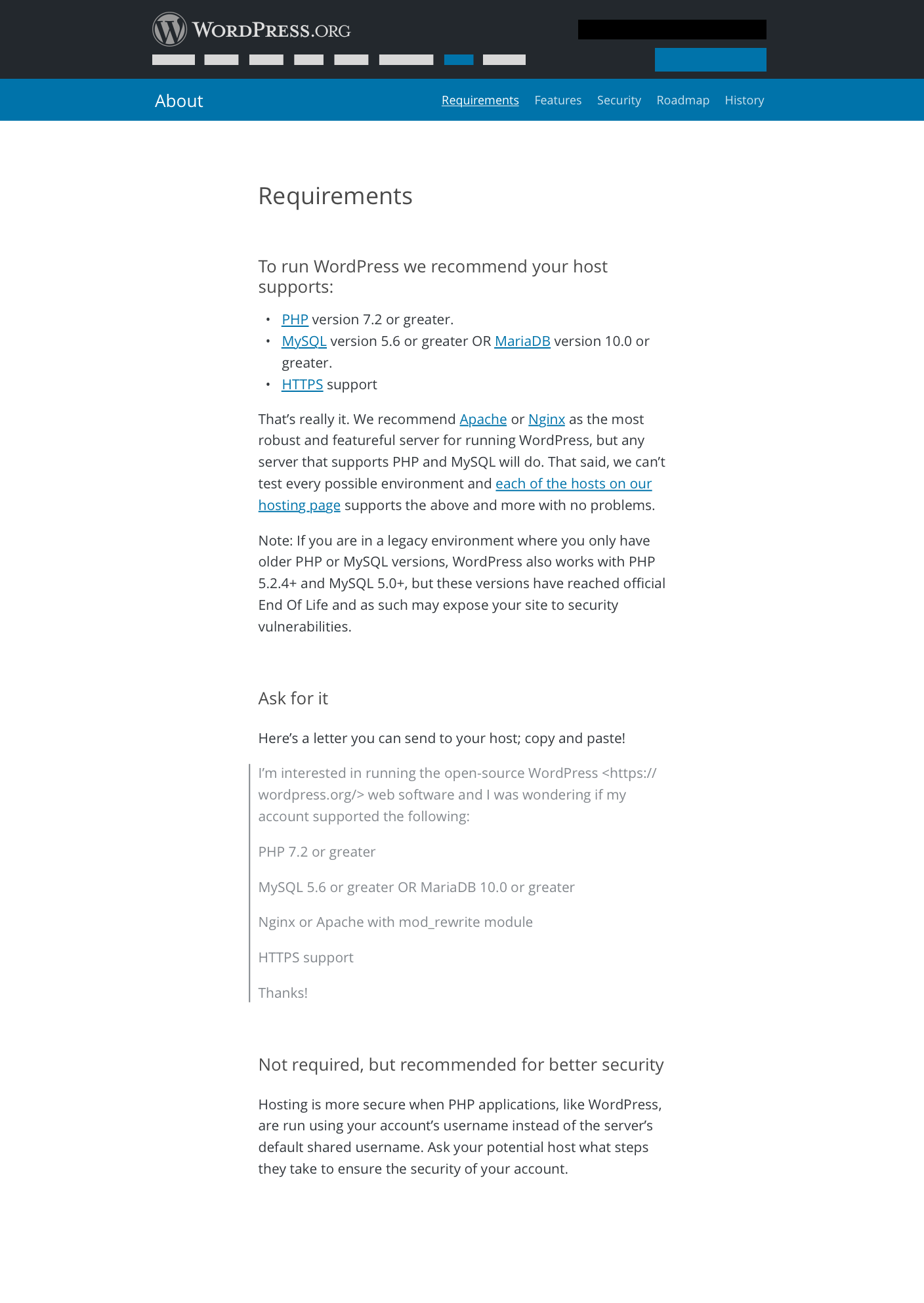
 @
@
2 years ago
Super fun. Excited to see where this goes.
The shapes are an interesting evolution on the brand, though a bit trendy at the moment. My only concern is it might look a little dated in a year.
FYI, have you seen the Accent Hues at the bottom of https://codepen.io/hugobaeta/full/RNOzoV/? They're also pretty bright, and work well with the blues. I think we should stick with those rather than making new colors, if we can.
#12
 @
@
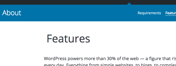
2 years ago
I'm totally against scrolljacking. My proposed animation doesn't hijack any scrolling at all. We're safe there. Again, I can probably get a prototype up in the near future.
Good to hear. Maybe over a prototype do you know of anything similar like in a CodePen or another design?
I've tried several variations of the freedoms section. I can post those for comparisons.
Yes, I would love to see those. There is a loss of the pace as it gets to that point.
#13
 @
@
2 years ago
FYI, have you seen the Accent Hues at the bottom of https://codepen.io/hugobaeta/full/RNOzoV/? They're also pretty bright, and work well with the blues. I think we should stick with those rather than making new colors, if we can.
I would +1 this as source of colors.
#14
in reply to:
↑ 11
 @
@
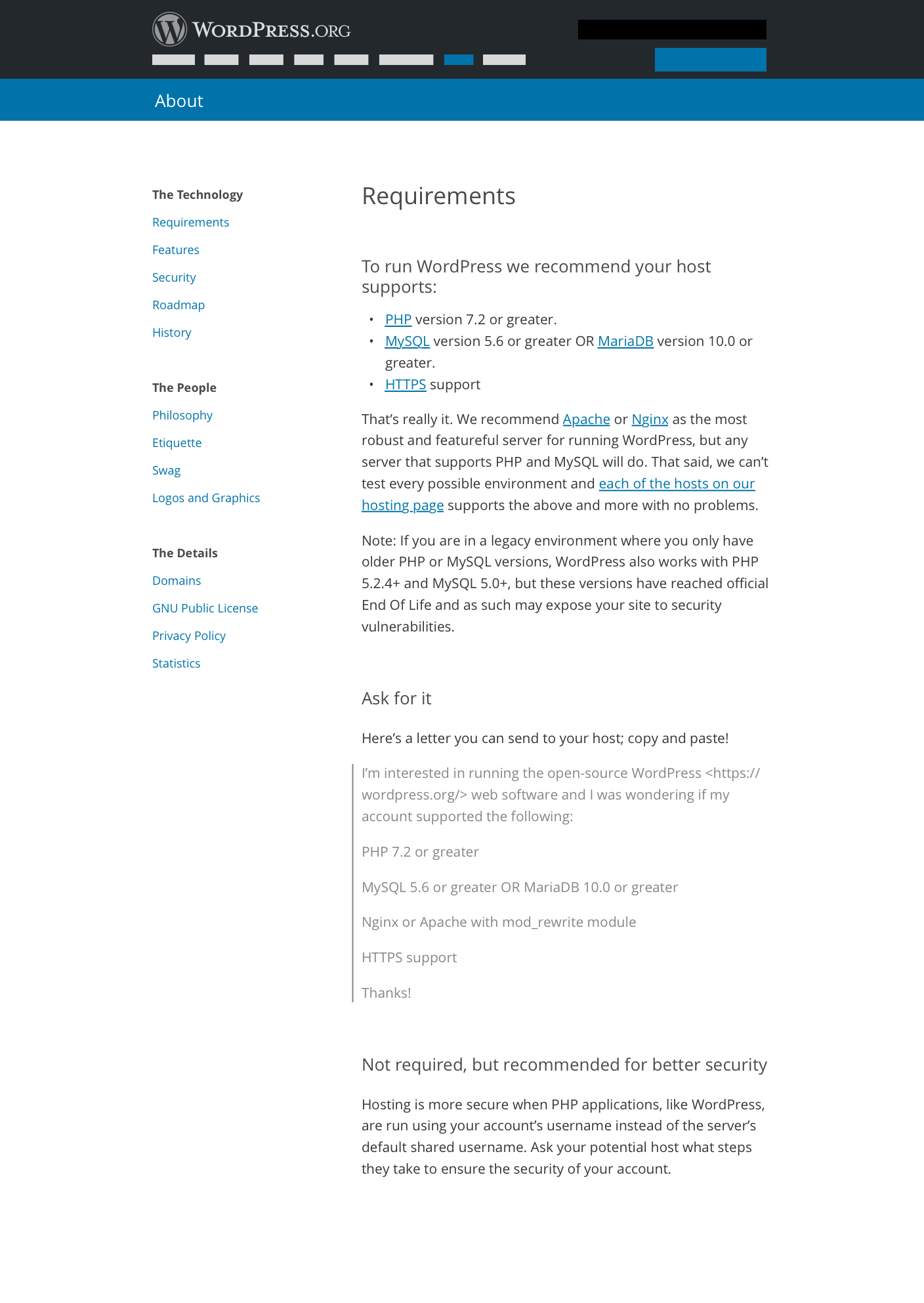
2 years ago
Thanks Mel!
Replying to melchoyce:
The shapes are an interesting evolution on the brand, though a bit trendy at the moment. My only concern is it might look a little dated in a year.
This is a good point. I thought about it as well and took a stab anyways. I figure anything that pushes the envelope or makes a hard design stand has more tendencies to become dated quicker. I could return to something less so?
FYI, have you seen the Accent Hues at the bottom of https://codepen.io/hugobaeta/full/RNOzoV/? They're also pretty bright, and work well with the blues. I think we should stick with those rather than making new colors, if we can.
I'll double check those colors. If we can find something bright in that palette, I'm all for it. And sticking with something pre-existing is a plus.
#15
follow-up:
↓ 18
 @
@
2 years ago
When I was reading your description of the animation and shapes overlapping, my mind saw them as the parts of the W in the logo. If they actually move to come together to form the W, that would look cool. As I read further, I thought the "technology" part could be the W and the "community" part is the circle around it, forming the logo.
#16
in reply to:
↑ 7
;
follow-up:
↓ 17
 @
@
2 years ago
Replying to mapk:
- Do you have any edits for the content? Does the tone and voice feel right?
I would like to take a second look at the copy for clarity, tone, and content.
- Is anything missing that you think should be included on the About landing page?
I think there might be a thought or two from the current page that would be good to include. A big question that I have is about where the current subnav will go.
#17
in reply to:
↑ 16
;
follow-up:
↓ 19
 @
@
2 years ago
Replying to chanthaboune:
Replying to mapk:
- Do you have any edits for the content? Does the tone and voice feel right?
I would like to take a second look at the copy for clarity, tone, and content.
Excellent, thanks!
- Is anything missing that you think should be included on the About landing page?
I think there might be a thought or two from the current page that would be good to include. A big question that I have is about where the current subnav will go.
Great question. Yes, this page was intended to be a landingpage that guided the reader into either the technology or the community side of things, in which case those sub-pages would have the smaller header and a subnav. If this isn't the case anymore, some thought should be done around which 'about' pages we can eliminate and which ones can be combined to help make the subnav more manageable. I'm happy to create a navigation system for this page to the others if needed.
#18
in reply to:
↑ 15
 @
@
2 years ago
Replying to joyously:
When I was reading your description of the animation and shapes overlapping, my mind saw them as the parts of the W in the logo. If they actually move to come together to form the W, that would look cool. As I read further, I thought the "technology" part could be the W and the "community" part is the circle around it, forming the logo.
Very creative! In the mockup the shapes are containers for content, so I'm not sure how that would ultimately work with the 'W', but the concept is interesting!
#19
in reply to:
↑ 17
;
follow-up:
↓ 20
 @
@
2 years ago
Replying to mapk:
Replying to chanthaboune:
Replying to mapk:
- Is anything missing that you think should be included on the About landing page?
I think there might be a thought or two from the current page that would be good to include. A big question that I have is about where the current subnav will go.
Great question. Yes, this page was intended to be a landingpage that guided the reader into either the technology or the community side of things, in which case those sub-pages would have the smaller header and a subnav. If this isn't the case anymore, some thought should be done around which 'about' pages we can eliminate and which ones can be combined to help make the subnav more manageable. I'm happy to create a navigation system for this page to the others if needed.
I agree that it looks like most of the pages can be split up into either Community or Technology — and additionally, this also seems like an opportune time to audit all the "About" content. It would be great if we can pull in some copywriters to help out with rewriting, reorganizing, and adding anything new.
#20
in reply to:
↑ 19
 @
@
2 years ago
I agree about a content audit in general (I think Mark did a high level one), but I think our current step is getting the About page to look a bit fresher.
Replying to melchoyce:
Replying to mapk:
Replying to chanthaboune:
Replying to mapk:
- Is anything missing that you think should be included on the About landing page?
I think there might be a thought or two from the current page that would be good to include. A big question that I have is about where the current subnav will go.
Great question. Yes, this page was intended to be a landingpage that guided the reader into either the technology or the community side of things, in which case those sub-pages would have the smaller header and a subnav. If this isn't the case anymore, some thought should be done around which 'about' pages we can eliminate and which ones can be combined to help make the subnav more manageable. I'm happy to create a navigation system for this page to the others if needed.
I agree that it looks like most of the pages can be split up into either Community or Technology — and additionally, this also seems like an opportune time to audit all the "About" content. It would be great if we can pull in some copywriters to help out with rewriting, reorganizing, and adding anything new.
#21
 @
@
2 years ago
I really like the architecture @mapk with Mission, Story, etc. presented in a clear and appealing way and everything else falling under the pillars of Technology or Community.
Those headings might benefit by losing the article "the" which feels repetitive and unnecessary.
The Technology: Learn about the software
The Community: Learn about the people
I also really like the use of angles in the mockup header design.

This ticket was mentioned in Slack in #design by mapk. View the logs.
2 years ago
#23
in reply to:
↑ 8
;
follow-up:
↓ 24
 @
@
2 years ago
Replying to obenland:
I like the shapes and most of the colors, though I think I'd prefer the header blue to be the same color as the rest of the page we redid recently, for consistency. Happy to experiment with shapes and a second color though.
It looks like this might happen since a11y isn't working here.
I really like the idea of a dial, though we should make sure to have relevant screenshots for each year. We also need to keep in mind that that will be something that will need to be updated and maintained.
Great point. I'd be happy to stay on top of this.
Would he hijack scroll to move the dial only when hovering over the dial, or similar to a parallax effect when scrolling the page?
No scroll jacking. I was trying to think this through as well. Do we first change the dial with the user's page scroll, but if the user clicks on the dial, they can override that and just change the dial as they please? Once they do this, there's no more scrolling with the page scroll until the page is reloaded. Yes? No?
What will The Technology and The Community pages look like?
As of right now, these will just by linking to existing pages.
Tech --> Downloads page
Community --> Get Involved
If we're not doing a lot with the subpages of this section, I need to figure out a way to get to those pages now. This will take more time.
#24
in reply to:
↑ 23
;
follow-up:
↓ 25
 @
@
2 years ago
Replying to mapk:
If we're not doing a lot with the subpages of this section, I need to figure out a way to get to those pages now. This will take more time.
@mapk Is this a blocker for starting work on the page as it stands?
#25
in reply to:
↑ 24
 @
@
2 years ago
Replying to chanthaboune:
Replying to mapk:
If we're not doing a lot with the subpages of this section, I need to figure out a way to get to those pages now. This will take more time.
@mapk Is this a blocker for starting work on the page as it stands?
Yes. I haven't explored an alternate option to solve this problem, and the solution may change a portion of the page layout.

This ticket was mentioned in Slack in #meta by netweb. View the logs.
2 years ago
#27
in reply to:
↑ 11
 @
@
2 years ago
Replying to melchoyce:
FYI, have you seen the Accent Hues at the bottom of https://codepen.io/hugobaeta/full/RNOzoV/? They're also pretty bright, and work well with the blues. I think we should stick with those rather than making new colors, if we can.
I explored some options from Hugo's color palette for wporg.
I first tried some darker blues and greens that are still a11y with white text. Using those colors, this was the closest I could get and still adhere to a11y color contrast guidelines.
I wasn't too happy with those colors, so I explored some lighter colors.
There's a definite lack of electricity or vibrancy here, but if we're sticking with these colors, I prefer the lighter palette in these instances.
Any other thoughts?
#28
follow-up:
↓ 29
 @
@
2 years ago
As much as I like order and adhering to rules, I think one should also know when to break them. I don't know how your original colors hold up against the darker blue of the header, but if that harmonizes I personally think it would be okay to think of these parallelograms as unique design elements and give them a unique color.
#29
in reply to:
↑ 28
 @
@
2 years ago
Replying to obenland:
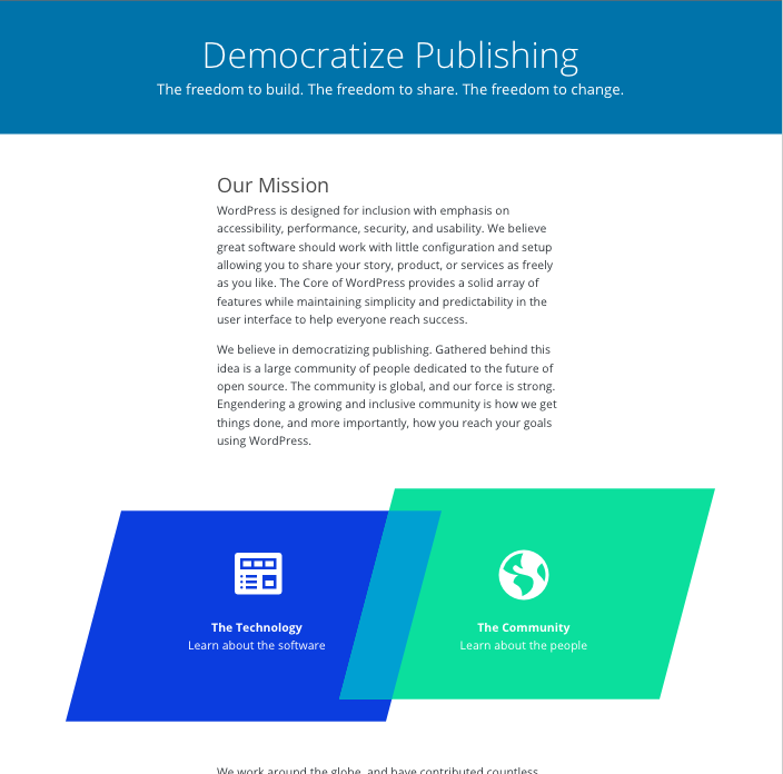
As much as I like order and adhering to rules, I think one should also know when to break them. I don't know how your original colors hold up against the darker blue of the header, but if that harmonizes I personally think it would be okay to think of these parallelograms as unique design elements and give them a unique color.
Here's an example of how that would look.
Unfortunately, the green here fails a11y. I need to revise that color.
#30
 @
@
2 years ago
With the header, maybe the lighter color palette might work? Is the contrast big enough on that?
#32
in reply to:
↑ 31
;
follow-up:
↓ 33
 @
@
2 years ago
Replying to melchoyce:
@mapk Would you mind if I tried out some color combos?
I would love some help! Thanks.
#35
follow-up:
↓ 36
 @
@
2 years ago
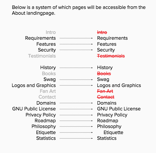
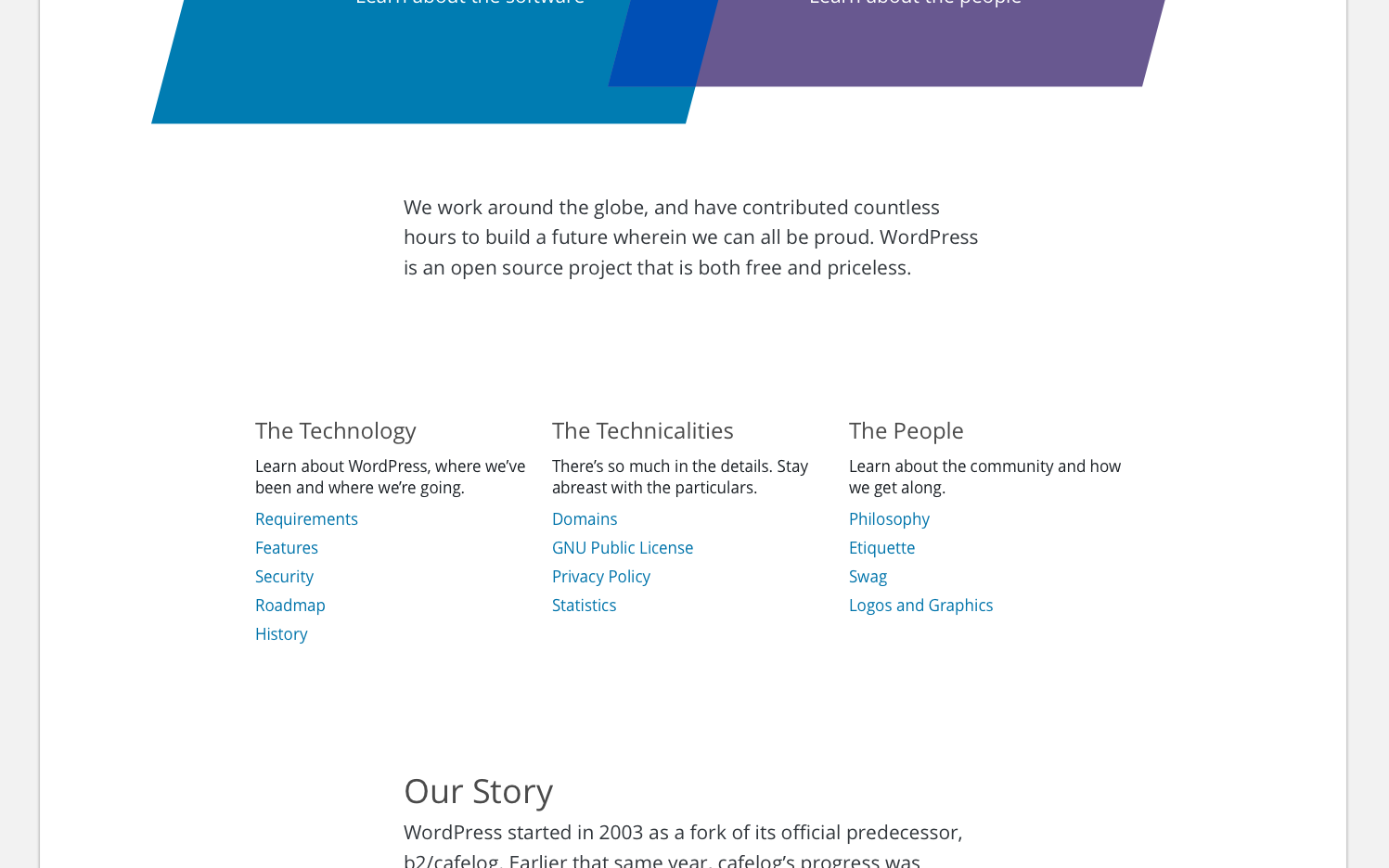
Without a restructure of the subpages, I needed to rethink how a subnav would be introduced on this page. Here's something I'm proposing, but I definitely need some feedback. I attempted to organize the links while removing some as well.
Feedback Request:
- Help with organization and copy of these links.
- I think there are too many links to work in a horizontal subnav, so I've worked them in similarly how they've been used on the other redesigned landingpages.
- Does their location on the page make sense?
@chanthaboune any thoughts?
#36
in reply to:
↑ 35
 @
@
2 years ago
Replying to mapk:
- Help with organization and copy of these links.
The organization of them looks right to me. I don't love "The Technicalities" which has a negative connotation. What about "The Details"
- I think there are too many links to work in a horizontal subnav, so I've worked them in similarly how they've been used on the other redesigned landingpages.
It's not great, but I think it is workable. Thanks for being flexible.
- Does their location on the page make sense?
Yes, it does.
@chanthaboune any thoughts?
I like the way you clearly identify the feedback you need. It makes it really easy to focus on what you're missing!

This ticket was mentioned in Slack in #meta by obenland. View the logs.
2 years ago
#39
 @
@
2 years ago
@mapk Font-sizes and margins would be good to know too, I forgot about asking for them yesterday
#40
 @
@
2 years ago
Here are the final mockups.
https://cloudup.com/cAz5HdRTR2x
- Blue header follows styles we've been implementing.
- Narrow width column of content follows the styling of this page: https://codepen.io/mapk/pen/rpKGZM We've used the narrow column before, and I thought it was implemented on the Plugin's developer page, but it isn't anymore.
- Colors: Standard Blue = # 0073AA | Purple = # 685890 | between shapes blue = # 004FB5
- Font sizes should be inline with the font sizes we've been using for the redesign stuff. Looks like 1.125rem.
- Illustrations are located here as well: https://cloudup.com/cAz5HdRTR2x
- We'll probably need to chat more about the timeline dial when development gets to it.
- Content (copy) is all updated, but may have changes in near future.
@obenland Please let me know if there is anything else.
#43
follow-up:
↓ 44
 @
@
2 years ago
@mapk I committed a first pass of the logos and graphics page. For the three color swatches at the bottom of the page, how should those be displayed?
My initial thought was to keep it within the same width as the surrounding text, to make it break away from how the logos are displayed. I experimented with the table look that the logos have but didn't like it at all. Any suggestions?
#44
in reply to:
↑ 43
;
follow-up:
↓ 45
 @
@
2 years ago
Replying to obenland:
@mapk I committed a first pass of the logos and graphics page. For the three color swatches at the bottom of the page, how should those be displayed?
My initial thought was to keep it within the same width as the surrounding text, to make it break away from how the logos are displayed. I experimented with the table look that the logos have but didn't like it at all. Any suggestions?
The content of this page is outdated — maybe this would be a good time to redirect it to https://make.wordpress.org/design/handbook/design-guide/ or copy content from the subpages in this section?
#45
in reply to:
↑ 44
 @
@
2 years ago
Replying to melchoyce:
The content of this page is outdated — maybe this would be a good time to redirect it to https://make.wordpress.org/design/handbook/design-guide/ or copy content from the subpages in this section?
I am in favor of updating it. Those two pages don't include the same information, though. The original is about identifying the fauxgo, and I don't see any content for that in the design guide (though I bet we need it!).
#46
 @
@
2 years ago
Good catch, the fauxgo stuff we should definitely keep.
The logo files, we should replace with the information from https://make.wordpress.org/design/handbook/design-guide/foundations/identity/.
I think we can turn the "colors" section into a "WordPress Style Guidelines" section, and link out to the colors, typography, and iconography pages in the handbook.
I don't really have an opinions on the wallpaper (other than they're kinda boring and outdated), but they should probably be at the end so they don't overshadow the official guidelines.
#47
 @
@
2 years ago
We should also revise https://wordpress.org/about/history/. It's referring to WP's tenth anniversary, which—for anyone who's not keeping count—was 5 years ago.
#48
 @
@
2 years ago
I agree that it should just redirect to the Handbook, and include a section in the Handbook about the fauxgo.
I was going to create a new ticket with all the updates for this particular page, but getting rid of this page and moving important info to the Handbook is a better idea.
#50
 @
@
2 years ago
I added the remaining subpages for y'all to see and approve/improve. They're all linked from https://test.wordpress.org/about/
/cc @mapk @melchoyce

This ticket was mentioned in Slack in #meta by obenland. View the logs.
2 years ago
#53
follow-up:
↓ 54
 @
@
2 years ago
Looks like the recent commits move away from custom content on standard pages like About or Requirements.
That seems good in terms of standardizing default content on Rosetta sites, but there should still be a way to add some custom content before or after default one, like a list of local team members (e.g. https://ru.wordpress.org/about/) or other locale-specific info.
This could technically be done in translation, however injecting additional markup there seems less than ideal and would cause warnings in GlotPress, so maybe there should be a the_content() call somewhere on the page.
#54
in reply to:
↑ 53
;
follow-up:
↓ 55
 @
@
2 years ago
Replying to SergeyBiryukov:
there should still be a way to add some custom content before or after default one, like a list of local team members
How about creating additional subpages to about for content like that? For example /about/team.
#57
 @
@
2 years ago
@mapk Do you have thoughts on 53?
I'd also identify https://meta.trac.wordpress.org/ticket/3372#comment:5 as a dependency. The graphics currently in the cloudup folder are not ideal.
#58
follow-up:
↓ 59
 @
@
2 years ago
How about creating additional subpages to about for content like that? For example
/about/team.
I like this. For locale related content, we could include links to subpages.
I'd also identify https://meta.trac.wordpress.org/ticket/3372#comment:5 as a dependency.
Thanks, I believe she has some SVGs that can be used?
#59
in reply to:
↑ 58
 @
@
2 years ago
Replying to mapk:
How about creating additional subpages to about for content like that? For example
/about/team.
I like this. For locale related content, we could include links to subpages.
In a separate column or part of existing ones?
#61
follow-up:
↓ 66
 @
@
2 years ago
Since the copy is now part of the page template we should make sure that we have proper tags for OG and Twitter. Something like this before the get_header() call:
<?php
add_filter( 'jetpack_open_graph_tags', function( $tags ) {
        $tags['og:title']            = _esc_html__( 'Democratize Publishing', 'wporg' );
        $tags['og:description']      = _esc_html__( 'WordPress is software designed for everyone with emphasis on accessibility, performance, security, and usability.', 'wporg' );
        $tags['twitter:text:title']  = $tags['og:title'];
        $tags['twitter:description'] = $tags['og:description'];
        return $tags;
} );
#63
 @
@
2 years ago
Still left to do here:
- Copy for each page's Open Graph title/description.
- Updated design for Logos and Graphics page.
- A place to link to non-templated About child pages.
- Create necessary pages on all Rosetta sites.
- Year dial.
#66
in reply to:
↑ 61
 @
@
2 years ago
Replying to ocean90:
Since the copy is now part of the page template we should make sure that we have proper tags for OG and Twitter.
I asked the Marketing Team for help on this.
#71
follow-ups:
↓ 72
↓ 73
 @
@
2 years ago
I disagree with only having the Logos page in the handbook. Those pages serve different audiences, with the main page being much easier to find by potential violators and by PR agencies / news outlets. If we're expecting those audiences to go from the homepage to About to Get Involved to Make WordPress Design to the Handbook to the specific page on logo guidelines, we've already lost. Having a page that's easily findable and accessible is important to preventing fauxgo and other violations in the future.
Redirecting doesn't solve that. Since we're moving it onto WordPress and into the meta repo, the page should be much easier to update going forward. If anything, I'd redirect the other way.
Other thoughts on the current setup on test.wordpress.org (I'm not sure how "complete" it is).
- In the Bill of Rights at the bottom of the page, it's worth linking to the GPL again. I know it's linked to as a subpage further up, but this is the relevant section, so a second link makes sense.
- Same with the Our Story section and History subpage.
- Early on, in Our Mission, we link off to the "freedoms that come with open source." After reading the page, I'd expect that to link to the graphics further down, since they are a great representation of those freedoms. Perhaps we can link down and link off from within that section instead?
- The subpage template is very narrow. Have you considered using the layout from the plugin directory? In most cases this doesn't matter because the pages are short, but the Security page (for example) is quite long and the narrow page width makes it harder to read (for me anyway).
- I noticed that different subpages use different header styles (or maybe just different header levels). Comparing Security with Philosophy, for example. Would be good to standardize there.
- It would be good if there was a way to get back "out" of a subpage. I'm sure there's future work planned to improve those pages (especially text!) but in the mean time, breadcrumbs would be helpful at the least.
#72
in reply to:
↑ 71
;
follow-up:
↓ 74
 @
@
2 years ago
I'll let @melchoyce and @mapk respond to the logos page question, though I'd be in support for keeping it as well.
The cross-references are useful I think, I'll take a look at that.
Replying to samuelsidler:
- I noticed that different subpages use different header styles (or maybe just different header levels). Comparing Security with Philosophy, for example. Would be good to standardize there.
Security is different from all others because it's a verbatim copy of the security whitepaper and its markup. Not sure if we're fine with that or if we want to change the header structure of the whitepaper.
- It would be good if there was a way to get back "out" of a subpage. I'm sure there's future work planned to improve those pages (especially text!) but in the mean time, breadcrumbs would be helpful at the least.
Yes, I've been thinking that too. Having "About" in the header navigation can mitigate that to a degree, but it still feels like you're trapped once you made your way down into one of those subpages.
#73
in reply to:
↑ 71
;
follow-up:
↓ 77
 @
@
2 years ago
Replying to samuelsidler:
I disagree with only having the Logos page in the handbook. Those pages serve different audiences, with the main page being much easier to find by potential violators and by PR agencies / news outlets. If we're expecting those audiences to go from the homepage to About to Get Involved to Make WordPress Design to the Handbook to the specific page on logo guidelines, we've already lost. Having a page that's easily findable and accessible is important to preventing fauxgo and other violations in the future.
You bring up a great point! Right now the "Logos and Graphics" page is largely outdated and unhelpful as it stands. So maybe just a refresh of that page is needed. Let's keep it, but simplify and update it. Keep the fauxgo stuff and just add the logo info from the Handbook.
- In the Bill of Rights at the bottom of the page, it's worth linking to the GPL again. I know it's linked to as a subpage further up, but this is the relevant section, so a second link makes sense.
- Same with the Our Story section and History subpage.
Good idea. Let's link the text "General Public License" and "GPL" from those sections to the GPL page.
- The subpage template is very narrow. Have you considered using the layout from the plugin directory? In most cases this doesn't matter because the pages are short, but the Security page (for example) is quite long and the narrow page width makes it harder to read (for me anyway).
The ideal line-length is 45-75 characters. We're breaking at about 65-70 characters with those narrow columns. In my opinion, what makes the security page difficult to read are all the various sizes of headings. They are really mixed up and difficult to focus on. If we can go through a clean those up, it will be much better.
Also the Plugin page width isn't right. It should be narrower.
- I noticed that different subpages use different header styles (or maybe just different header levels). Comparing Security with Philosophy, for example. Would be good to standardize there.
I totally agree here. Reducing the larger first paragraph on the security page and dropping the logo from that page could help a lot.
- It would be good if there was a way to get back "out" of a subpage. I'm sure there's future work planned to improve those pages (especially text!) but in the mean time, breadcrumbs would be helpful at the least.
This is on me. I need to provide @obenland with a subnav to move around these pages easily.
#74
in reply to:
↑ 72
;
follow-up:
↓ 76
 @
@
2 years ago
Replying to obenland:
- It would be good if there was a way to get back "out" of a subpage. I'm sure there's future work planned to improve those pages (especially text!) but in the mean time, breadcrumbs would be helpful at the least.
Yes, I've been thinking that too. Having "About" in the header navigation can mitigate that to a degree, but it still feels like you're trapped once you made your way down into one of those subpages.
Ideally, the subnav should follow the architecture of the Plugin Directory.
Rather than stating the page name on the left side, we should probably state the section like "About" as you suggested @obenland. And that text would link back to the main page. The problem I run into is the series of links on the right side. We've just got so many in the About section that they can't all fit there. But I do like how the page you're on shows in solid white with an underline.
#76
in reply to:
↑ 74
 @
@
2 years ago
Replying to mapk:
Rather than stating the page name on the left side, we should probably state the section like "About" as you suggested @obenland.
With header navigation I meant the site navigation in the wporg header. I think the title should remain the title.
The problem I run into is the series of links on the right side. We've just got so many in the About section that they can't all fit there. But I do like how the page you're on shows in solid white with an underline.
What if we just re-used that three column navigation and tacked that to the bottom of all about subpages?
#77
in reply to:
↑ 73
 @
@
2 years ago
Replying to mapk:
Let's keep [Logos and Graphics], but simplify and update it. Keep the fauxgo stuff and just add the logo info from the Handbook.
Would you mind mocking that up for me? I think that'd be easier than me shooting in the dark
#78
 @
@
2 years ago
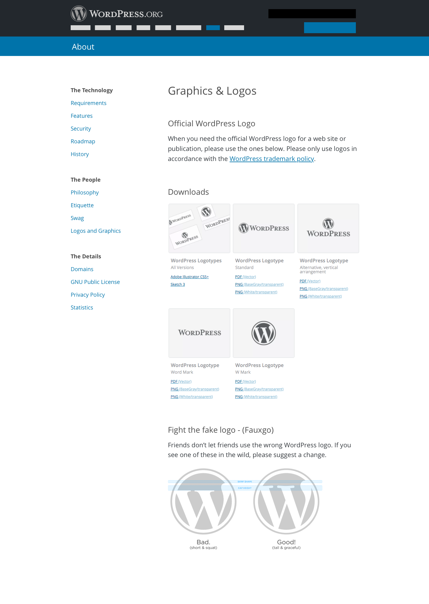
@obenland Here's a couple subpages including the Logos and Graphics page. They also include the subnav sidebar due to our inability at this moment to redesign the IA.
Logos and Graphics mockup
Let me know if there are any questions. I've edited some of the text on the Logos and Graphics page as well.
#82
in reply to:
↑ 79
 @
@
2 years ago
Replying to mapk:
Another pass at the subnav, props to @obenland.
We'll show that About section's pages in the subnav instead of them all. The "About" is still clickable to take the user back to the About landingpage. From there the user can dive into another About section of pages.
I think this approach will be a bit inconsistent and unexpected for users. Typically, subnavs don't change within a given section. If I'm in "About", I'd expect the subnav to remain consistent across all of the About section. The same should be true (and is true) for Plugins, Themes, etc.
#83
 @
@
2 years ago
It is inconsistent between the three areas, but consistent within those.
We're always open to better ideas!
#85
follow-ups:
↓ 88
↓ 98
 @
@
2 years ago
Here's a quick outline of remaining tasks needed to launch:
- Navigation - decide on the design and implement
- Make sure navigation works for extra child pages on Rosetta sites
- Decide on how to handle translated slugs, and implement
- New logo page redesign - implementation done this week
- Dial - not a launch blocker
- Write a script to add pages to Rosetta sites
- Find a way to add links to About page into main Rosetta navigation
- Back up old About page images
- Enable main theme on w.org
- Decide how to keep new pages in sync, and implement
- Replace prefixed translation strings
Anything I've missed?
#88
in reply to:
↑ 85
 @
@
2 years ago
- Navigation - decide on the design and implement
While it's not perfect, I think we should go with Mark's most recent mockup for the subnav. Increasing consistency across all of the site will probably require a redesign of the entire site (which is probably needed anyway).
- Make sure navigation works for extra child pages on Rosetta sites
Let's reach out to the specific communities affected and discuss what is changing and how we can help in specific cases where the content is absolutely not covered by the new About page.
#96
follow-up:
↓ 97
 @
@
2 years ago
@mapk Can we remove .entry-content { hyphens: auto; } from the styling? What's your thought there?
It's breaking a lot of words in half (at least in Chrome, Safari doesn't break) and it's going to look worse once translated I feel.
#97
in reply to:
↑ 96
 @
@
2 years ago
Replying to dd32:
@mapk Can we remove
.entry-content { hyphens: auto; }from the styling? What's your thought there?
It's breaking a lot of words in half (at least in Chrome, Safari doesn't break) and it's going to look worse once translated I feel.
Yes please. They drive me nuts.
#98
in reply to:
↑ 85
;
follow-up:
↓ 151
 @
@
2 years ago
- Owner changed from obenland to dd32
Replying to tellyworth:
- Make sure navigation works for extra child pages on Rosetta sites
After reviewing the situation of how the existing navigation happens, and what about pages exist in the Rosetta network at present, I think I'm going to suggest that this isn't a launch blocker nor something we need to support.
Locales in general only appear to have a translation of the about page, one which is often outdated. There's two locales which do have extra content, both of which are also out of date (when I checked them).
There's been some examples of pages which would work placed under /about/, such as translation contributors, and I do think that's a good use-case of putting something under About. However, I think that'd be best implemented for all locales and put into the main /about/ page hierarchy globally rather than on a per-locale basis.
A new ticket for those pages would be appreciated.
Locales will still be able to add a page into the /about/ hierarchy, they'll just have to link to it from somewhere else. I'd highly suggest against it though as it may break things down the line when we add a conflicting slug page globally (which will take precedence over the locales custom page)
- Decide on how to handle translated slugs, and implement
Slug translation isn't something we've solved on WordPress.org yet for rosetta sites (see: /plugins/ and /themes/) and I don't see this as a release blocker either.
I've spun this out into #3507 as it's going to require a bit more work and will be best handled as it's own mini-project.
- Write a script to add pages to Rosetta sites
- Decide how to keep new pages in sync, and implement
I've been testing a script for this, and have promising results. I expect re-running the script to populate rosetta sites will also let us populate them with changes. The pages will be owned by wordpressdotorg so not modifiable by locales which makes syncing changes easier.
Unfortunately we also need to create these pages on new-rosetta-site-creation so we'll need to define it in two places - unless we set Rosetta to just duplicate any pages on wordpress.org/ (Which is what I think I'll do).
- Find a way to add links to About page into main Rosetta navigation
This tends to fall back to #1201 where forcing certain items into the nav is going to be better in the long-run for consistency
This isn't a release blocker, and can be dealt with post-launch. The about pages will be linked to from the footers (See #3315)
As Obenland is now taking some time off, I'll be finishing up the remaining tasks here.

This ticket was mentioned in Slack in #meta by dd32. View the logs.
2 years ago
#104
follow-ups:
↓ 105
↓ 117
 @
@
2 years ago
Hey, here is a quick a11y review of the new about page.
First of all, it's beautiful!
I only address the specific page issues, not the theme issues (like e.g. the double H1, colour contrast of the submenu and placing of the skip link). Those will be addressed in a full a11y review of the site later.
I found the following issues
Heading structure
Don't skip a heading level, so the heading structure stays semantic and meaningful
On https://test.wordpress.org/about/
The H4 headings should be H3s
For: The Technology; The Details and The People, The 1st Freedom, The 2nd Freedom, The 3rd Freedom, The 4th Freedom.
In the sub pages of /about/ most H3 headings should be replaces by an H2, except on about/security/, there the headings in the content are perfect.
Colour contrast
The text "The freedom to build. The freedom to change. The freedom to share." has a too low contrast.
CSS text: hsla(0,0%,100%,.8);
Translates to: #cce3ee
Background: #0073aa
Font size: 22.5px
Colour contrast is 3.92:1
Quick fix: If you make the text 24px it will comply to WCAG 2 AA.
For more info, see the Accessibility handbook:
Headings in the content: https://make.wordpress.org/accessibility/handbook/best-practices/content/using-headings-in-content/
Use of color: https://make.wordpress.org/accessibility/handbook/best-practices/design/use-of-color/
#105
in reply to:
↑ 104
 @
@
2 years ago
Replying to rianrietveld:
Hey, here is a quick a11y review of the new about page.
Thanks @rianrietveld, very useful :)
It looks like different heading levels have been used for styling purposes, ie. the <h4> on the main /about/ page is supposed to be a <h3> from a document-outline POV, but not from a visual perspective. Will fix that.
For the contrast, I agree, increasing the font size is the simplest option there, and doesn't change the overall look of the page.
Unfortunately I can't recompile the SCSS right now, so those tasks will have to wait, but will get done before launch.

This ticket was mentioned in Slack in #polyglots by dd32. View the logs.
2 years ago
#109
 @
@
2 years ago
Typo in this original string: https://translate.wordpress.org/projects/meta/wordpress-org/nl/default?filters%5Boriginal_id%5D=5802583
First word, first letter missing.
#111
follow-up:
↓ 114
 @
@
2 years ago
Need to cater for formatting around percent sign %
With reference to the following:
printf( wp_kses_post( __( 'WordPress started in 2003 when Mike Little and Matt Mullenweg created a <a href="%1$s">fork of b2/cafelog</a>. The need for an elegant, well-architected personal publishing system was clear even then. Today, WordPress is built on PHP and MySQL, and licensed under the GPLv2. It is also the platform of choice for over %2$s of all sites across the web.', 'wporg' ) ), esc_url( 'https://www.whoishostingthis.com/resources/b2-cafelog/' ), esc_html( WP_MARKET_SHARE . '%' ) );
In Swedish, we put a
between the number and the percent sign.
I suggest that the percent sign here is moved into the translated phrase.
Since this will create a fuzzy match for those locales that have already translated this phrase, it would probably be good to update the corresponding comment to translators with a Note.
#112
 @
@
2 years ago
@dd32
After "MySQL %2$s+", before ", but" there's a tab - feels strange to me and makes funny things in GlotPress..
#114
in reply to:
↑ 111
;
follow-up:
↓ 116
 @
@
2 years ago
Replying to tobifjellner:
Need to cater for formatting around percent sign %
...
In Swedish, we put a between the number and the percent sign.
Thanks for bringing that up @tobifjellner - Swedish isn't alone in that regard - https://en.wikipedia.org/wiki/Percent_sign#Spacing
There's 6 translations that will need to be updated, I'm pondering if it'd be worth simply translating the percent group to ease the chance of errors.
So instead of having .... %2$s%% .... in many strings, with a comment about how the % needs to be doubled up, we'd have a single translation _x( '%s%%', 'Percent formatting; The percent sign for % should be doubled for escaping.', 'wporg' ); which can be inserted into the other strings.
#116
in reply to:
↑ 114
 @
@
2 years ago
Replying to dd32:
I'm pondering if it'd be worth simply translating the percent group to ease the chance of errors.
Decided the context of the sentence is more important, especially as Czech can position it before or after based on said context.
If GlotPress doesn't warn about the number of %%'s not matching between translations, we should add that as a warning to GlotPress instead of trying to work around it in strings.
#117
in reply to:
↑ 104
 @
@
2 years ago
Replying to rianrietveld:
Colour contrast
The text "The freedom to build. The freedom to change. The freedom to share." has a too low contrast.
CSS text: hsla(0,0%,100%,.8);
Translates to: #cce3ee
Background: #0073aa
Font size: 22.5px
Colour contrast is 3.92:1
Quick fix: If you make the text 24px it will comply to WCAG 2 AA.
Thanks for your help here, @rianrietveld!
On the color contrast issue, I think we should keep the font size as is because it conforms to a modular scale. So let's work with the color.
If we change the RGBA value to be rgba(255,255,255,0.9) instead, we end up with a hex value of #DFEDF4 and passes WCAG AA for large text (18pt+) at a 4.35:1. Is that adaquate? I know we like 4.5, but that's for smaller text, correct?
#118
 @
@
2 years ago
I've also noticed that this page's header is not conforming to the preexisting header CSS styles that have been laid out for the [Support page]https://wordpress.org/support/ and [Plugins page]https://wordpress.org/plugins/.
/plugins & /support styles for the H1tag in the header
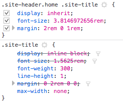
These H1 styles need to change to match the /plugins and /support pages.
- font-size.
- font-weight.
- line-height.
- margins
/plugins & /support styles for the p tag in the header
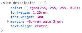
These p styles need to change to match the /plugins and /support pages.
- font-weight
#122
follow-ups:
↓ 123
↓ 128
 @
@
2 years ago
I've also noticed a Heading problem.
The H1s for the /about page are too big when compared to the other pages using this similar styling like /plugins and /support. The /about page heading also appears to be indented when it should align with the text along the left side.
ABOUT
PLUGINS and SUPPORT
The CSS for these headings appears to be different as well.
#123
in reply to:
↑ 122
 @
@
2 years ago
Replying to mapk:
I've also noticed a Heading problem.
...
The CSS for these headings appears to be different as well.
It looks like the base SCSS which we're using has been haphazardly implemented - Each theme/site and site seems to use a different markup for headings/etc, which results in a lot of duplication and re-implementing of this stuff.
Unfortunately I don't really know what was intentionally different, and what's just different so I'm relying upon you to point them out :) - I'll update those styles to match.
#128
in reply to:
↑ 122
 @
@
2 years ago
Replying to mapk:
I've also noticed a Heading problem.
The
H1s for the/aboutpage are too big when compared to the other pages using this similar styling like/pluginsand/support. The/aboutpage heading also appears to be indented when it should align with the text along the left side.
The CSS for these headings appears to be different as well.
So while looking at implementing this, I realised that the heading sizes vary quite a lot. I can't really just change one of them and I'm not able to go through all the different heading sizes to make it consistent right now.
Here's an example of the resulting header sizings with just changing the main header: https://cloudup.com/chrV-MN1gfE
The .entry-content h1 shouldn't get used, but the h2 onwards are used on things like the Security page.
(edit: This is what it's currently: https://cloudup.com/cZCkJ32y6yg)
#131
follow-up:
↓ 132
 @
@
2 years ago
Are there any colons or line breaks missing? See the bold words in the list.
https://test.wordpress.org/about/features/
#132
in reply to:
↑ 131
;
follow-ups:
↓ 133
↓ 136
 @
@
2 years ago
Replying to La Geek:
Are there any colons or line breaks missing? See the bold words in the list.
I believe that's intentional - that being said, I haven't seen the original document the pages were built from.
@mapk was that a deliberate design choice? I did question the lack of a colon or dash, but I felt it was crowded with those.
#133
in reply to:
↑ 132
;
follow-up:
↓ 134
 @
@
2 years ago
Replying to dd32:
@mapk was that a deliberate design choice? I did question the lack of a colon or dash, but I felt it was crowded with those.
I don't know the english spelling in this case, but at least in german this is no design decision. The bold words should be either headlines (HTML h tags) or end with a point or colon.
You cannot reliably filter for these words in GlotPress because they are not marked accordingly, even the <strong> tags are not around these translation strings.
#134
in reply to:
↑ 133
;
follow-up:
↓ 135
 @
@
2 years ago
Replying to La Geek:
I don't know the english spelling in this case, but at least in german this is no design decision. The bold words should be either headlines (HTML h tags) or end with a point or colon.
Feel free to translate the strings with extra punctuation if required by your language.
You cannot reliably filter for these words in GlotPress because they are not marked accordingly, even the <strong> tags are not around these translation strings.
Huh, I hadn't noticed they were separate strings, that is indeed non-optimal for translating.
We can either suffix, combine the strings, or add context/comments reflecting their actual usage depending on the intended design choice here.
You'll find the strings in this filtered view - just note that some items (For example, the menu headings) are also included so pay attention to the references, they should only be in page-about-features.php.
#135
in reply to:
↑ 134
 @
@
2 years ago
Replying to dd32:
Feel free to translate the strings with extra punctuation if required by your language.
Huh, I hadn't noticed they were separate strings, that is indeed non-optimal for translating.
We can either suffix, combine the strings, or add context/comments reflecting their actual usage depending on the intended design choice here.
This would be very appreciated. I know the shortcomings here at the moment, but the next contributor or PTE/GTE may have no knowledge of them and will suggest another translation or reject the old (but correct) one.
#136
in reply to:
↑ 132
 @
@
2 years ago
Replying to dd32:
@mapk was that a deliberate design choice? I did question the lack of a colon or dash, but I felt it was crowded with those.
This was not deliberate. It's exactly how it appears on the current 'Feature' page. https://wordpress.org/about/features/
But yes, I think there should be a line break after each one since the words in bold aren't part of the sentence. Something like:
Simplicity
Simplicity makes it possible for you to get online and...

This ticket was mentioned in Slack in #meta by tellyworth. View the logs.
2 years ago
#143
follow-up:
↓ 144
 @
@
2 years ago
There is a problem with the blue and purple boxes being partially off screen. They are completely visible only with a window size of ~888px to ~1010px and ~1187px and wider. This screenshot is from a window of 1013px looking at https://en-au.wordpress.org/about/.

#144
in reply to:
↑ 143
 @
@
2 years ago
Replying to joyously:
There is a problem with the blue and purple boxes being partially off screen. They are completely visible only with a window size of ~888px to ~1010px and ~1187px and wider. This screenshot is from a window of 1013px looking at https://en-au.wordpress.org/about/.
For now (launch), I think that's fine.
The resolution you've posted is a few pixels above the next breakpoint for the smaller size, and the important text is still visible.
Adjusting the breakpoints and/or making it smoothly reduce with the window size would be nice, but I don't think it's super urgent (Especially considering I can't actually update the CSS for that at present)
#146
 @
@
2 years ago
Just noting that the initial iteration of this has been rolled out to both WordPress.org/about and to all localised rosetta sites (https://es.wordpress.org/about/ for example).
For further issues, posting here or creating a new ticket is acceptable. I'll likely split out all of the major things remaining here into new tickets next week for easier management (150 comment trac tickets are hard to keep track on)
#147
follow-up:
↓ 148
 @
@
2 years ago
Looks like we have to reduce the font size of the title a bit, see attached screenshot.
#148
in reply to:
↑ 147
;
follow-up:
↓ 149
 @
@
2 years ago
Replying to ocean90:
Looks like we have to reduce the font size of the title a bit, see attached screenshot.
Hmm, What browser / size is that in? Chrome on Android (Nexus 5X) looks fine
Once I can recompile the SCSS i'll see what can be done about the headings (See Comment #122 too)
#151
in reply to:
↑ 98
;
follow-up:
↓ 156
 @
@
2 years ago
Replying to dd32:
- Decide on how to handle translated slugs, and implement
Slug translation isn't something we've solved on WordPress.org yet for rosetta sites (see: /plugins/ and /themes/) and I don't see this as a release blocker either.
I've spun this out into #3507 as it's going to require a bit more work and will be best handled as it's own mini-project.
As much as I love the visual impact of these beautiful about pages, I'm sad about having no option whatsoever to have the slugs translated from the get go. Because this looks just wrong: https://nl.wordpress.org/about/history/ and we, as the Dutch team, would've considered this a blocker. Not even mentioning that fact of having English pages automatically published before they're translated.
Do we really have to wait for core to solve this or can we solve this with making the slugs translatable?
#155
follow-up:
↓ 157
 @
@
2 years ago
RTL issues in the Graphics & Logos page, see the "Downloads" section.
#156
in reply to:
↑ 151
 @
@
2 years ago
Replying to Remkus de Vries:
Replying to dd32:
- Decide on how to handle translated slugs, and implement
Slug translation isn't something we've solved on WordPress.org yet for rosetta sites (see: /plugins/ and /themes/) and I don't see this as a release blocker either.
I've spun this out into #3507 as it's going to require a bit more work and will be best handled as it's own mini-project.
As much as I love the visual impact of these beautiful about pages, I'm sad about having no option whatsoever to have the slugs translated from the get go. Because this looks just wrong: https://nl.wordpress.org/about/history/ and we, as the Dutch team, would've considered this a blocker. Not even mentioning that fact of having English pages automatically published before they're translated.
Do we really have to wait for core to solve this or can we solve this with making the slugs translatable?
This isn't something we'll wait for core on, but it wasn't something that was going to be remotely done before launching these, and honestly may not be implemented in the short-term either.
Discussion and implementation details should be kept to #3507.
#157
in reply to:
↑ 155
 @
@
2 years ago
Replying to ramiy:
RTL issues in the Graphics & Logos page, see the "Downloads" section.
If you could detail the issues on this ticket, that'd be great.
#162
in reply to:
↑ 161
 @
@
2 years ago
Replying to Dominik Schilling:
In 7026:
@ocean90 Could you please ensure that any changes you've made to the whitepaper are pushed to it's primary location - https://github.com/WordPress/Security-White-Paper ? otherwise there's going to be conflicts with trying to merge it back into the page, etc.
#163
 @
@
2 years ago
The default theme which ships with core WordPress (currently "Twenty Fifteen")
should be
(currently "Twenty Seventeen")
#164
 @
@
2 years ago
It would be good to make the whole "About" section more congruent in terms of typography. In many places, simple " quotes are used, but in some places there are typographical quotes called via html entities.
#165
 @
@
23 months ago
For all further issues, please open new tickets.
I'll transfer any remaining issues from this ticket into new tickets later today.
#169
 @
@
23 months ago
- Resolution set to fixed
- Status changed from accepted to closed
I'm going to mark this as fixed with all future issues to be Ticketed.
See the following list of related tickets: (It's a dynamic list)
- #1310
- About / Requirements advises on SuPHP which is unmaintained
- #1725
- About testimonials embeds overlaid
- #3548
- About: Add simplified logo back to the Graphics and Logos page
- #3556
- About section: improve typographical details
- #3557
- About section: improve sizing of highlight boxes
- #3558
- About section: improve formatting on Features page
- #3559
- About section: make heading sizes consistent
- #4084
- About/Roadmap: Gutenberg demo URL should be translatable






+1 to this.