#24048 closed defect (bug) (fixed)
Code Editors: Increase the usability of Code Editor's files list
| Reported by: |
|
Owned by: |
|
|---|---|---|---|
| Milestone: | 4.9 | Priority: | high |
| Severity: | normal | Version: | 3.5.1 |
| Component: | Plugins | Keywords: | needs-patch |
| Focuses: | ui, accessibility | Cc: |
Description
Regarding the list under Plugin Files in the Plugin Editor (plugin-editor.php):
- Plugin root directory does not need to be mentioned in the file list.
- In order to improve readability, directories should be marked in a way that distinguishes them from the filename.
Preferably directories should not be shown next to every file, but rather as headers, under which all files in the same directory are grouped. This would make the list a lot shorter, as currently most of the filename-and-path-combinations span two lines.
- The form of the list should be changed to limit the total height of the list. This is especially useful for plugins with dozens of editable files.
One way would be to use a < ul > element with expansible/collapsible directory headers, showing only the first-level directories and files by default.
Attachments (14)
Change History (75)
#2
 @
@
6 years ago
- Focuses ui added
- Keywords needs-patch added
- Type changed from defect (bug) to enhancement
I have to admit that I'm not super excited about the prospect of either making some kind of tree nav or implementing and then maintaining an existing, compatible script. Something native to jQuery UI sounds nice but it doesn't seem to have any traction.
I also rather dislike the idea of making this look and feel like a sustainable way to be editing files. I don't think we should get rid of the file editors, but I also don't see any reason to make them particularly convenient or comfortable.
I could maybe get behind some basic headers. Probably need to fix #6531 first or alongside.
#3
follow-up:
↓ 4
 @
@
6 years ago
We've certainly had numerous discussions about removing the editors. In fact, even as a developer who writes a popular plugin focused on making these editors more usable, I've still argued the case for removing them myself. I don't think they ever will be though.
Regardless, they are here, and as long as they're here, there's no reason to ignore patches that improve their usability. I wouldn't discourage contributors from writing patches just because a number of us continue to debate whether they should be in core at all.
As for relying on and distributing another 3rd party library in core just for a file tree view, and also adding the requirement for JS to use the editors, that's something that does need to be discussed. It's obviously possible (as we currently do) to provide an interface that doesn't rely on JS or any 3rd party libraries, and it's not terrible. Also, in my opinion, pulling in a new 3rd party library to handle things like this screams "plugin territory" to me.
We could go for a smaller and more simple patch that provides some basic UI improvements to the current functionality that takes advantage of faster and smaller AJAX requests to navigate the tree when JS is available without reloading the editor itself (and making it possible to navigate the tree without losing unsaved changes in the editor), but continues to fall back gracefully on it's current behavior otherwise.
I also would be interested to see some new designs around how files are listed, and as this has bothered me significantly in the past, seeing designs that don't incorporate file descriptions in the list itself or sort files by those descriptions by default instead of by filename. I find that incredibly frustrating every time I use these editors myself, and I know others do too.
Those are just a couple ideas that would be more realistic, and have a better shot at being applied.
#4
in reply to:
↑ 3
;
follow-up:
↓ 5
 @
@
6 years ago
Replying to bpetty:
Regardless, they are here, and as long as they're here, there's no reason to ignore patches that improve their usability. I wouldn't discourage contributors from writing patches just because a number of us continue to debate whether they should be in core at all.
Not totally sure who or what you're addressing. There's no patch here, and I don't think the debate about keeping the editors is anything beyond academic. They're staying. :)
Anyway, let's just remember that these are basic editors and we should keep things basic. Think of them as a stepping stone to learning about more full-fledged development. If we make them too fancy/IDE-ish, it conveys the message that it's a good idea to be cowboy coding all the time, when it's not. But, speaking from personal experience, they can be a great way for somebody to find a whole new world of things to learn.
Design/concepts and/or patches happily encouraged here. Again, it could be as basic as adding some headers and showing files in a reasonable order and grouping.
#5
in reply to:
↑ 4
;
follow-up:
↓ 6
 @
@
6 years ago
Replying to helen:
Not totally sure who or what you're addressing. There's no patch here, and I don't think the debate about keeping the editors is anything beyond academic. They're staying. :)
I wasn't claiming there was one, just clarifying that despite your comments, it didn't mean no-one should bother even submitting a patch (because that's what it sounded like).
If we make them too fancy/IDE-ish
Certainly not advocating building a full IDE here either. We're just talking about making the file tree (that we already provide) actually work the way it was intended to. If you think providing a way to actually select files to edit is too much of an "IDE feature", then we have a case for removing it entirely. We're not in the habit of adding half-working features just because we sort of think it should be there, but we've intentionally made it difficult (and in some situations here, impossible) to use in order to discourage users from using it.
I completely understand your concerns here, but we're not talking about optional new features like "jump to file", "find in files", syntax highlighting, line numbers, or anything like that. This is absolutely required functionality for selecting which file to edit. It doesn't get more basic than that.
#6
in reply to:
↑ 5
 @
@
6 years ago
Replying to bpetty:
I don't even know what you're talking about anymore. If for some bizarre reason I was opposed to making this better at all, I would have closed the ticket. Let's quit this non-discussion so as not to scare anybody else off, because even I'm scared now.
#7
 @
@
6 years ago
Well, I don't know what either of you are talking about, so there. :-)
Right now, the plugin screen lists the path to each file. There are a few ways to improve this. One would be "grouping" each level and directory with a heading, and then all files below that header are inside that directory. This would probably be "flat", with a heading specifying the full path to that directory, versus some kind of hierarchy.
Another option is to actually show hierarchy. This would require some sort of tree. It doesn't necessarily need to be collapsible, and I really wouldn't think we need to bring in a new JS library for this. Simple nested unordered lists with a dash of JS would get the right result. If you wanted a full-fledged "tree view" file browser, I think that would be plugin territory.
I don't know which is best. And really, I don't know if either of them would be a significant improvement. Perhaps we could at the very least chop off a common path. Right now if you edit a plugin within a folder, you get the full path on top of the page (makes sense) but also the folder repeated all the way down the tree. Even just removing that one segment would probably go a long way to cleaning this up, and I don't think we'd even need to do much more than that.
#8
 @
@
6 years ago
I agree with Nacin. It would improve the UI significantly just to:
- Not display the common part of the path (the plugin root directory)
- Arrange files in groups by folders where the folder name is a header instead of being repeated for every filename.
- Make the list collapsible.
Any of the above steps would improve the usability considerably by itself, so it's best to implement even just one of them for 3.9 instead of making them all depend on the most debatable one.
The ideal end result would look something like http://www.jqueryscript.net/other/jQuery-Flat-Folder-Tree-Plugin-simplefolders.html.
To comment on 'cowboy coding', I'd like to emphasize that having an editor doesn't require using it carelessly. I know people (e.g. students) who do a bulk of their site development through WP-admin due to a limited ability to install anything. The editor can be used on a dummy site from where it's easy to copy the finished changes to a live one. For many of those who use plugin solutions, the editor in core was a crucial first step and is an important backup.
#9
 @
@
6 years ago
Aside from visual aides, one of the main reasons I'd get behind this is simply to provide a way to edit any file within a plugin or theme. As it stands, the plugin / theme does not always make all of the files of the theme or plugin available. I'm not sure of the exact logic for how the files are loaded, but it seems that only files included directly into the main plugin file or theme's functions.php file are displayed.
The WP Editor plugin gets around this limitation by providing a browsable directory structure. I think it's overkill for what this ticket should and/or could introduce, but it does provide a nice contrast in usability to the current editor.
To summarize, I'd love to see the ability to show / edit all files within a plugin or theme instead of just some.
#11
 @
@
6 years ago
Yes, the bug regarding actually listing files should be fixed.
I in no way oppose improvements here. I am just cautious about going too far and people getting *too* comfortable in the editor, when they should probably eventually be encouraged to grow out of it if it becomes a common task. A nested unordered list with proper hierarchy and maybe some headers seems like it could go a long way.
#12
 @
@
5 years ago
I personally think this would make a great usability enhancement. I don't use the editors often myself, but I know alot of users do, and when trying to find a file in a several hundred file plugin, it's a nightmare in the editor currently.
#16
 @
@
3 years ago
- Summary changed from Increase the usability of Plugin Editor's files list (separate directories, limit height) to Code Editors: Increase the usability of Code Editor's files list
FYI, been exploring some designs in #41729. I'll be uploading the most recent one to this ticket.

This ticket was mentioned in Slack in #core by jeffpaul. View the logs.
3 years ago

This ticket was mentioned in Slack in #core by melchoyce. View the logs.
3 years ago
#20
 @
@
3 years ago
- Focuses accessibility added
Quoting from https://wordpress.slack.com/archives/C02RQBWTW/p1507148635000268
might need restructuring for the html to be grouped differently the plugin files and theme files are printed very differently, and we'd like to use accessible tree structure markup
#21
 @
@
3 years ago
The Plugin Editor markup is fairly straight forward, in that the files are organized as they are found in a file system directory, and the only modification is that the Main plugin file is moved to the top of the list. This is like a normal file browser.
However, the Theme Editor organizes by file type first, then lists out each file under those headers. When "editable extensions" is filtered to allow more types, the organization goes a little funky.
In this cleanup for accessibility, should we drop the grouping by filetype, or do a hybrid? (Leaving it as it currently is, with headers for ".js files" and ".txt files," seems less usable.)
If we drop grouping, we could move the most important files to the top, like styles.css and functions.php, while leaving the rest of the files in a normal folder view, like the plugin editor.
If we do the "hybrid" we'd group php (Templates) and css (Styles) but then leave all other files grouped together so that there are only 3 groups.
(I prefer the first option, 1 tree.)
Once we decide on that, we can build either 1 or 3 Tree Structures that @afercia (I think) had mentioned elsewhere (which I'm reading http://accessibleculture.org/articles/2013/02/not-so-simple-aria-tree-views-and-screen-readers/ to understand better).
#22
 @
@
3 years ago
Good thinking. Let's try this:
If we drop grouping, we could move the most important files to the top, like styles.css and functions.php, while leaving the rest of the files in a normal folder view, like the plugin editor.
#23
 @
@
3 years ago
Detailed explanation of ARIA roles, attributes, expected keyboard interaction, and examples of Tree Views in the ARIA Authoring Practices:
https://www.w3.org/TR/wai-aria-practices/#TreeView
The first two examples are about a File Directory ;)
https://www.w3.org/TR/wai-aria-practices/examples/treeview/treeview-1/treeview-1a.html
https://www.w3.org/TR/wai-aria-practices/examples/treeview/treeview-1/treeview-1b.html
#24
 @
@
3 years ago
@afercia I have an incoming patch based on https://www.w3.org/TR/wai-aria-practices-1.1/examples/treeview/treeview-2/treeview-2a.html
#25
 @
@
3 years ago
The attached patch is a Work in Progress. The Work is on the plugin editor (theme not done yet).
Patch contains:
- the latest patch from #6531 since this depends on that.
- libraries from https://www.w3.org/TR/wai-aria-practices-1.1/examples/treeview/treeview-2/treeview-2a.html (GPL compatible) 2 javascript files, and some css included into common.css
- formatting fixes on theme-editor.php and plugin-editor.php to meet WP coding standards
- Introduces a recursive function for printing out an aria marked up file list based on w3c's recommendations.
It's a work in progress, so the new function can be renamed and moved, and the new design still needs to be implemented, and then build into the theme editor ... but I just wanted to get a working patch up on Trac for a preview and for early testing (accessibility).
#26
 @
@
3 years ago
- Keywords has-patch ui-feedback ux-feedback added; needs-patch removed
Patch is ready for review!

This ticket was mentioned in Slack in #accessibility by wraithkenny. View the logs.
3 years ago

This ticket was mentioned in Slack in #core by wraithkenny. View the logs.
3 years ago
#30
 @
@
3 years ago
Quickly tested the patch, I'm sorry I have no time to go in depth but noticed a few things worth checking.
Icons: I don't think we can use unicode characters directly in the CSS files. These should use the unicode escape sequence or, better, dashicons. See the dashicons f139 and f140.
For RTL: I think there's already a Grunt task that inverts f139 to f141 but worth checking.
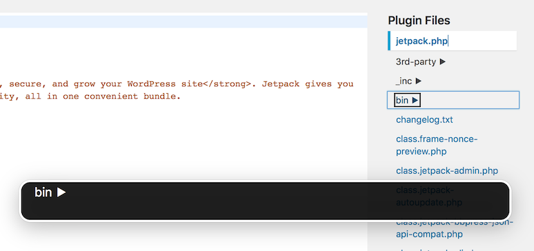
Regardless they're unicode or dashicons, screen readers tend to announce CSS generated content. VoiceOver announces "Right pointing triangle" and "Down pointing triangle", we should avoid this generating the CSS pseudo element inside a span that uses aria-hidden="true", see also #40428.
Coding standards, minor issues to address for example:
$('#templateside [role="tree"] [aria-expanded]').attr("aria-expanded", false);
WordPress uses single quotes and spaces inside parenthesis: .attr( 'aria-expanded', 'false' )
Minor: HTML attributes are string, not boolean. Ideally, false and true should be 'false' and 'true' even if jQuery and browsers take care of this.
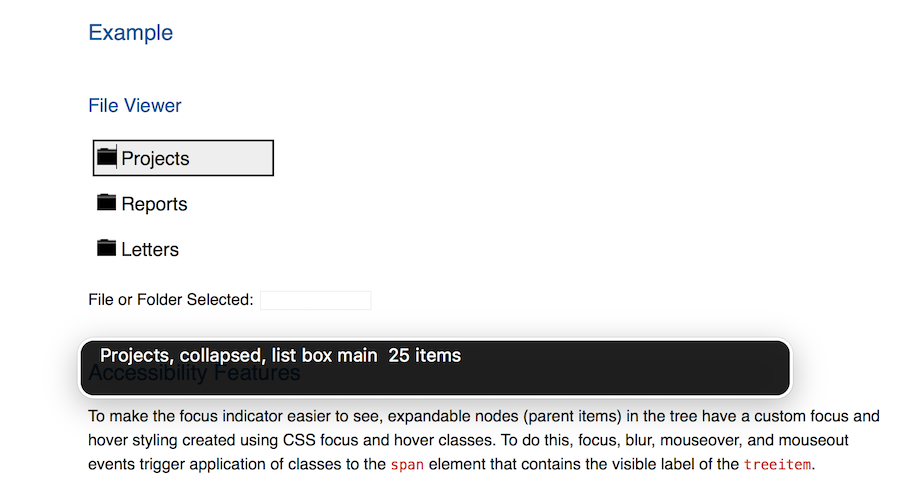
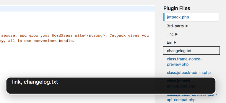
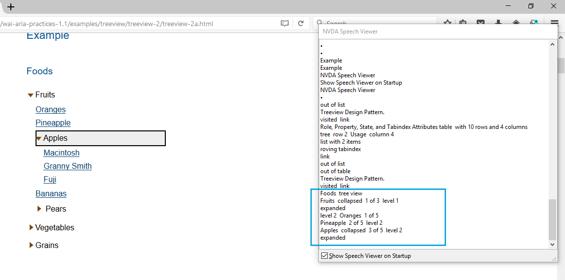
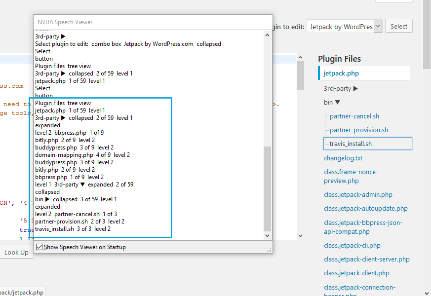
As per the ARIA side, seems to me it is working nicely with Firefox and NVDA. Instead, it doesn't work as expected with Safari 11 and VoiceOver. To my understanding, Safari and VoiceOver don't fully support tree views, they announce them as "table" and "list box" on the W3C example, but here they announce the items as "Link" and this shouldn't happen.
I've tried changing role="none" to role="presentation" and seems to me this pairs the behavior of the editor files list with the one of the W3C example. This sort of makes sense since the role none is new in ARIA 1.1 and maybe not yet fully supported. Would you mind double checking and see if that makes any difference for you when using Safari and VoiceOver?
Will attach a few screenshots to better illustrate.
#33
 @
@
3 years ago
@afercia Thanks for the feedback, I'll work on those edits (code-style and generated content) tonight. I'm glad that you have no issues on NVDA, since testing on Windows is a pain for me.
I'm testing Safari with VoiceOver, and getting different results than you.
I am getting the same as you on the file voice over link, changelog.txt (instead of changelog.txt, list box) and I'm unsure as to what difference between their markup and mine is, but I think I can track that down.
As to the bin ▶ result, I'm getting the full bin ▶, collapsed, group. I did notice that it's slow (either Safari or the VoiceOver program) and occasionally responds with "busy". Additionally, the w3c library waits for window.load instead of ready, so that might be something also. Are there any console errors?
I've also noticed that out of the 4 examples at the w3c, they have "computed" vs. "declared" and "Directory" vs "Navigation". I went with the "Navigation" version as its markup supports links, but maybe I'll switch to "declared" instead of "computed" as it seems to work nicer, even on their demo.
I'm going to comb over our code to see if I can find the difference that's causing the discrepancies, and add the declared properties (which will take a bit more work).
One weird thing, on Safari with VoiceOver, when I expand a section, I get: bin ▼, partner-cancel.sh, link, partner-provision.sh, link, travis_install.sh, link, expanded, group (which is listing the nested items). When using Chrome, I simply get: bin ▼, expanded, list box. At any rate, I'll try to get it to work as it does on https://www.w3.org/TR/wai-aria-practices-1.1/examples/treeview/treeview-2/treeview-2b.html
#34
 @
@
3 years ago
@WraithKenny haven't noticed any JS error.
About the markup, consider role="presentation" (or none in the new ARIA 1.1) is used to not expose an element to assistive technologies. Basically a tree view expects just a "tree" (the ul in our case) with "tree items" as children (the a in our case) and the li is not exposed to screen readers. Worth noting since the ARIA roles override the native semantics, we could theoretically use any element, even a series of divs. The ul/li/a structure is used for convenience and interaction.
I wouldn't recommend you to use Chrome in combination with VoiceOver, as Chrome is not the best browser for screen readers. On a mac, always test with Safari + VoiceOver.
occasionally responds with "busy"
Hm it usually happens to me when I keep the Safari inspector open, then VoiceOver usually goes nuts.

This ticket was mentioned in Slack in #accessibility by afercia. View the logs.
3 years ago
#38
follow-up:
↓ 40
 @
@
3 years ago
@afercia turns out the issue wasn't with role="none" (presentation seemed to have no effect that I noticed), but rather that it needed a root folder because of the way the w3c library was written. Rather than edit their script, I wrapped the files in a ul>li. This changed the design to have the folder lines encompass the whole tree, but I think it looks nice. (Thoughts on design @melchoyce?)
Another thing removed was the "nonessential" span that shows the path of the file under the filename, as it's redundant with the tree structure. I do have a question about the accessibility of it. Would having the path read, i.e. back-compat.php (inc/back-compat.php), list box add useful info, or is it just noise? I figured it'd just be noise, but can add it back in if it's desirable.
The patch is now equivalent in behavior to the w3c demo, as far as I can tell.
I noticed that if a file (as opposed to folder) is the last highlighted item (or initial item), Safari won't tab into the tree (but will in reverse!)... This is a bug in Safari apparently, because it does it without VoiceOver, probably do to its treatment of li's vs a's Luckily, besides this issue, Safari/VoiceOver seems to be working as expected!
#39
 @
@
3 years ago
- Keywords needs-refresh added
24048.4.diff needs to be refreshed now that #6531 has landed.
#40
in reply to:
↑ 38
 @
@
3 years ago
Replying to WraithKenny:
I wrapped the files in a ul>li. This changed the design to have the folder lines encompass the whole tree, but I think it looks nice. (Thoughts on design @melchoyce?)
The overlap with the current file styling is a little wonky, and I think it feels really cramped with the whole file list encompassed in the tree. Can we change that with CSS so only folders have the lines?
#41
follow-up:
↓ 42
 @
@
3 years ago
@melchoyce Sure, I'll rework that when I rework the patch without 6531's patch.
#42
in reply to:
↑ 41
 @
@
3 years ago
Replying to WraithKenny:
@melchoyce Sure, I'll rework that when I rework the patch without 6531's patch.
Thanks! This is working great btw :)
#43
 @
@
3 years ago
- Keywords needs-refresh removed
Patch refreshed!
I've left out the style-guide cleanup of the rest of the plugin-editor and theme-editor files, since it made it hard to see what changed.
I've adjusted the folder lines to only show for subfolders, and also added mobile styles that I had forgotten in the last patch. Also, the file list is now the same size as the code editor area, with scrollbars if needed.
I've tested on php5.6 and php7.1
Can someone confirm that it's OK on php 5.2 & 5.3?
#44
 @
@
3 years ago
Styles look good 👍
For some reason, though, clicking the folder names/arrows isn't opening the folders — I can only open via keyboard navigation.
#45
follow-up:
↓ 46
 @
@
3 years ago
@melchoyce are you getting any JS errors? What browser/OS? (I tested on Mac versions of Chrome, Firefox, Safari and Opera.)
#46
in reply to:
↑ 45
 @
@
3 years ago
Replying to WraithKenny:
@melchoyce are you getting any JS errors? What browser/OS? (I tested on Mac versions of Chrome, Firefox, Safari and Opera.)
If I was before, I'm not anymore — it's working again 🤷♀️
Let's update the pointer to cursor when hovering over folders.
#47
follow-up:
↓ 48
 @
@
3 years ago
@WraithKenny Some feedback:
- Instead of adding new JS files for tree links, I suggest just adding the JS inside of
theme-plugin-editor.js. That is, unless we know we're going to use it elsewhere. If we are going to use it elsewhere, then the scripts should be added as dependencies for thetheme-plugin-editorscript so that it doesn't have to be enqueued separately. - The inline scripts added should be added to
theme-plugin-editor.jsas well. wp_print_theme_file_tree()andwp_print_plugin_file_tree ()both take$labelarg that doesn't have the right phpdoc type, if the default value isfalseand not astring. Nevertheless, I don't even see$labelbeing used at least in the case ofwp_print_theme_file_tree()`.
See review with context for comments: https://github.com/xwp/wordpress-develop/pull/281
An eventual enhancement would be to load the given file when clicking it without even navigating to a different page (just updating the URL with history.pushState).
#48
in reply to:
↑ 47
 @
@
3 years ago
Replying to westonruter:
Updated patch to have the new javascript in the theme-plugin-editor.js file, removed the unused $label param from the wp_theme_file_file_tree() and cleaned up the docs!

This ticket was mentioned in Slack in #core by wraithkenny. View the logs.
3 years ago
#50
follow-up:
↓ 52
 @
@
3 years ago
In 24048.10.diff (see delta):
- Add missing semicolons
- Update initFileBrowser to use jQuery consistently
- Fix JSHint issues related to use of 'char' as variable name
- Suppress JSHint issues from 3rd-party code
- Fix jscs issues
- Suppress eslint issues for 3rd-party code
- Move initFileBrowser above 3rd-party code
@melchoyce Since the file list is now a scrollable container, should the current file being edited be scrolled into view when the page first loads?

This ticket was mentioned in Slack in #core-customize by westonruter. View the logs.
3 years ago
#52
in reply to:
↑ 50
 @
@
3 years ago
Replying to westonruter:
@melchoyce Since the file list is now a scrollable container, should the current file being edited be scrolled into view when the page first loads?
Yeah, let's load it with the selected file scrolled into view (but without any animation, I think)
#53
 @
@
3 years ago
- Keywords commit added; ui-feedback ux-feedback removed
- Owner set to westonruter
- Status changed from new to accepted
#56
 @
@
3 years ago
- Keywords needs-patch added; has-patch commit removed
- Resolution fixed deleted
- Status changed from closed to reopened
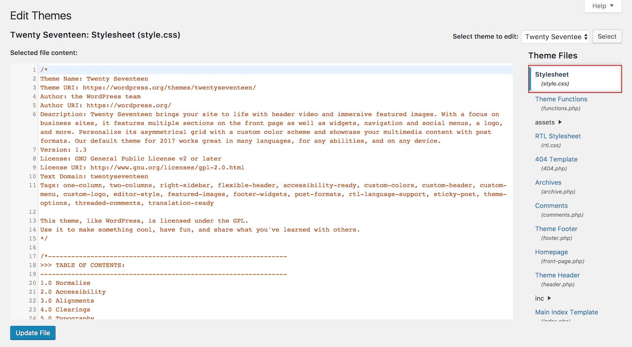
Found a weird behaviour with Chrome that's pretty serious for keyboard navigation.
Seems scrollIntoView() in Chrome is also altering the native tab order. To reproduce:
- just go to the Theme (or plugin) editor page
- press Tab
- keyboard navigation should start from the document root, revealing the "skip link"
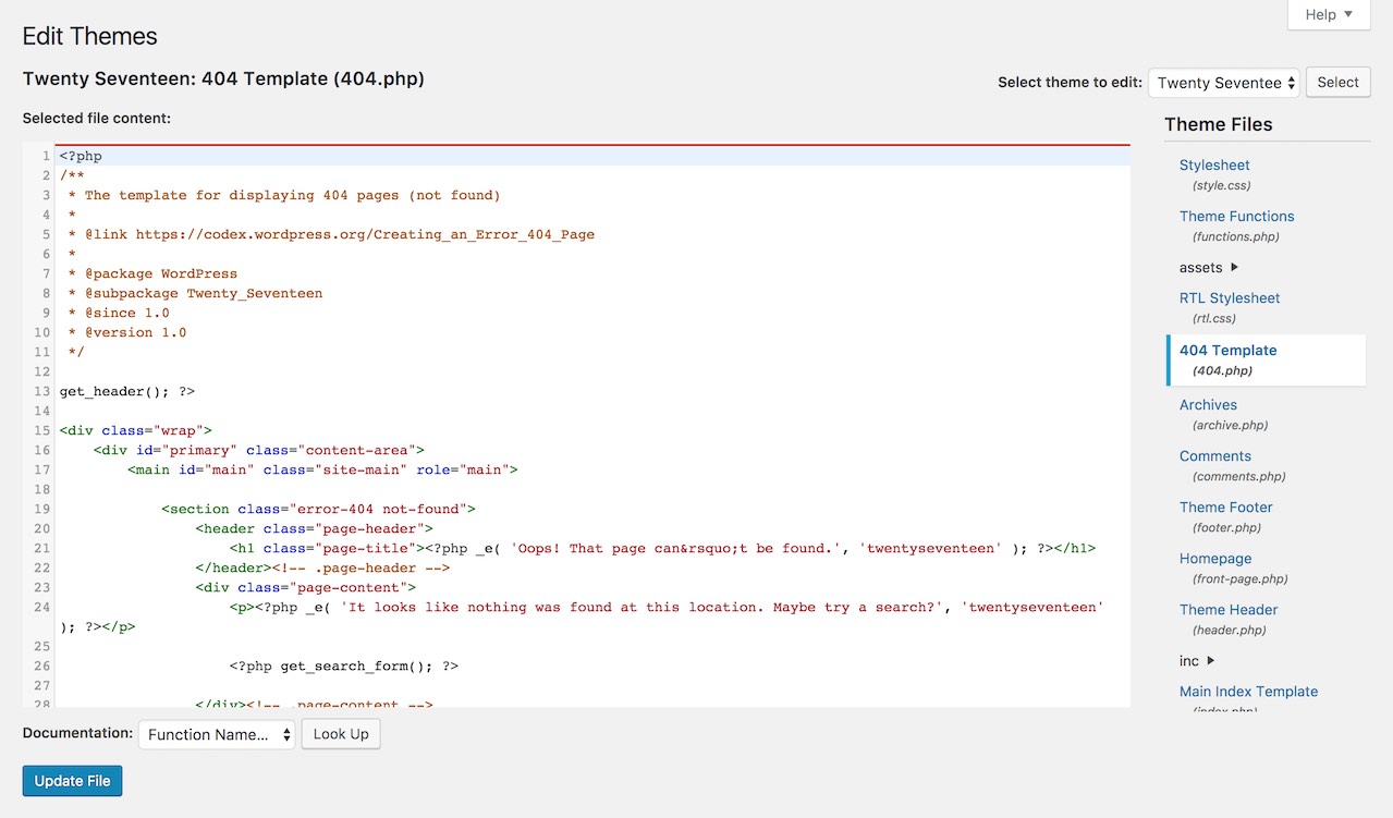
- instead, keyboard navigation starts from the first file in the tree view (highlighted in red in the screenshot below)
- click on another file in the tree view
- page reloads
- press Tab
- keyboard navigation starts from the editor (focus is inside the editor)
Comment the line this.scrollIntoView( false ); in wp-admin/js/theme-plugin-editor.js and everything works as expected.
Couldn't reproduce in other browsers, seems this happens just with Chrome (v. 61 both macOS and Windows).
Seems to me this is really a Chrome bug, I don't see why scrollIntoView() should alter the native tab sequence. However, it should be worked around: starting keyboard navigation form the middle of a page shouldn't happen in any case.
Possible options I can think of:
- don't use
scrollIntoView()and use some jQuery scroll animation instead - use the proprietary
scrollIntoViewIfNeeded()that seems doesn't trigger the bug
scrollIntoViewIfNeeded() is already used for some reason in widgets.js, I've quickly tried it and seems something like this would work:
if ( this.scrollIntoViewIfNeeded ) {
	this.scrollIntoViewIfNeeded();
} else {
	this.scrollIntoView( false );
}
Aside: not sure why .each() is used here, there's only one .current-file at a time.


Two jQuery-based solutions:
http://wiki.jqueryui.com/w/page/12138128/Tree (under development to become part of jQuery UI)
http://www.webappers.com/2008/10/07/treeview-expandable-and-collapsible-tree-jquery-plugin/