#35210 closed enhancement (fixed)
Add notification area to Customizer
| Reported by: |
|
Owned by: |
|
|---|---|---|---|
| Milestone: | 4.9 | Priority: | normal |
| Severity: | normal | Version: | |
| Component: | Customize | Keywords: | has-patch has-dev-note |
| Focuses: | ui, javascript | Cc: |
Description (last modified by )
There is currently no standard location for showing notifications in the Customizer, whether success messages or failures. Currently in the Customizer, if there is a failure to save due to a server error or connectivity problem, there is no visual indicator that a failure happened other than that the Save & Publish button doesn't get disabled. When an error does happen, there should be an error message displayed there.
In #34893, validation constraints are added to settings in the customizer. When validation constraints fail, the error messages should be shown in the notification bar. Likewise, in #34923 there is a proposal to be able to create new pages in the Customizer: the first iteration is just to add new blank pages with only the title supplied, and upon saving we need to be able to provide edit post links for those new pages so that the body content can be fleshed out. These links can be displayed in a notification bar. (These links can also be included in the nav menu item controls.)
The notification bar should facilitate plugins to inject their own messages and indicate failures vs successes.
Tickets dependent on the notification area:
Attachments (15)
Change History (147)
#1
follow-up:
↓ 2
 @
@
4 years ago
Just checking, but I assume the bar only shows if a notification is in it @westonruter?
#2
in reply to:
↑ 1
 @
@
4 years ago
Replying to karmatosed:
Just checking, but I assume the bar only shows if a notification is in it @westonruter?
That's right. It would only appear if there is a message to show.
Under the covers, it would make sense for the notification messages to be stored in a wp.customize.Values (collection) instance. When it is empty, the bar would be hidden. When the collection is populated, the bar would be displayed.
#3
 @
@
4 years ago
@westonruter thanks for clarification. Perhaps the phrasing of it as a bar maybe could be changed to notification area? A little change but saves the potential confusion with admin bar.
A few other queries as I look to give some UX feedback:
- Visually was the plan for notifications to take the entire space up?
- What happens with multiple notifications? Do they stack? If they stack, what happens with a large number?
- Will the notifications be the same color and design as used in other areas?
Maybe animation could be explored too, perhaps when the notifications load in or to get people to notice even with a slight bouncing.
#4
 @
@
4 years ago
- Summary changed from Add notification bar to Customizer to Add notification area to Customizer
@karmatosed Thanks for the feedback:
Visually was the plan for notifications to take the entire space up?
By taking up the entire space, do you mean the full width of the preview? If so, then I suppose not as it could take some inspiration from Android's notifications that display when a device is in landscape mode.
What happens with multiple notifications? Do they stack? If they stack, what happens with a large number?
Yes, I should think they stack like admin notices stack in the admin. Good question on if there is a large number. Perhaps there should be up/down arrows to cycle through the notices?
Will the notifications be the same color and design as used in other areas?
As with admin notices, I suppose there would be a red error notice and a green success notice.
Maybe animation could be explored too, perhaps when the notifications load in or to get people to notice even with a slight bouncing.
Good idea.
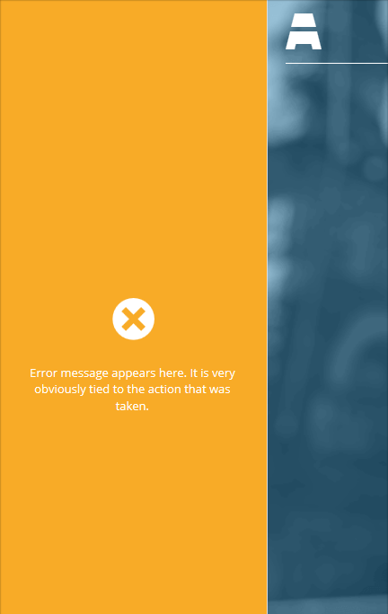
Also, I'm no designer, so take the mocks I've supplied as just rough placeholders for what it could actually look like :)
#5
 @
@
4 years ago
Yes, I should think they stack like admin notices stack in the admin. Good question on if there is a large number. Perhaps there should be up/down arrows to cycle through the notices?
I think that's a good idea and having a maximum size in this case makes sense.
Also, I'm no designer, so take the mocks I've supplied as just rough placeholders for what it could actually look like :)
No worries, let me have a play with things and upload some musings.

This ticket was mentioned in Slack in #core by westonruter. View the logs.
4 years ago
#7
follow-up:
↓ 11
 @
@
4 years ago
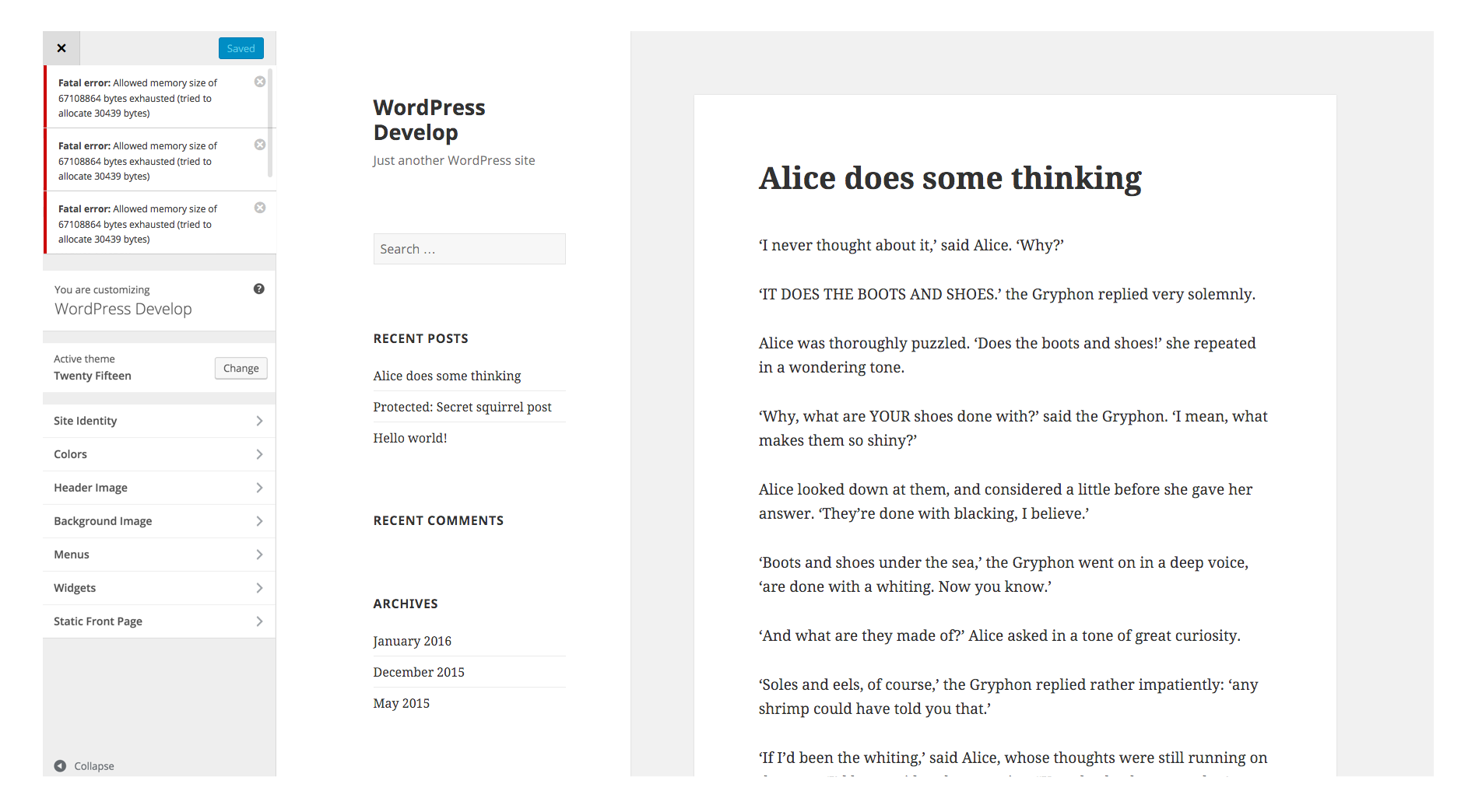
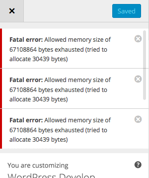
I've done a few mockups. I played around with how the notifications would stack. For this example I took the coloured notifications to make it obvious.
As far as stacking goes, I found that the arrows just didn't look great, so I have for now shown it with a scrollbar here:
Potentially we could use existing pagination patterns such as pages and posts, but I feel this may be overkill and the simple scroll potentially works. Would probably be something to test actually in code.
#8
follow-up:
↓ 10
 @
@
4 years ago
@westonruter Can you give some examples of errors that people would typically see in the Customizer? Would be good to get a feel for how long they can be.
#10
in reply to:
↑ 8
 @
@
4 years ago
Replying to melchoyce:
@westonruter Can you give some examples of errors that people would typically see in the Customizer? Would be good to get a feel for how long they can be.
For example in #31582:
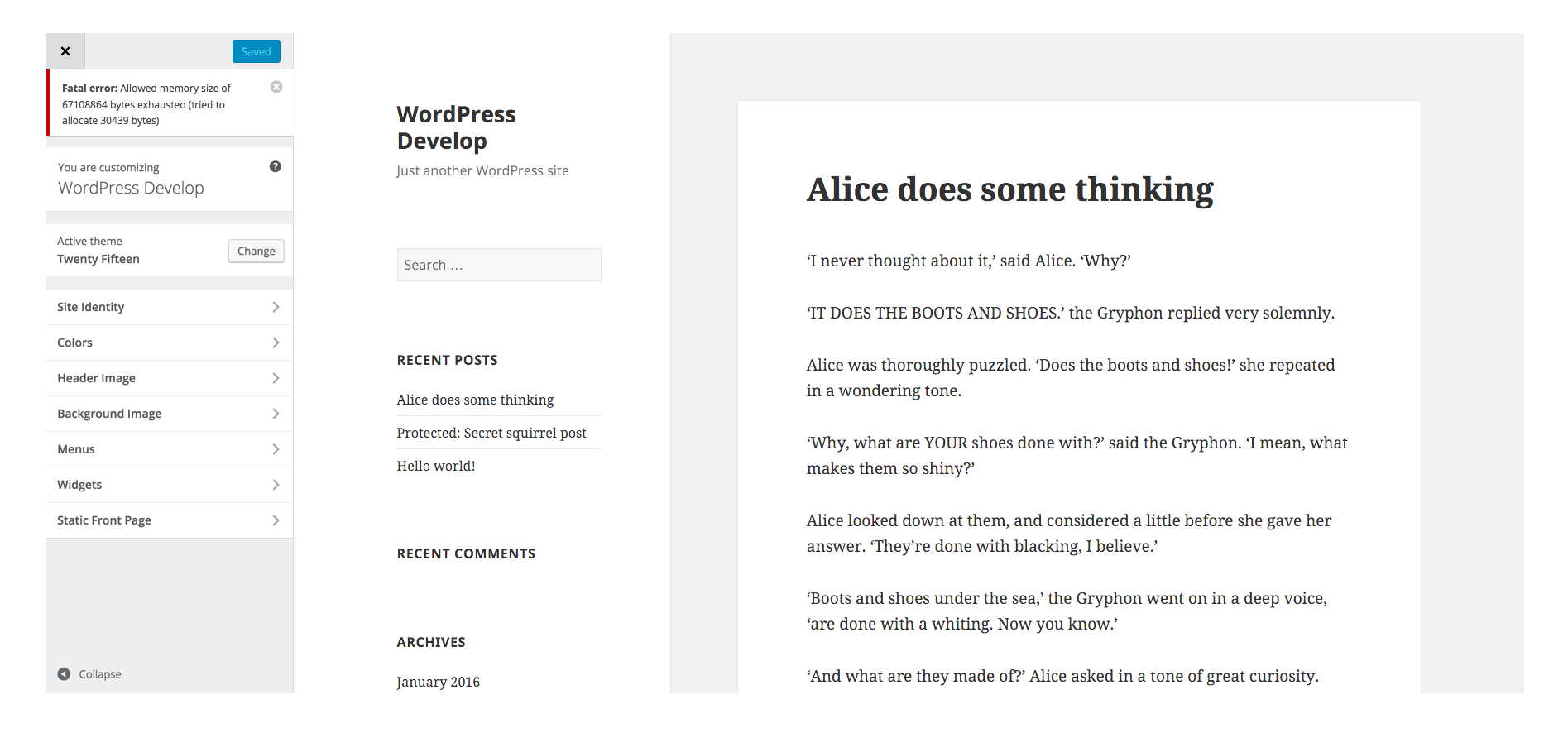
Fatal error: Allowed memory size of 67108864 bytes exhausted (tried to allocate 30439 bytes)
Or in #34893:
There are 4 invalid fields. Correct them and try saving again.
Or with #34923:
You inserted 3 page stubs which you can now finish authoring: Lorem Ipsum, Foo Bar Baz, Hello World.
Or with #29932:
The uploads directory is not writable.
#11
in reply to:
↑ 7
;
follow-up:
↓ 12
 @
@
4 years ago
Replying to karmatosed:
I've done a few mockups. I played around with how the notifications would stack. For this example I took the coloured notifications to make it obvious. […] As far as stacking goes, I found that the arrows just didn't look great, so I have for now shown it with a scrollbar here […] Potentially we could use existing pagination patterns such as pages and posts, but I feel this may be overkill and the simple scroll potentially works. Would probably be something to test actually in code.
These are looking good. What about a mock for mobile?
Should these be pushing the preview down or should they overlay the preview? If the width of the notification weren't full-width, such as Android notifications, then this would make more sense to overlay the preview as opposed to shifting down the preview to make room for the notification.
#12
in reply to:
↑ 11
;
follow-up:
↓ 13
 @
@
4 years ago
Replying to westonruter:
Should these be pushing the preview down or should they overlay the preview? If the width of the notification weren't full-width, such as Android notifications, then this would make more sense to overlay the preview as opposed to shifting down the preview to make room for the notification.
If they push down rather than overlay we may run into problems with themes that use fixed or absolute positioning.
Additionally, are we sure we want these to appear in the preview panel? These are responses to the user; to actions taken. These actions originated in the Customizer panel, with a button click typically. I'd think the response should be there.
#13
in reply to:
↑ 12
 @
@
4 years ago
Replying to Kelderic:
If they push down rather than overlay we may run into problems with themes that use fixed or absolute positioning.
Additionally, are we sure we want these to appear in the preview panel? These are responses to the user; to actions taken. These actions originated in the Customizer panel, with a button click typically. I'd think the response should be there.
Great points. I only suggested having the notifications appear over the preview for the sake of the real estate. But notifications wouldn't be suitable here for mobile anyway, so I suppose everything should be designed to appear in the left Customizer pane regardless.
#14
 @
@
4 years ago
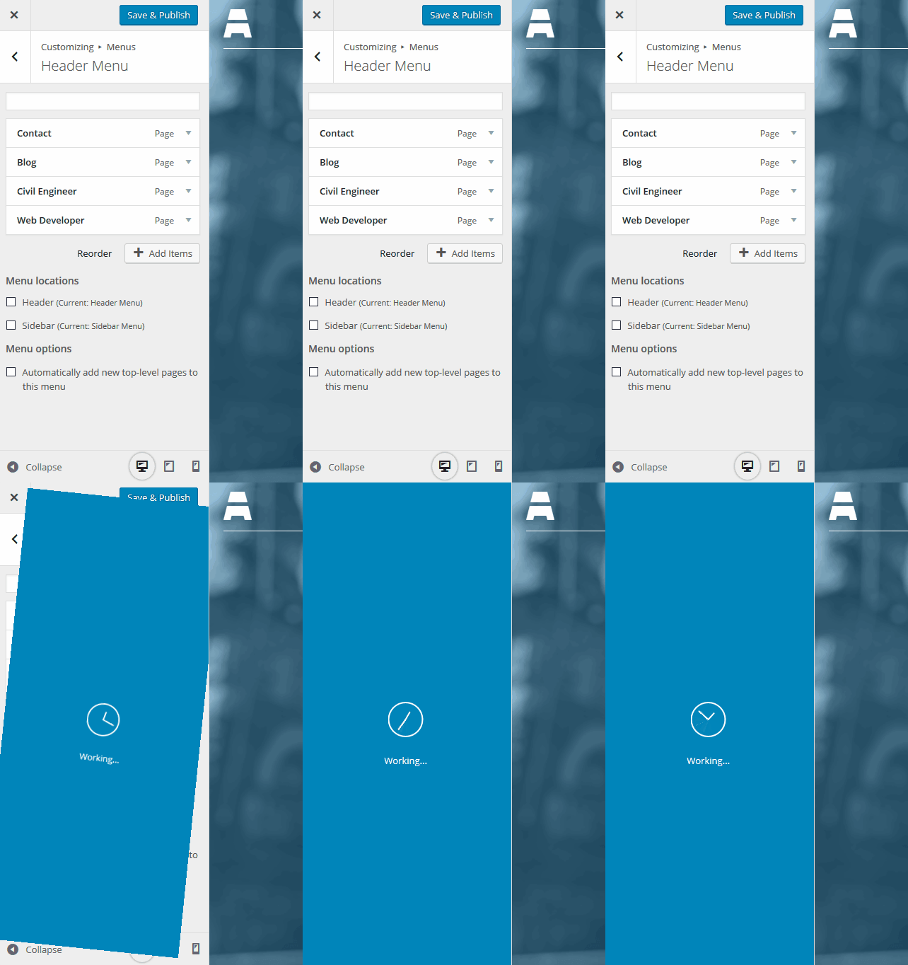
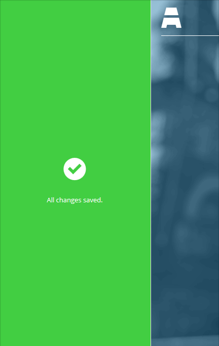
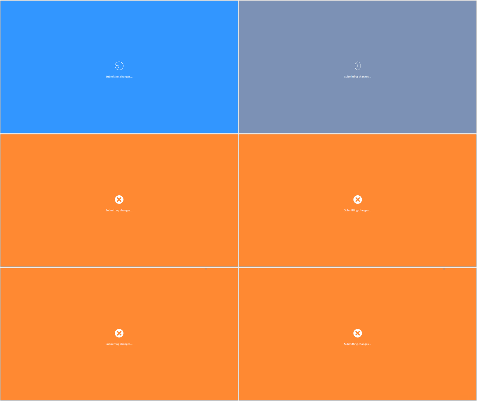
Here are some very quick/rough mockups of a possible response to user method. The first image happens after a user clicks the Save button.
Second image is the state after changes are successfully saved. Now shown would be the color fading to new color, and the icon maybe doing a 3D flip, or something.
Third is for error messages, if there was a problem. Instead of fading to green, fade to orange or red. Show error messages, maybe for 5 seconds, then fade out, with a X at top to remove overlay faster.
#16
 @
@
4 years ago
@Kelderic These are pretty cool and innovative, but I think there too obtrusive and not in-line with WordPress's design patterns (caveat: I'm not a designer). I think the notifications should stay out of the way as much as possible, but also notbe easy to miss.
#17
follow-up:
↓ 18
 @
@
4 years ago
Not to mention the WordPress admin still officially supports IE 8 :)
#18
in reply to:
↑ 17
;
follow-up:
↓ 19
 @
@
4 years ago
Replying to afercia:
Not to mention the WordPress admin still officially supports IE 8 :)
We support it for Admin areas?

This ticket was mentioned in Slack in #core by westonruter. View the logs.
4 years ago
#21
follow-up:
↓ 22
 @
@
4 years ago
@Kelderic I appreciate what you are suggesting, however I think we are best to stick to conventions and usability, performance issues with what you are suggesting. I'm not convinced a entire section cover is apt for notifications. A notification doesn't need the entire section taken control of. Those are quite some impact visually. Adding an entire layer like that with animation too adds weight I don't think we need performance wise for notifications. It's worth noting we should not take away from the user experience with regards to that along with keep to conventions.
@westonruter let me take an exploration into what having everything in the panel would be like. I think that's an interesting idea. I'll explore and pop up tomorrow something.
#22
in reply to:
↑ 21
;
follow-up:
↓ 24
 @
@
4 years ago
Replying to karmatosed:
@Kelderic I appreciate what you are suggesting, however I think we are best to stick to conventions and usability, performance issues with what you are suggesting. I'm not convinced a entire section cover is apt for notifications. A notification doesn't need the entire section taken control of. Those are quite some impact visually. Adding an entire layer like that with animation too adds weight I don't think we need performance wise for notifications. It's worth noting we should not take away from the user experience with regards to that along with keep to conventions.
I agree that taking up the entire panel might be a bit much, but I think we need to remember that in the event of an error occurring with saving, then that error message is now the primary content on the page. It should catch the eye and be unable to miss. This isn't as important with a success message (probably don't really even need one, not sure), but with an error it can be critical.
Plus we want to respond to the user and prevent further changes while the submitting changes are being processed. An overlay does that, but it's also very obtrusive, and processing feedback isn't as critical as error feedback is.
(The performance impact of transform is relatively minor, as is the performance impact of opacity, since neither requires a browser repaint.)
What about using the button itself as feedback? Instead of just changing color, it could first change to a disabled state, and then change to a green or orange state, for success or error, with the error tied then to a message.
#23
follow-up:
↓ 25
 @
@
4 years ago
Here is a mockup of a potential less obtrusive error message. Slide down from above. They could theoretically stack, and probably have an X in top right corner of each for quick dismissal.
This can be done with transition and transform, to avoid performance issues on IE10 and above, and use JS to animate downward for older browsers.
#24
in reply to:
↑ 22
 @
@
4 years ago
What about using the button itself as feedback? Instead of just changing color, it could first change to a disabled state, and then change to a green or orange state, for success or error, with the error tied then to a message.
That assumes that it's an error to do with the button. It perhaps isn't. What we are looking for is a place that any notification can go and is seen as the 'one area'. I also think we shouldn't just rely on colours for the notifications. That's not a great accessibility take.
#25
in reply to:
↑ 23
 @
@
4 years ago
Thanks for the mockup. I'm not convinced that placing over the top is the best place. Also the heavy drop shadow isn't consistent with styling in the admin.
This can be done with transition and transform, to avoid performance issues on IE10 and above, and use JS to animate downward for older browsers.
I'd stick with CSS and then just have no animation on older browser. The animation is a flourish not a requirement in this case.
#26
follow-ups:
↓ 27
↓ 28
 @
@
4 years ago
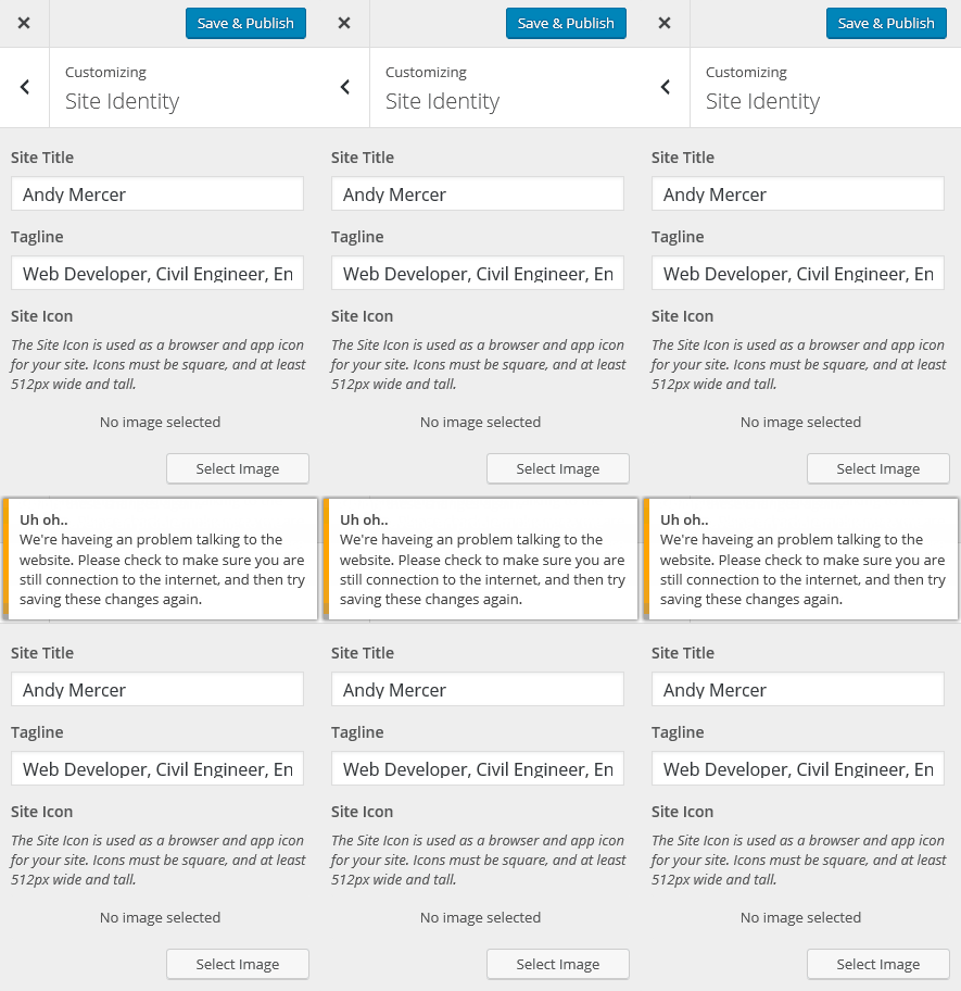
I think it's important to first think and settle on the display area then they things like animation. So, I've done a quick mock with context of the customizer here and used one of the errors you mentioned @westonruter:
This uses the on non-white styling for the notification rather than the white background full color. By placing it here, the space is
#27
in reply to:
↑ 26
 @
@
4 years ago
Replying to karmatosed:
Not a designer but consistency is important so this mockup is the one that makes more sense to me. Also, was thinking that all the notices&warnings should be wp.a11y.speak()'ized :)
#28
in reply to:
↑ 26
 @
@
4 years ago
Replying to karmatosed:
I think it's important to first think and settle on the display area then they things like animation. So, I've done a quick mock with context of the customizer here and used one of the errors you mentioned:
Yes, this placement is better. My only concern is that technically this would mean the notification is appearing inside the root panel, and so if you are nested down inside of a panel and section, you wouldn't see it. What about if the notification area were added to #customize-header-actions instead, so in this mock the message would appear between the row that has the Close and Saved buttons, and the element that says “You are customizing”.
#30
 @
@
4 years ago
@karmatosed I like that a lot. Any thoughts on how we'd handle stacking multiple notifications?
#31
follow-up:
↓ 35
 @
@
4 years ago
@westonruter I think it would have to have a scroller. It's not a great option but unless we add a new UI pattern that's the best existing one. We could explore new ones, but I'm not sure in that small a space it would work.
We need to consider how many times more than 3 would appear. If not so common and most cases it would be one, then we can have the scroll without too much pain interface wise.
#32
 @
@
4 years ago
In the general case, I believe, there would only be one notification displayed at a time. So I think we should design for that in mind. Having a fixed height for the notification area will simplify the logic for getting the panels to be positioned properly, although this would be less of a concern with #34391 implemented.
If there are three notifications, but only one displayed at a time, would we utilize the native browser scrollbar to see them all? Or would there be up/down buttons to cycle through the notifications if there is more than one?
#34
 @
@
4 years ago
@westonruter I'd probably go with scroll rather than arrows.
@Kelderic I on purpose put no gap to make sure the eye catches it. There isn't a pattern that says it should have padding. Without it's less obvious and could merge into the other content.
#36
 @
@
4 years ago
…and ideally the JS logic to add a notification to the area, and to remove a notification area (via clicking the X).
#39
follow-up:
↓ 40
 @
@
4 years ago
What about a case when user is modifying some field that is 'below the fold' (the Customizer pane has been scrolled down) and a notification is displayed? Should the pane scroll back automatically to the very top in order to show the error message? In such case the control that caused the error would get out of the screen and the message would have no 'context'.
Even in case of editing field that is above the fold, new notification would push the whole content down. It could be confusing to the user.
What about having the notification area fixed to the bottom border of the header-action bar? It would be displayed over the content and visible no matter how 'far' the user has scrolled the pane. In case the pane is in its initial position (has not been scrolled), the content area would be pushed down to make space for the notifications. It would work pretty much the same as now the header-actions bar does.
Due to limited screen real-estate the notification area wouldn't be fixed for mobile/small screens.
#40
in reply to:
↑ 39
 @
@
4 years ago
Replying to delawski:
What about having the notification area fixed to the bottom border of the header-action bar? It would be displayed over the content and visible no matter how 'far' the user has scrolled the pane. In case the pane is in its initial position (has not been scrolled), the content area would be pushed down to make space for the notifications. It would work pretty much the same as now the header-actions bar does.
Due to limited screen real-estate the notification area wouldn't be fixed for mobile/small screens.
+1

This ticket was mentioned in Slack in #core by mike. View the logs.
4 years ago
#42
follow-up:
↓ 43
 @
@
4 years ago
I'd be really happy to work on this ticket, at least UI part. Still, I have to first complete work on #34391 that may have some impact on this ticket.
What are your opinions on my suggestion in previous comment:
What about having the notification area fixed to the bottom border of the header-action bar? It would be displayed over the content and visible no matter how 'far' the user has scrolled the pane. In case the pane is in its initial position (has not been scrolled), the content area would be pushed down to make space for the notifications. It would work pretty much the same as now the header-actions bar does.
Due to limited screen real-estate the notification area wouldn't be fixed for mobile/small screens.
#43
in reply to:
↑ 42
 @
@
4 years ago
Replying to delawski:
What are your opinions on my suggestion in previous comment:
I agree with your suggestion. I gave it a +1.
#44
 @
@
4 years ago
So yeah, if anyone can submit an initial patch before @delawski gets a chance, that would be great.

This ticket was mentioned in Slack in #core by westonruter. View the logs.
4 years ago
#46
 @
@
4 years ago
I'll work up a patch this weekend unless someone else gets to it before then. I'm thinking that we may need to make it an expandable section that opens from a fixed bar, so that it can contain multiple distinct notices without taking up too much space. We should also only use it for things that really need a notice (such as save errors, or links to edit new pages), since users would need to manually dismiss notices.
#47
 @
@
4 years ago
I would be happy to help on this ticket.
35210.patch is a first try to include a hard-coded notice in the customizer header-action panel. I followed @delawski suggestion to put it just bellow the save and exit buttons, but I thought it would be better to push the content down a little bit so that the notification does not hide the content. Is that OK, or do you prefer to have it displayed on top of the content ?
For the moment, I have not implemented the logic to close the notification.
#48
 @
@
4 years ago
- Milestone changed from 4.5 to Future Release
Punting to next release per discussion with @westonruter

This ticket was mentioned in Slack in #design by melchoyce. View the logs.
4 years ago
#51
follow-up:
↓ 52
 @
@
4 years ago
I made a second version of my patch with the following enhancements :
- the notification is displayed on top of other informations
- several notifications can be stacked
- the notification is inserted dynamically into the DOM with the help of a JS template
- the error message is generated on the server in PHP, and send back to the customizer to be displayed
- a test notification can be triggered by selecting the "test error notification" panel, entering a custom error message and saving.
Could anyone test this patch and see if something is missing ?
The next step is to use this mechanism to display real life errors. Does anyone knows an easily reproductible error that could be displayed this way ?
#52
in reply to:
↑ 51
 @
@
4 years ago
Replying to Fab1en:
I made a second version of my patch with the following enhancements :
Hi @Fab1en thanks for your patch. I applied the patch and see the error testing section, however I never got it to actually show the errors? Do I need more than your most recent patch?
#53
 @
@
4 years ago
@adamsilverstein : if everything works as expected, you have to click on the section to show the panel, enter some text into the input field and hit the "save" button. The error notification should appear with the text you entered as error message.
#55
follow-up:
↓ 57
 @
@
4 years ago
I updated the patch against the latest trunk, and I modified it to avoid using anonymous PHP function, that are not supported before PHP 5.3, in the testing part of the code.
The issue could also come form the JavaScript : I have set define('SCRIPT_DEBUG', true); in the wp-config.php file to use non-minified js files.
@adamsilverstein : Could you please test again and, if it's still not working, see if there are any message displayed in the JavaScript console ? Another interesting information would be to see the content of the response to the request sent when the save button is pushed.
#57
in reply to:
↑ 55
 @
@
4 years ago
Thank you for the contributions @Fab1en . I'll try to get this tested on top of the recently launched 4.5 and see how it goes.

This ticket was mentioned in Slack in #core-customize by celloexpressions. View the logs.
4 years ago
#59
 @
@
4 years ago
- Priority changed from normal to high
There are several tickets dependent on this that are targeting 4.6.
#60
 @
@
4 years ago
In terms of the JavaScript API, I think it should be closely aligned with control-level notifications (#34893, #29932). The global notification and the control-level notification could both have instances of a NotificationCollection that contains instances of NotificationModel, where the model contains message and type (whether an error or a notice). The global notification and the control-level notification should both render the notification message(s) in response to changes to their respective NotificationCollection.

This ticket was mentioned in Slack in #core by westonruter. View the logs.
4 years ago
#62
 @
@
4 years ago
See the wp.customize.Notification object as I've proposed in a patch at https://core.trac.wordpress.org/ticket/34893#comment:24
 @
@
4 years ago
Potential UI for a summary of per-control notifications, and for notifications in a less obtrusive location (has advantages and disadvantages). See #34893.

This ticket was mentioned in Slack in #core by celloexpressions. View the logs.
4 years ago

This ticket was mentioned in Slack in #design by celloexpressions. View the logs.
4 years ago
#66
 @
@
4 years ago
- Milestone changed from 4.6 to Future Release
Punting due to transactions being too large to finish patch and test in time for 4.6.
#68
 @
@
4 years ago
- Keywords ui-feedback ux-feedback added
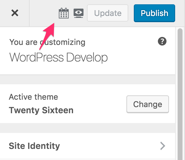
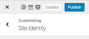
I've been giving the idea of the global notification are some more thought. We recently had to create a similar UI element in the Customize Snapshots plugin to show a dialog for providing the date that the customizer settings should be applied. Due to the way that the panels and sections are laid out (hopefully revamped in #34391), it was very challenging to introduce a new element that shifted down the existing customizer UI (the list of panels, sections, or controls). So what we ended up doing is introduce a new icon in the toolbar that when clicked would slide-down a panel for showing that scheduling UI:
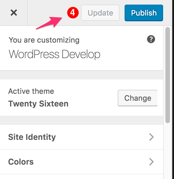
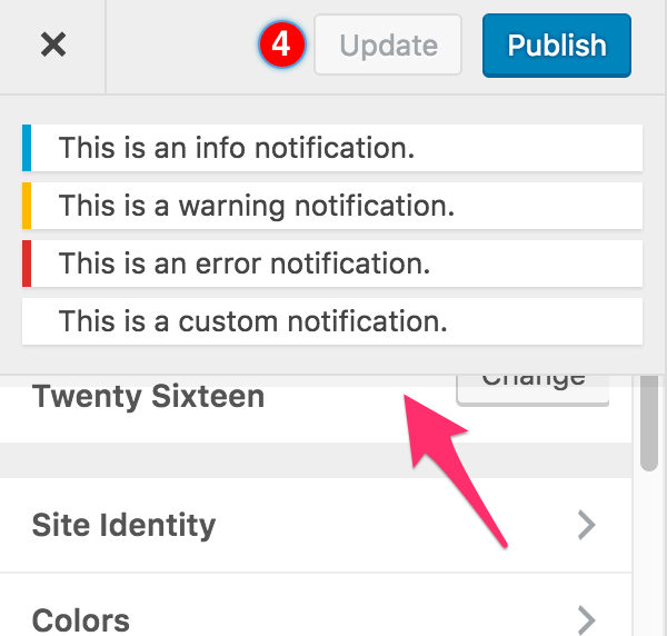
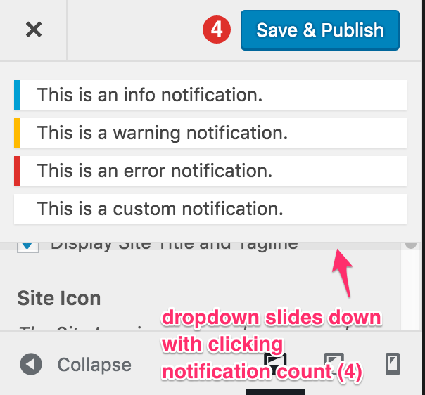
What if we took the same approach for notifications? What if the icon only appeared when there were notifications to display? What if the icon was a red circle with a white number inside, as is very familiar today as an indicator of a certain number of updates?
Here is a video depicting the interaction: https://youtu.be/16Fb3lwtekc
When a notification first is added, and the number increments, the notification bar could expand for a second and then re-collapse, in a similar way that Android and iOS show new notifications momentarily and then collapse them for you to then look at again later.
Thoughts?

This ticket was mentioned in Slack in #design by westonruter. View the logs.
4 years ago
#72
 @
@
4 years ago
I will admit my initial reaction is against a notification blob like this. I feel that area is rapidly going to become busy and have visual issues because of that. I also think people assume it's something in WordPress we're not using it for. This is for information, notes - not for personal notifications or comments.
I would like to see this approach user tested though to ensure we find out if it's the right move, my feelings are it's not. I am though against putting "all the things in the header", like this with icons though.
Could we not also return to the original styling of the notifications? I feel we'd got quite far with that and it seems a shame to revert to something with line height and other format issues.
#73
 @
@
4 years ago
@karmatosed there isn't a style for this yet. This global notifications area would link to the different settings that have notifications (added in 4.6), which becomes necessary once there are multiple.
I think the biggest problem here is the clutter introduced by the snapshots UI; without that, the concept of an icon or notification bubble of some sort will be the best solution, and it should open in a slide-down section like that. The notifications should be dismiss-able from here (especially for warnings and info), and they should have the same padding and margins as they do elsewhere - they're too condensed in the screenshots above. The color probably shouldn't be red, at least not that red. Rather, we'll want to match an existing color and possibly key to the notification color in color schemes. Another option could be to pair the count with a notification icon of some sort and use the secondary button style (or similar) for them grouped together.
In terms of the snapshots UI, I'm envisioning we'll do a split button on the save & publish button, with an arrow icon on the right that pulls down a section with all of the snapshots-related functionality (including the save/update button) to keep the top level simple and reduce the use of icons. On a side note, the background color of the drop-section should be #eee, not white, as it is in the notifications screenshot.
#74
 @
@
4 years ago
@karmatosed @celloexpressions right, the exact styling of the notifications I have in my screenshot was not refined. It was just a proof of concept. Also, I didn't intend for the UI in Customize Snapshots to muddy things; the icons for scheduling and frontend preview wouldn't be in play here. So please disregard anything about snapshots, other than to note the approach for how the scheduling UI was developed as a slide-down panel which appears when clicking an icon that appears next to the Save & Publish button.

This ticket was mentioned in Slack in #core-customize by celloexpressions. View the logs.
4 years ago
#76
 @
@
4 years ago
Closely related: #37727 (Allow for customize control notifications to have extensible templates)
#78
 @
@
4 years ago
@westonruter ah, ok. Yeah it did muddy a little when trying to judge. I'll admit it's tricky to pull apart. Can we maybe even have a sketch of what is being suggested? Away from the complexity we have now? I want to judge it on what is being suggested away from noise.
#79
 @
@
4 years ago
Putting aside the creepy eye icon and whatever the calendar icon are (I had no idea until I read "Snapshots" and "Scheduling UI" what they would be, and even now I'm not sure what either of those things means, and in any rate neither should be the focus of this ticket)...
How often are you going to receive that many Customizer errors? This seems like overkill.
I also think people assume it's something in WordPress we're not using it for. This is for information, notes - not for personal notifications or comments.
I agree. Using a bubble like that makes it seem like the user is receiving a notification. "Oh, maybe if I click this I'll see my recent comments on my posts? Oh, nope, that's something I don't understand, let me never click this again." This is the wrong metaphor for this kind of interface, which adds an extra layer of confusion.
I also think that we should be focusing on putting errors within the context of whatever is going wrong. Errors are more helpful when displayed inline with whatever feature caused the error. If it's a feature-independent error, I can see displaying it at the top of the Customizer, like in 35, but we should be striving to bring clarity to errors and providing suggestions to fix those errors.
#80
 @
@
4 years ago
This is primarily needed for general errors that aren't tied to a particular setting. Additionally, setting-specific errors would also be displayed here and linked to the corresponding setting, so that clicking on the notification will provide context. If there are multiple save-blocking errors, with out this you'd have to search through all of the sections to find the other errors. It's important to note that the indicator would only be visible when there are multiple notifications (single notifications are autofocused when you try saving), and it could potentially only be visible when there are errors as well.
The benefit to having the notifications toggle open is that we can also collect info and warning (and custom) notifications here so that users can more easily navigate to the settings with issues. If they display at the top (which isn't actually possible with our current CSS and JS), we'd only show errors there.
What can we do in terms of UI to make an indicator next to the save button that indicates that there are errors to address rather than seeming like notifications such as comments?
#81
follow-up:
↓ 82
 @
@
4 years ago
@melchoyce
Putting aside the creepy eye icon and whatever the calendar icon are (I had no idea until I read "Snapshots" and "Scheduling UI" what they would be, and even now I'm not sure what either of those things means, and in any rate neither should be the focus of this ticket)...
Again, sorry to muddy things here. I should have made these mocks/screenshots from a pristine environment. Here's another:
How often are you going to receive that many Customizer errors? This seems like overkill.
A few situations where global notifications make sense to me:
- When the customizer preview fails to refresh due to a network connectivity error, a notification should be displayed.
- When the server returns with a fatal error when refreshing the preview, there should be a notification instead of failing silently. See #29932 and #31582.
- When attempting to Save & Publish settings and they are rejected due to validation constraints, in addition to there being a notification displayed with the control related to the invalid setting, there could be a global notification as well to make it clear that there was an error overall on saving the changes: “Unable to save due to invalid settings”.
Again, as @celloexpressions noted, these errors are not necessarily related to a specific control and so the notifications aren't suitable to be displayed in a control's notifications area.
I agree. Using a bubble like that makes it seem like the user is receiving a notification. "Oh, maybe if I click this I'll see my recent comments on my posts? Oh, nope, that's something I don't understand, let me never click this again." This is the wrong metaphor for this kind of interface, which adds an extra layer of confusion.
The red disk with a white number in it seems like a common way to show notifications (e.g. Facebook, iOS icon overlays). I'm not sure it would be confused with comments because the styling of the post comments count (.post-com-count) distinctly has a speech bubble “tail”:
Nevertheless, the Jetpack notifications icon (#wpnt-notes-unread-count) in the admin bar also looks like a comments count speech bubble icon, and yet it includes notifications other than comments (e.g. booming stats, number of likes, new followers, etc):
#82
in reply to:
↑ 81
 @
@
4 years ago
Replying to westonruter:
From an accessibility perspective, I'm more concerned about the order of elements in the markup. Ideally, the control that toggles the notifications list should be immediately followed by the... notifications list, meaning there should be no other elements in between.
I'd also recommend to consider a long standing issue in this top part of the Customizer sidebar, again about the order of controls in the source which is:
- Save (& Publish) button
- Preview/Customize toggle (only in the responsive view)
- Close X link (this one receives the initial focus)
Since the initial focus goes to the X link, the notification red circle would be "skipped" for keyboard and screen reader users and very hard to find. Currently, this happens with the Save button. Users need to tab backwards in order to find it, but their starting point is the X link so why they should even think they have to do so? I'd agree this is related but also a separate issue and should probably go in a separate ticket :)
Other minor things for accessibility would be using aria-label and aria-expanded on the toggle control (and it needs to be a button), these are not a big deal I guess.
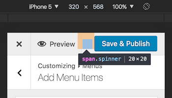
Lastly, I'd recommend to carefully consider if there's enough available space. Especially in the responsive view, where the Preview/Customize toggle appears, and considering translations could use longer strings, I'm not so sure there's enough space. There's also a spinner there :)

This ticket was mentioned in Slack in #design by karmatosed. View the logs.
4 years ago

This ticket was mentioned in Slack in #core-customize by celloexpressions. View the logs.
4 years ago

This ticket was mentioned in Slack in #core-customize by celloexpressions. View the logs.
4 years ago

This ticket was mentioned in Slack in #core by westonruter. View the logs.
4 years ago

This ticket was mentioned in Slack in #design by hugobaeta. View the logs.
4 years ago

This ticket was mentioned in Slack in #core-customize by celloexpressions. View the logs.
4 years ago

This ticket was mentioned in Slack in #core-customize by celloexpressions. View the logs.
4 years ago

This ticket was mentioned in Slack in #core-customize by celloexpressions. View the logs.
4 years ago
#91
 @
@
4 years ago
- Owner set to westonruter
- Status changed from new to assigned
Assigning for now for traacking, but if anyone has time to patch this, please go ahead and start working on it.

This ticket was mentioned in Slack in #core-customize by celloexpressions. View the logs.
4 years ago
#93
 @
@
4 years ago
- Owner changed from westonruter to delawski
@delawski will try to work on this for now.

This ticket was mentioned in Slack in #core-customize by celloexpressions. View the logs.
4 years ago

This ticket was mentioned in Slack in #core by jeffpaul. View the logs.
4 years ago

This ticket was mentioned in Slack in #core-customize by celloexpressions. View the logs.
4 years ago
#97
 @
@
4 years ago
We still need a patch, so punting for now. @delawski if you have time to work on this in time for 4.8 it would be good to get it in early.

This ticket was mentioned in Slack in #core-customize by delawski. View the logs.
4 years ago

This ticket was mentioned in Slack in #core by celloexpressions. View the logs.
4 years ago
#101
 @
@
3 years ago
I've attached a patch to the ticket which implements global notifications area. You can see the changes on the GitHub too:
https://github.com/xwp/wordpress-develop/pull/180/files
If you'd like to test it out locally, here's the JS snippet you can use in your console in order to generate several notifications:
_( [ 'none', 'error', 'warning', 'info', 'success' ] ).each( function( code ) {
  wp.customize.notifications.add( code, new wp.customize.Notification( code, {
    isDismissible: true,
    message: code.toUpperCase() + ': this is sample ' + code + ' message.',
    type: code,
    code: code
  } ) );
} );
The patch is reusing templates and styling of control-specific notifications and other existing elements in WordPress.
@westonruter and @celloexpressions - can you have a look maybe after 4.7 is released?
#103
 @
@
3 years ago
- Owner changed from delawski to westonruter
- Status changed from assigned to reviewing
#104
 @
@
3 years ago
I thought we decided to try making this toggleable and stuck under the header, per https://core.trac.wordpress.org/raw-attachment/ticket/35210/rough-global-notifications-mock.png?
#105
 @
@
3 years ago
@celloexpressions - Actually I don't know why I've sticked to the @karmatosed mockup. Most likely because of the discussion around the overall (potential) clutter in the top bar and the fact that the global notifications area should be displayed straight away and not being hidden behind an icon.
I believe it'd be a good idea to have you and maybe someone from the Design team to take a look at the current implementation. We could hopefully come up to the final solution based on the work that's already done.
#106
 @
@
3 years ago
We can discuss this in our weekly meeting. Any design change would need to be looked at by us. I'm on that team and got this ping as you mentioned me @delawski :)
#107
 @
@
3 years ago
Yes, let's discuss today. We had previously decided to re-evaluate the more recent iteration once there's a patch; my biggest concern is that putting them up here is fairly intrusive, especially for info and success notifications. If we went this route we'd probably only want to show errors or explicitly global notifications here, instead of aggregating all notifications in one place.
#108
 @
@
3 years ago
See also #38794 which suggests adding the ability to show notifications in panels and sections, just like controls can.
#110
 @
@
3 years ago
This still needs to be resolved; my understanding was that the general approach should be https://core.trac.wordpress.org/raw-attachment/ticket/35210/rough-global-notifications-mock.png but that it needs design refinement, particularly for what the notification bubble should look like/where it should be.

This ticket was mentioned in Slack in #core-customize by westonruter. View the logs.
3 years ago
#113
follow-up:
↓ 114
 @
@
3 years ago
- Milestone changed from Future Release to 4.8
Moving to 4.8 milestone due to dependency on #39896 per melchoyce:
Replying to westonruter:
So, is this then a clear use case for the global notification area (#35210)?
Yeah, I think it is. I went with @karmatosed's design proposal from ticket:35210#comment:26 because I still find it the most simple and clear version.
@melchoyce @karmatosed It is simple, but two questions:
- What about when a user is not at the root of the customizer but instead has a panel open? Will the notification area just not be visible in that case?
- What if there is more than one notification needing to be displayed? Or would we only allow one to be displayed at a time? Or if there are multiple, would they just stack vertically?
#114
in reply to:
↑ 113
 @
@
3 years ago
@westonruter Chatted with @karmatosed and we agree:
What about when a user is not at the root of the customizer but instead has a panel open? Will the notification area just not be visible in that case?
We'd continue showing them at the top of the Customizer, until dismissed (or fixed).
What if there is more than one notification needing to be displayed? Or would we only allow one to be displayed at a time? Or if there are multiple, would they just stack vertically?
Stack all of them vertically.
#115
 @
@
3 years ago
- Keywords needs-patch added; ui-feedback ux-feedback has-patch removed
Ready for dev.
For the API, I suggest that we introduce wp.customize.notifications which is a of wp.customize.Values (collection) instance of wp.customize.Notifications. This would mirror what is added to controls and settings. When this collection changes, the notifications should be re-rendered just as they are done on controls.
There should be an opportunity to factor out the current code from controls to some utils namespace to re-use between control notifications and root notifications, while also allowing the code to be re-used for implementing notifications on panels and sections (see #38794). For some sample code, see:
- https://github.com/xwp/wp-customize-featured-content-demo/blob/8bf4d65/js/featured-items-panel.js#L45
- https://github.com/xwp/wp-customize-featured-content-demo/blob/8bf4d65/js/featured-items-panel.js#L69-L116
- https://github.com/xwp/wp-customize-featured-content-demo/blob/c748adf/php/class-featured-items-customize-panel.php#L47-L63
#116
 @
@
3 years ago
Patch for the global notifications can also include the panel/section-specific notifications from #38794. Since they should re-use the same code, implementing the notifications for root, panels, and sections together will ensure that the right abstractions are implemented. As part of this, #37727 should also be considered.

This ticket was mentioned in Slack in #core-customize by westonruter. View the logs.
3 years ago

This ticket was mentioned in Slack in #core by jeffpaul. View the logs.
3 years ago

This ticket was mentioned in Slack in #core by jeffpaul. View the logs.
3 years ago

This ticket was mentioned in Slack in #core-customize by joshuawold. View the logs.
3 years ago
#124
 @
@
3 years ago
- Keywords has-patch added; needs-patch removed
I'm finally picking this up again, as we need it for #39896 among other tickets. @delawski you did great work. I'm going to try to finish up the patch for committing tomorrow.
I've left several comments on the pull request with things that I'm going to work on next for this: https://github.com/xwp/wordpress-develop/pull/180
I'm also including #37727 in the scope for this because we will indeed need notifications that have custom behaviors, like links and buttons for accepting or dismissing autosaved changesets.
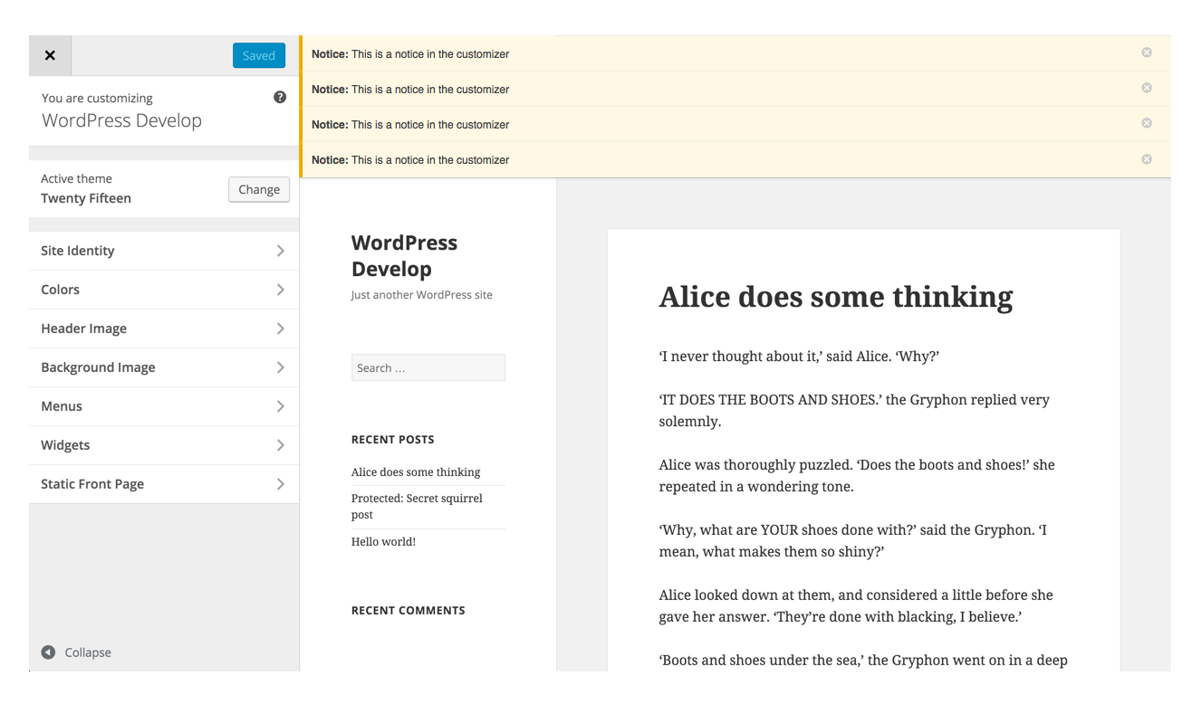
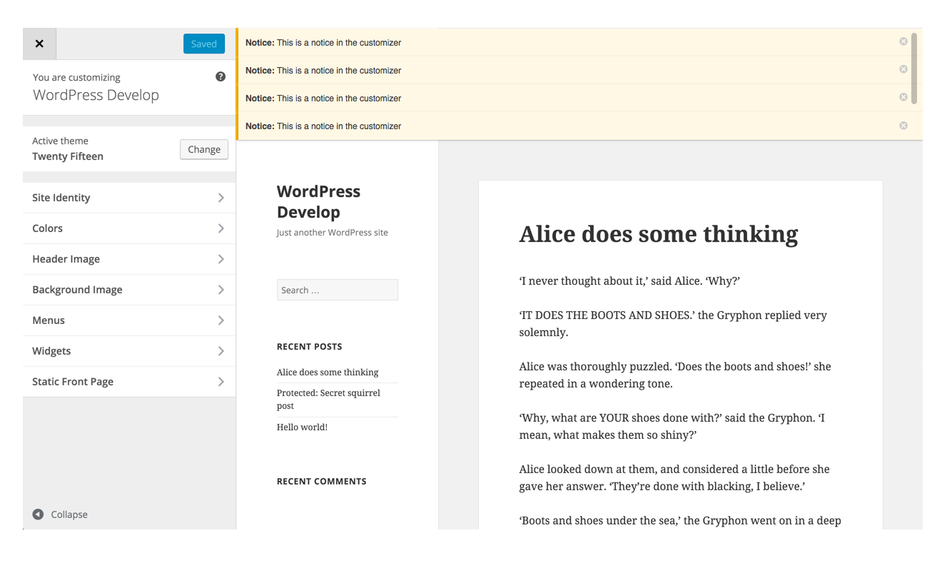
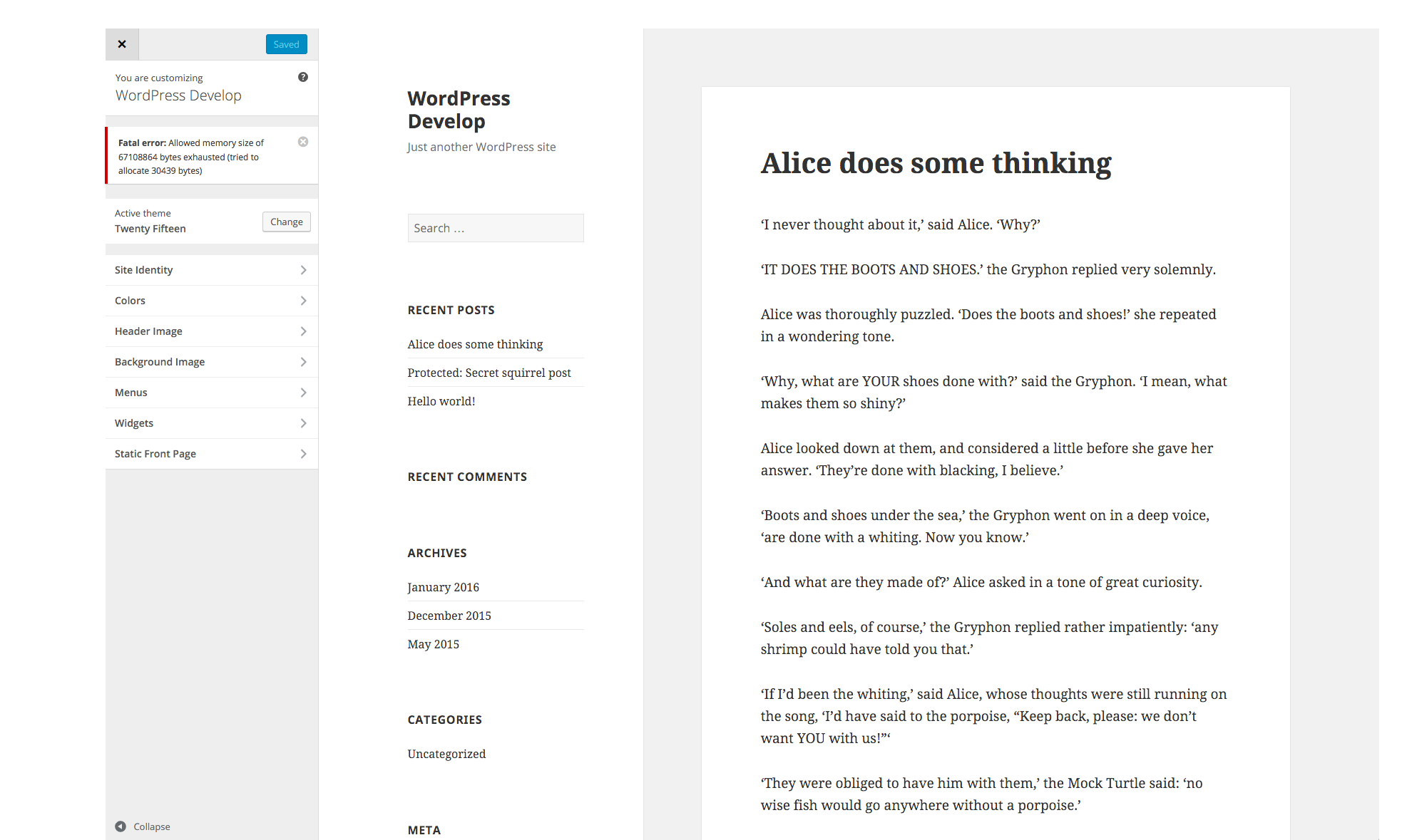



Notification bar can appear above preview, either shifting down the preview or appearing over the preview. It would need to appear somewhere else on mobile, however, perhaps appearing below the Save & Publish header row.