#41316 closed task (blessed) (fixed)
Introduce "Try Gutenberg" callout
| Reported by: |
|
Owned by: |
|
|---|---|---|---|
| Milestone: | 4.9.8 | Priority: | normal |
| Severity: | normal | Version: | |
| Component: | Editor | Keywords: | has-patch has-screenshots |
| Focuses: | administration, privacy | Cc: |
Description
At the WordPress Community Summit, we talked about getting more eyes on Gutenberg early by introducing it as a beta feature for folks to test out before being officially released. This could be some kind of pointer or notice in your dashboard with a link to install the plugin, and also a link to https://make.wordpress.org/test/handbook/call-for-testing/gutenberg-testing/ (or similar site).
cc @matveb and @joen
Attachments (51)
Change History (238)

This ticket was mentioned in Slack in #core-editor by melchoyce. View the logs.
3 years ago
#5
in reply to:
↑ 4
 @
@
3 years ago
Replying to melchoyce:
@joen Is it too soon to include this in 4.8.1?
I do feel like we are already receiving a large amount of feedback, more than we can react to quickly. It'd be nice to at least reach 1.0 in 4ish weeks time, before we widen the circle. But I've no _strong_ objection.
#6
 @
@
3 years ago
Without being actively involved in Gutenberg development, it seems like it is nowhere near a state where we should actively encourage users to try it out on live sites (which we do by adding any information in core for non-development builds). Before we can do that, it should at minimum be presented as the primary editing experience when the plugin is active.
More importantly, we cannot encourage people to use it on live sites until development is at a stage where core (not just the Gutenberg team) can commit to 100% backwards compatibility moving forward. Without that, any content created with Gutenberg is at some risk of being degraded over time, and therefore, it cannot be used on live sites.
I'm not sure what the 1.0 version is intended to signify (it would be great if a roadmap of some sort were publicly communicated via make/core and other means), but my passing observation is that that seems to still be pre-beta based on the current state of activity and progress. That's good, and the project deserves time to mature, but it realistically should not be promoted as an encouraged plugin to install on every live site until it's at more of a "release candidate" stage ready for final feedback and core merge consideration. I'd think that being more successful as a regular plugin in terms of reviews and being able to promote itself for use on real sites would be a good prerequisite to anything in core to promote more-widespread testing (see attached).
 @
@
3 years ago
Current plugin card for Gutenberg, showing very mixed reviews and a warning not to use it on real sites.
#7
 @
@
3 years ago
From some Slack convos, it sounds like @Joen doesn't want to show this until 4.9 at the earliest, to address some of those issues 👍

This ticket was mentioned in Slack in #core-editor by melchoyce. View the logs.
3 years ago
#12
 @
@
3 years ago
A secondary button, or even a link (depending on what the action is, auto-installing the plugin would be nice) would be more appropriate than introducing another primary button here. When a new user lands on the dashboard, they should still see the "welcome" panel first, and it should have primary visual hierarchy as that's the starting point for working on their site. Maybe the Gutenberg section should be more minimal here, with a way to expand to show more information and other graphics, or emphasize a primary flow that links out to a marketing page. If this is in core, it can't be easily changed without a core release.
An alternative idea would be to promote Gutenberg as the next major focus for core at the end of the 4.9 about page. That's a more appropriate place for this sort of information, and the users that see that would tend to be the ones that would be responsible for installing the plugin on their site.
Also, it still feels a bit premature to introduce this as "Gutenberg" and "The new editing experience for WordPress" within core before a merge proposal is published. And as I stated previously:
We cannot encourage people to use it on live sites until development is at a stage where core (not just the Gutenberg team) can commit to 100% backwards compatibility moving forward. Without that, any content created with Gutenberg is at some risk of being degraded over time, and therefore, it cannot be used on live sites.
Hopefully the core team can make that commitment before 4.9 is released, but if not, it doesn't seem appropriate to encourage its use on live sites.
#13
 @
@
3 years ago
- Keywords has-patch added
41316.diff is a first pass at implementing this mockup. (It doesn't look quite right, it was more about making sure the shiny updates code could be used on the dashboard.)
#14
 @
@
3 years ago
An alternative idea would be to promote Gutenberg as the next major focus for core at the end of the 4.9 about page. That's a more appropriate place for this sort of information, and the users that see that would tend to be the ones that would be responsible for installing the plugin on their site.
We're going to do this regardless 👍

This ticket was mentioned in Slack in #design by travelgirl. View the logs.
3 years ago

This ticket was mentioned in Slack in #core-editor by melchoyce. View the logs.
3 years ago
#17
 @
@
3 years ago
I have a few iterations to suggestion:
As rightly pointed out by @melchoyce and @helen, calling it Gutenberg means nothing to users. This hopefully resolves that but keeps the name there for those that may associate already.
I'll also think about a video for this.
#18
follow-up:
↓ 20
 @
@
3 years ago
Is it kosher to reference a hosted image that we can change as we go, so the image doesn't quickly become dated as we continue to refine the UI?
#20
in reply to:
↑ 18
 @
@
3 years ago
Replying to Joen:
Is it kosher to reference a hosted image that we can change as we go, so the image doesn't quickly become dated as we continue to refine the UI?
Yep, as @iseulde suggested, we can put this on the w.org CDN. So we don't need to worry about updating the filename, lets use date( 'Ymd' ) as a cache buster, so the image will be outdated for 24 hours at most.
#21
 @
@
3 years ago
Something to consider with an image updating is that the ALT text won't be updating.
#22
 @
@
3 years ago
Who loves screenshots? Look at all them screenshots! ☝🏻
In 41316.3.diff, I changed the following:
- Updated the text, per @karmatosed's suggestion.
- Added a cache buster for the image.
- Added an empty
altattribute for the image. - Tweaked the layout a bit on different screen sizes.
I'm not wild about some of the sizes, particularly iPad.png. Also, something about larger layouts feels a bit off when viewed next to the "Welcome to WordPress" box, but that may just be me staring at it for too long.
Should we have alternative images to show on desktop/tablet/mobile views? Showing the desktop screenshot on an iPhone 4 looks... weird. 🙂
Replying to jorbin:
Something to consider with an image updating is that the ALT text won't be updating.
I was viewing the screenshot as being similar to what we do for screenshots on about.php - no alt text. A generic alt text feels like it wouldn't be particularly useful here, and as you said, there's no way to update a specific alt text when the image updates.
#23
 @
@
3 years ago
1) Those images seem HUGE once we collapse the sidebar menu
2) Should the images shown on mobile and tablet be what Gutenberg looks like on mobile and tablet?
Is the image really only for decorative purposes? That's what an empty alt attribute signifies.
#24
 @
@
3 years ago
Because mobile has enough to deal with, can we remove the images on mobile/tablets and just have the text? Maybe we can add in a small icon, but I'm all for the image only appearing on desktop. Those big images are not great.
#25
 @
@
3 years ago
41316.4.diff removes the image from phone and mobile sized devices.
It definitely looks a lot better on mobile, and on iPad size, but iPad Pro size is looking a little bare. (See screenshots ☝🏻.)
Speaking of big images, the current image is ~4MB. We should probably make it a little smaller. 😉
#26
 @
@
3 years ago
Took a stab at some small tweaks in https://core.trac.wordpress.org/attachment/ticket/41316/41316.5.diff:
- Tightned verbiage
- Titlecase in buttons
- New recorded GIF that's better compressed
Note that the GIF is still 2.9mb — that's after a roundtrip to ImageOptim, but that's the full resolution version. I have also recorded medium and small versions, and included the mp4 if anyone wants to make the recording smaller. All files are here: https://cloudup.com/c9TIU69YFzl
The direct link to cloudup as a host is temporary, we should host this on s.wordpress.org.
Note, it's been a while since I did patches in SVN, I may be rusty, hope this works as intended! :fingerscrossed:
#27
 @
@
3 years ago
Looking good, @Joen!
In 41316.6.diff:
- As much as I'm a fan of making people read things, I guess we should make the "Dismiss" button actually work. Now it does.
- Add a "New Editor" option to the Screen Options panel on the Dashboard.
- Tweak the Shiny Install behaviour, so that activating redirects to the Gutenberg Demo page.
Speaking of shiny installs, should the install button read "Download Today", or "Install Today"? It seems the latter is more accurate.
#28
follow-up:
↓ 29
 @
@
3 years ago
Speaking of shiny installs, should the install button read "Download Today", or "Install Today"? It seems the latter is more accurate.
Latter sounds good — though there appeared to be some logic in the code that would display three different messages depending on your user rights.
#29
in reply to:
↑ 28
 @
@
3 years ago
Replying to Joen:
Latter sounds good — though there appeared to be some logic in the code that would display three different messages depending on your user rights.
Yep, there are 3 cases:
- If Gutenberg is not installed, and the user can install plugins, show the Install Today button.
- If Gutenberg is installed but not activated, and the user can install plugins, show the Activate Today button.
- If Gutenberg is installed and activated, and the user can edit posts, show the Try Today button.
For any other cases (ie, Gutenberg isn't installed, and the user can't install plugins; the user can't edit posts), the button is hidden.
#30
 @
@
3 years ago
In 41316.7.diff:
- Change the "Download Today" button text to "Install Today".
- Fix a bug where the box wasn't shown when a new user logged in (and fixed the same bug with the Welcome box).
- Check that the plugin is active before offering the "Try Today" button.
Also, see the screenshot ☝🏻 for an example of how it looks without the button. Any thoughts on putting extra text in there?
#31
 @
@
3 years ago
Two ideas:
- I think we should probably have a light border around the gif.
- What if we tried breaking up the content into two columns on wide screens, to better use space? See attached mockup.
#32
 @
@
3 years ago
41316.8.diff implements the 3 column layout, see screenshots ☝🏻.
#33
follow-up:
↓ 34
 @
@
3 years ago
What are the usability implications of putting a large screenshot of wp-admin at the top of the dashboard? At first glance this seems confusing and disorienting for new users especially.
What is the status of guaranteeing backwards and forward compatibility for content created while the plugin is active and continues to be evolve? Any change to the integrity of published content and its formatting that results from changes during continued development and evolution would be unacceptable from the point that we encourage users this directly to install it on live sites. On the other hand, this could require core to take on significant technical debt to maintain compatibility for earlier iterations of the editor as a plugin. There should be a make/core post addressing this issue, at a minimum, along with a compatibility plan for the next stage of development as a plugin. Before core encourages millions of sites to use the plugin and rely on it functioning a certain way.
Is it appropriate to refer to this as "gutenberg" in code, or in database fields (as user meta)? Note that 41316.8.diff still uses "Gutenberg" in some user-facing text. From a core perspective, this word is unlikely to ever mean anything once it's eventually merged - should it be described that way now?
Why is there an @since 4.9.9 in 41316.8.diff?
#34
in reply to:
↑ 33
 @
@
3 years ago
Replying to celloexpressions:
What are the usability implications of putting a large screenshot of wp-admin at the top of the dashboard? At first glance this seems confusing and disorienting for new users especially.
The design leads of Gutenberg and the 4.9 release are cool with it, I'm going with their recommendations. We'll also be updating the screenshot regularly.
What is the status of guaranteeing backwards and forward compatibility for content created while the plugin is active and continues to be evolve?
Backwards compatibility already works. The format can be easily changed in a backward compatible way, and can be versioned if it doesn't. Similarly, it can be forward compatible if we add versioning to Gutenberg now, but it's not a high priority.
There should be a make/core post addressing this issue
That's part of a post I'm in the middle of writing.
Is it appropriate to refer to this as "gutenberg" in code, or in database fields (as user meta)? Note that 41316.8.diff still uses "Gutenberg" in some user-facing text. From a core perspective, this word is unlikely to ever mean anything once it's eventually merged - should it be described that way now?
It's fine to call it Gutenberg, because that's what it's referred to everywhere - the plugin name, the repo name, news articles. Changing it to something more generic is unnecessarily confusing.
Why is there an
@since 4.9.9in 41316.8.diff?
Well, I was going to leave that function out until WordPress 4.9.9, but I guess we can put it in 4.9, instead. 😉
#36
 @
@
3 years ago
- Owner set to pento
- Resolution set to fixed
- Status changed from new to closed
In 41895:
#39
follow-up:
↓ 41
 @
@
3 years ago
Just a little concern about the "autoplaying" GIF, accessibility wise: it's a GIF so it can't be stopped. But I guess the ability to dismiss the meta box entirely is enough, although not exactly the same thing. /cc @joedolson
#41
in reply to:
↑ 39
 @
@
3 years ago
Replying to afercia:
Just a little concern about the "autoplaying" GIF, accessibility wise: it's a GIF so it can't be stopped.
A video would likely also be both higher quality, and smaller in size here.

This ticket was mentioned in Slack in #forums by clorith. View the logs.
3 years ago
#43
 @
@
3 years ago
Should there be the text "Gutenberg" before the "Try it now" button? It seems there isn't any mention of this before the CTA and people may not make the connection between the term "Gutenberg" and this feature from the dashboard.
If "Gutenberg" is mentioned inside the alternative text of the image then I think it would be better to position the image 'after' the title for context.
#44
 @
@
3 years ago
- Resolution fixed deleted
- Status changed from closed to reopened
I'm going to re-open this, as I don't feel various scenarios have been discussed that may have a large impact on sites.
Firstly, I'm worried, as @celloexpressions has already mentioned, about including beta software and encouraging it's use, both the plugin page, AND the Gutenberg page on WordPress.org state "do not use this on production sites", yet we're encouraging them to do so.
The about page on WordPress.org doesn't actually give any information, it just says "this is the future" with some images that do not really convey what is going on, and has a whole paragraph dedicated to telling you not to install it on a production site (I'm clearly not the target audience here, but I'm sure others will feel just as confused as I was after looking over it).
There's also accessibility issues with the Gutenberg page on WordPress.org, like the "who will see the most difference" being just a straw-person drawing with no alt text, it took me a moment to realize that was the intended use of that image, and I am able to see the image.
There was also mention of technical debt, this is where my primary concerns lie, and where I suspect most scenarios will lie.
If I install Gutenberg, I edit my post, I put in a nice gallery, then I remove Gutenberg for whatever reason, I now lose the Gutenberg styling that is applied to the gallery. A gallery and a paragraph aren't the worst, these only lose minor styling and nothing more, but still bothersome.
I've added a fancy looking widget, I want to list recent posts, this looks good, but again I disabled Gutenberg, I now "lost" content, as the block is no longer rendered. It's still there, in my post content, but hidden as HTML comment markup, but to me, I just lost a part of my content.
Now let's say I've added a lot of blocks, paragraphs, some images, then I disable Gutenberg. I notice that the page isn't looking so hot any more, so I go into the normal editor, I fix up my paragraphs and my images, and I'm happy as it looks normal. Then 5.0 comes around, Gutenberg is now in core and suddenly my pages are overflowing with blocks and widgets, because the HTML markup was hidden in the editor, but it was still in my post content.
A VERY unrelated issue that we shouldn't have to worry about when Gutenberg hits core, but it should be at least mentioned when we're doing promotions like this; Caching/optimization plugins generally strip html comments from content, depending on when they process the post content this may be before or after content is generated by Gutenberg and we may end up with false positive bugs from missing blocks or content. Not a major concern like the points above imho, but still worth a mention for tracking purposes.
---
The minimalist approach for the call out box is great, people don't like reading, but we need to be more descriptive about possible pitfalls of using beta software on a production site, especially if we are going to promote such use.
#45
 @
@
3 years ago
Should the 'Welcome Dashboard' take priority over the 'Try Gutenberg' dashboard for new end-users, the welcome dashboard is more relevant than trying to get those end-users to install and active Gutenberg on their site. Since currently 'Try Gutenberg' will stack over the 'Welcome to WordPress!' one.
#46
 @
@
3 years ago
I think some of the issues raised here and elsewhere about the expectations of people who see this callout can be addressed by improving the copy. The current copy is sparse on information and doesn't clearly state what you agree to when clicking the "Install Today" button.
The current text reads:
"WordPress is working on a better way to control your content. How about giving it a try early?"
This there are two parts to this: The introduction, and the call to action. They should both be more descriptive and provide additional information.
Something like this may work better, but needs refining or rewriting:
"WordPress is working on a new editing and content management experience. Test drive the future of WordPress and provide feedback to the development team by installing the beta plugin today!"
Copy along these lines properly introduces what Gutenberg does right now, tells people in plain language they are test driving the new experience and that it is a beta feature, and asks for people to take part in the beta testing. An invitation to participate through feedback will likely entice more people to take a look while at the same time framing them in the reality that this is experimental and will have issues.
Like I said, this precise wording is not great and could be shortened and improved by others, but I stand by my first statement. Much can be solved by improving the copy in the callout. In my opinion.
#47
 @
@
3 years ago
Is it too late to make the code around this non-specific to Gutenberg? My concern is that the current approach is not scalable to future feature developments beyond Gutenberg.
For example, when a new codenamed feature comes along for WordPress 5.2, cloning this same approach does not seem ideal. Also, when Gutenberg ships with WordPress, are we going to (can we) really strip all of this work back out, only to put it back in again for another flagship feature?
The one technical concern I have with the current approach, is that Dashboard meta-box names will now be a constantly moving target on a per-release basis. This places unwelcome overhead on the managers of all existing WordPress installations who will want to protect their users from seeing these ever-changing pitch statements.
Also, the multitude of admin area "White Label" type plugins will need to more frequently update the disallowed meta-box names for each feature, and maintain their own per-version dictionary of what boxes to remove when.
If this mock meta-block is to stay (which I am really neither for nor against) my preference would be that it be reinvented as a "teaser" box – not a Gutenberg specific one – and that the related code become a bonafide full-time part of the Dashboard experience like has been done successfully with the Community meta-box. This way, we can hype the new hotness on an as-needed basis, and plugins that want to hide it forever can reliably do so 1 time in a plugin.
I see 260 references in trunk to gutenberg already, so I know it won't be quick or easy to refactor this code during beta/RC, but I feel pretty confident the current approach is not the best version of what this should be, and may accidentally cause undue stress and harm to users and developers in the long-term.
Edit: please accept my apologies for not chiming in with these thoughts sooner. There's so much going on in so many places these days, I'm not able to do a very good job at keeping up with them. (That’s not an an intentional dig on the process; just my excuse for not noticing this until it was in my dashboard/face visually.)
#48
 @
@
3 years ago
First up, I want to thank everyone for chiming in. To address this:
Is it too late to make the code around this non-specific to Gutenberg? My concern is that the current approach is not scalable to future feature developments beyond Gutenberg.
It's not too late! That's one of the reasons for merging so early, so we can get more attention on these kinds of features that might need additional discussion. We're in Beta 3, and after that we still have one more Beta, so we do have time to iterate.
I've had a chance to scan your comments, but @pento, @karmatosed and I have been together for a meetup, so we haven't yet had a chance to examine them all closely. We'll review more thoroughly as soon as we're able.
I for one think some additional explanatory copy would be a great addition, and think making this a reusable component could be quite valuable in the future.
#49
 @
@
3 years ago
Head's up, we're going to revert for now and re-try in 4.9.1 when Gutenberg's a bit more stable, per this conversation: https://wordpress.slack.com/archives/C02QB2JS7/p1508523904000059.
We'll look into reverting tomorrow.

This ticket was mentioned in Slack in #core by jeffpaul. View the logs.
3 years ago

This ticket was mentioned in Slack in #core-editor by buzztone. View the logs.
3 years ago

This ticket was mentioned in Slack in #core by desrosj. View the logs.
2 years ago
#58
 @
@
2 years ago
- Milestone changed from 4.9.3 to 4.9.4
No movement on this. Punting since 4.9.3-beta1 is slated for today.

This ticket was mentioned in Slack in #core-editor by joen. View the logs.
2 years ago

This ticket was mentioned in Slack in #core by ocean90. View the logs.
2 years ago

This ticket was mentioned in Slack in #design by karmatosed. View the logs.
2 years ago

This ticket was mentioned in Slack in #core by danieltj. View the logs.
2 years ago

This ticket was mentioned in Slack in #core by sergey. View the logs.
2 years ago

This ticket was mentioned in Slack in #core by audrasjb. View the logs.
2 years ago
#66
 @
@
2 years ago
Hello,
Are we ok to see it land in 4.9.5?
4.9.5 beta release is planned for next Tuesday so we'll need confirmation :)

This ticket was mentioned in Slack in #core by audrasjb. View the logs.
2 years ago
#68
 @
@
2 years ago
Note the additional chat on this topic, well after the original mention in Slack as noted above, that picked up AFTER the bug scrub. In summary, folks were good to see this land in 4.9.5 and will work separately with #forums to identify and iterate on "what's needed to help support scale as people scale into using Gutenberg".

This ticket was mentioned in Slack in #core by danieltj. View the logs.
2 years ago
#71
 @
@
2 years ago
Side note: this is intentionally only being committed to the 4.9 branch, as it won't be needed for WordPress 5.0. 🙂
#72
 @
@
2 years ago
I’m still worried about the precedence this sets about temporary code being committed directly to WordPress core.
This really should be done as an API for future feature call-outs.

This ticket was mentioned in Slack in #forums by clorith. View the logs.
2 years ago

This ticket was mentioned in Slack in #core-editor by nikolam. View the logs.
2 years ago
#75
 @
@
2 years ago
I really worry about this appearing in sites when it still has the potential to adversely effect people's site who activate it. Take my example here:
https://markwilkinson.blog/2018/03/testing-gutenberg-on-this-blog/
I lost support for the types of gallery I was using and with Gutenberg active they don't work anymore. Moreover the posts I have edited in Gutenberg with those galleries don't revert back to how they were when the plugin is deactivated.
For me it need to be made much clearer that this is software not to be run on a live site without testing.
#76
follow-up:
↓ 77
 @
@
2 years ago
- Keywords gdpr added
Callout gif animation is hosted on third party server.
#77
in reply to:
↑ 76
;
follow-up:
↓ 78
 @
@
2 years ago
Replying to Ov3rfly:
Callout gif animation is hosted on third party server.
Isn't it the same for images on the About page though?
#78
in reply to:
↑ 77
 @
@
2 years ago
Replying to SergeyBiryukov:
Isn't it the same for images on the About page though?
In terms of #gdpr-compliance it is the same for any content hosted on third party servers.
#79
 @
@
2 years ago
I think there should be clear guidance about how to deactivate the Gutenberg plugin after someone has installed it. This might seem like an obvious thing (go to 'Plugins' and click 'Deactivate'). However I'm concerned that basic users of WordPress may be stuck with the Gutenberg pre-release plugin with no knowledge of how it was installed or where it is located in their dashboard.
The dashboard notification makes it very easy to install and activate Gutenberg within 2 clicks, which is great! However this means that people which have no knowledge of how to install (and therefore uninstall) a plugin are funneled into an unusual situation. What if Gutenberg causes a breaking change with another plugin/theme they are using? They're stuck with Gutenberg until they figure out what they have done.
I know the answer to this may be "It is the site owner's responsibility to know what is going on with their site/plugins". It just seems a little reckless to push this on people who may be less experienced than others. I work with a lot of that type of WordPress user.
#81
 @
@
2 years ago
@philclothier
When WordPress 5.0 comes out Gutenberg will be integrated into the core, as the main editor, and there will not be the possibility, or the need, to disable it!
P.S. I agree with everything you wrote.
#82
 @
@
2 years ago
- Milestone changed from 4.9.5 to 4.9.6
- Resolution fixed deleted
- Status changed from closed to reopened
Unfortunately, there are still a few more issues in Gutenberg that we need to get fixed before it's ready for the level of attention this will bring, so we'll probably aim for a small, quick 4.9.6 release a week or so after 4.9.5.
#85
 @
@
2 years ago
41316.11.diff is a fresh patch updated for 4.9.6, along with changes made as part of #43614.
Additional props from the followup ticket: @bph, @Clorith, @afercia, @chanthaboune.
#87
 @
@
2 years ago
Getting reverted twice and receiving further iteration afterwards reinforces my concerns; this needs to be a vanilla dashboard widget fed by api.wordpress.org.
If that were the case, it would be:
- added & removed remotely
- iterated on without edits to core code
- release agnostic
- feature agnostic
Please reconsider the approach being taken here.
#88
 @
@
2 years ago
I understand what you're saying, but that's a significantly larger project, for which we currently have only one use for. If it turns out that we'd like to do these callouts regularly in the future, we can certainly explore a more generic approach.
In the mean time, I can live with the slight inconveniences of attaching the callout to a release, if it gives us more time to focus on getting Gutenberg ready.

This ticket was mentioned in Slack in #hosting-community by jadonn. View the logs.
2 years ago
#90
 @
@
2 years ago
We have been discussing the Gutenberg launch in the #hosting-community Slack channel as part of our efforts to help test popular WordPress plugins for compatibility with Gutenberg. We want to help make contribute to a smooth launch. We have been working to expand our collection of data about how well plugins function with Gutenberg. To help with that effort, we would like to explore using feedback collected from WordPress users through the Try Gutenberg effort to add to the existing database on WordPress plugin compatibility if that could be worked out. The goal of this project is to make sure everyone can use Gutenberg without having to worry about plugin incompatibilities. If this is not an appropriate place to discuss this work, I would be happy to discuss this directly through the correct channel.
#91
 @
@
2 years ago
As @philclothier pointed out it should be very clear how to disable the plugin if there are issues, perhaps as a permanent admin notice in the Posts/Pages listing. It should also be clear that this is still beta software, with several large accessibility and compatibility issues (as pointed out in multiple issues such as https://github.com/WordPress/gutenberg/issues/179) more than just the wording that they'll be "one of the first to try."
The current design also has a major flaw with the "Get Support" and "Report Issues" links, namely the fact that this dismissible notice will disappear once they click "Try Today" and install the plugin and they wouldn't really be clicking them beforehand? A permanent admin notice with a way to Learn More, Deactivate, Get Support and Report Issues could solve that.
I'm still pretty adamant that this is not ready for prime-time, though.
#92
 @
@
2 years ago
41316.12.diff has a slight language tweak, props @benhuberman.
Thanks for the offer, @jadonn! I've caught up with the log of the hosting meeting, I agree with a lot of the discussion there. Hosts are in a unique position to be able to collect a wide range of testing data and feedback, and filter that into actionable items for us to work on. Depending on the skills of the folks you're able to put onto this, I think there are three major areas where you'd have the biggest impact:
- Support forums. If you have support folks who can help out with the increased load we expect to see on the forums, that will be a huge help to the forums team. Having support folks who are able to recognise and diagnose similar issues across a wide range of sites means we can get fixes out faster.
- Testing. Not necessarily front-line testing, but folks who are able to take a reported problem, and turn it into a reproducible set of steps would be wonderful. Getting bug fixes out as quickly as possible depends on being able to consistently reproduce the bugs.
- Tools development. I saw some discussion about improving and streamlining @danielbachhuber's plugincompat tool. Being able to build an accurate snapshot of plugin compatibility means we can give end users the best possible experience, regardless of which plugins they use. We can fix compatibility issues where possible, and fall back to the classic editor where it isn't.
@brianhogg: While Gutenberg is still a plugin, it will continue to have the Classic Editor link, so people can easily switch back to the classic editor, should they either be a user who can't disable plugins, or they're not sure how.
Also, the admin notice doesn't disappear when you click "Try Today", it only disappears if you click the "Dismiss" button. It re-appears if you re-enable it in the "Screen Options" dropdown.
#93
 @
@
2 years ago
@pento I do think it should be easier to re-find that notice, as most wouldn't know they could go to Screen Options. Perhaps a sidebar box within the Gutenberg UI at the very least. The whole goal of something like this is to collect feedback and find issues so it should be as straightforward as possible.
Also if the admin notice doesn't disappear, what does "Try Today" button do then after the plugin is installed and activated?
#94
 @
@
2 years ago
@pento Thank you for the warm response! I think those three areas you outlined align with our goals from the #hosting-community side. We are aiming to recruit folks who could screen the forums for issues and then confirm they are issues before logging them in a database of reported incompatibilities. I think at the moment we have the most interest in automated tools for identifying incompatibilities, but we are going working on outreach to drum up more help for reviewing and replicating issues. I will report back to the #hosting-community at our next meeting next week about what you have said to get everyone's feedback and to work on developing plans for supporting the Try Gutenberg launch and for ensuring our goals and yours align.
#95
 @
@
2 years ago
Helping inexperienced users get to know the new editing experience.
Having the option to choose among a few pre created designs/layouts (similar to selecting template layouts).
Perhaps having two thumbnails boxes.
Box 1: Enter the Gutenberg Experience. Gives the standard blank screen.
Box 2: How to use Gutenberg. Shows a post/page with examples on how Gutenberg works. Gives hand holding instructions in adjusting various blocks that are used in the layout. The user gets instructions from the beginning on how to adjust and add blocks by reading the instructional Gutenberg layout page. It would then use various standard blocks, give links to various resources pages and at the same time also ask for feedback. All in one instructional Gutenberg created page.
--
Having resources easily available for the user to read/learn about Gutenberg. Will the plugin support forum be the main way for all users to give feedback and ask questions? Or are there plans to easily add feedback in another way?
#96
 @
@
2 years ago
After reading through [Jeff Chandlers tale]https://wptavern.com/my-gutenberg-experience-thus-far I have to admit, among us friends, the "Try Gutenberg prompt" has me a little worried.
Most content creators just want to get their work done. And even if they are brave and go and try out things. They will get mad, when we let users install and activate Gutenberg, on live sites, when we know some of the plugins installed won't work and they won't get their work done.
"People may not remember exactly what you did, or what you said, but they will always remember how you made them feel." --
Is there are way to warn a person before they install and activate Gutenberg, when they have plugins installed we know won't work (Publish Post Preview, or Switch Post Type)?
Can we have a warning on the prompt, stating 1) it's still in beta, and they are part of a test. Things might break and 2) if they are brave enough to try it, here are things that WILL NOT work? And make it individual to their own installation.
I started a list of known Themes and Plugins that bomb, its rudimentary right now from various sources, with maybe a 14 - 16 items on it. I can certainly use the next couple of weeks to add to it, and maintain it also in machine readable form (json, csv, txt, whatever) so it can be polled by a script, that comes with the "Try Gutenberg" prompt.
In essence, all you would need is the plugins' slugs in a list, I'd be happy to augment it with export of Daniels data.
And this list gets better and better the more people try it and report. That way, we can warn the people of the potholes along the way regardless how fast the hick-ups can be fixed. The list of known plugins can be updated with every Gutenberg update.
If the 'hard-hat-zone" searcher finds plugins installed from the list, the prompt could also just not appear.
The goal of the prompt, as I understand is to find out how 'real users' (not experts) work with Gutenberg. It should give information about the use of editor itself. It would be a shame when we want to get users working with Gutenberg, yet some users, ready to help-out get discouraged just because we didn't warn them even if we could. And instead getting more user to help debugg the Gutenberg editors, we primarily collect tickets on incompatibilities. It has its own value, admitted, but do we need 'normal users' to get to this pain to discover them?
I have a lot of empathy for users that can't get their work done because they didn't think twice and clicked on a nice blue button.
#97
 @
@
2 years ago
I agree with the points being made by @bph and @brianhogg. I think at the very least, there should be more guidance on what this all really means to the user. Currently it is far too easy to to install the plugin via the prompt without any formal introduction to what Gutenberg is and is going to change on the site.
I'm left wondering what the goal of this callout is. If it is to get more "eyes on" Gutenberg for testing, then this is not a good method of gathering suitable candidates. All this will cause is further [backlash](https://wordpress.org/support/plugin/gutenberg/reviews/?filter=1) against Gutenberg from "normal" users who may have a negative experience. There needs to be far more hand-holding throughout this process, such as on screen popups and pointers to each section when the plugin is activated. Much like when WooCommerce is activated and you add your first product, each section of the product editing screen is described and shown via on screen popups.
Currently, it feels like we're just throwing a callout with the idea of "This will get more people to look at Gutenberg and give it a try, which is cool". I feel like we're sleep walking into a nightmare for the support forums.
#98
 @
@
2 years ago
I agree with Jeff's post — there's a good amount of fit and finish to be desired before rolling out to a large number of unacquainted users. We're not quite over the hump on the issues we do already know about. There's not a ton of sense in having 10,000 users re-report them.
Are there alternative mechanisms we could employ to do a larger rollout (e.g. hosting companies promoting to end users or similar)? Or, if Try Gutenberg is destined for core, could we only make it visible for something like 10% of installs to start?
 @
@
2 years ago
If we're going to create a "Try Gutenberg" callout, can we make the "learn more" and "report issues" way more prominent so that our design is placing the same weight on those issues as the "try" message? The reality is that people don't read a lot, so people may not fully grasp the "testing" part given the proposed design. When there are equal weight to the design, the message also carries with it the same equality. I'm no designer, but here's an example of what I'm talking about...
#99
follow-up:
↓ 100
 @
@
2 years ago
Thanks for the suggestion, @chrislema! You mention people don’t read a lot, but this introduces a lot more text — can you walk us through your thought process a bit more?
#100
in reply to:
↑ 99
 @
@
2 years ago
Replying to melchoyce:
Thanks for the suggestion, @chrislema! You mention people don’t read a lot, but this introduces a lot more text — can you walk us through your thought process a bit more?
You're right. It absolutely does.
The additional text starts with headers to suggest a process. It's value neutral so as not to scare someone. But also can create a pause so that people don't just blindly click a button.
By putting the button in the second column, we essentially highlight that there's a step one before a step two. Again, it's a way to make sure people are paying attention to the fact that they'll be testing something - which is reinforced by the third column.
Even if they don't read anything but the headers, the layout now helps put their action in context and prepares them for what they're about to do.

This ticket was mentioned in Slack in #hosting-community by danielbachhuber. View the logs.
2 years ago
#102
 @
@
2 years ago
Thanks @chrislema. I really like the concept. I think you're right to include some more information and clarify the whole process. Let me take this concept and try out a couple ideas!
#103
follow-up:
↓ 104
 @
@
2 years ago
I reviewed all 673 open Gutenberg issues today to identify those I think are blockers for the Try Gutenberg callout:
- Block conversion strips some inline attributes (and its sibling issues)
- Adding images to a post doesn't also attach it
- Gutenberg breaks "classic" posts w/ shortcodes by carelessly wrapping shortcodes into <p> tags
- Editing cases a huge number of revisions
- Category, tag, and taxonomy controls don't respect the correct capabilities, which can cause terms to be lost.
These are blockers because they cause some amount of data transformation that's non-trivial to recover from (particularly if revisions are disabled).
To roll out Try Gutenberg, I'd suggest this order of operations:
- Resolve all
Try Gutenbergblockers because it will be very annoying to try to fix associated data-mangling at scale after the fact. - Complete the "Feature Complete" milestone by landing all major APIs. There's no sense in extensive end-user testing while we're still making major architectural changes.
- Allocate a solid few weeks to bug-fixing / polish to address the usability issues we already know of and don't need reported a second time.
- Ensure WordPress.org support forums are adequately staffed, bug reporting workflow communicated, etc.
- #shipit
#104
in reply to:
↑ 103
 @
@
2 years ago
100% agree though would also add this to the list:
- [https://github.com/WordPress/gutenberg/issues/179 Simple text interactions
and others related to keyboard accessibility.

This ticket was mentioned in Slack in #core by desrosj. View the logs.
2 years ago

This ticket was mentioned in Slack in #hosting-community by mike. View the logs.
2 years ago
#110
 @
@
2 years ago
For those interested, I've done another round of research regarding "Try Gutenberg" blockers: https://github.com/WordPress/gutenberg/issues/7147
#111
follow-up:
↓ 112
 @
@
2 years ago
In Callout: 3 Cols.png and Callout: Mobile.png, I took @chrislema's suggestions and played around to reach a design that fit well within the admin dashboard. Updated copy courtesy of @michelleweber.
#112
in reply to:
↑ 111
;
follow-up:
↓ 113
 @
@
2 years ago
That looks great! Is it me or do the titles in the new callout look slightly smaller than the titles in the box below it?
Replying to melchoyce:
In Callout: 3 Cols.png and Callout: Mobile.png, I took @chrislema's suggestions and played around to reach a design that fit well within the admin dashboard. Updated copy courtesy of @michelleweber.
#113
in reply to:
↑ 112
 @
@
2 years ago
Replying to chrislema:
That looks great! Is it me or do the titles in the new callout look slightly smaller than the titles in the box below it?
They're both 21px. The bottom section is a browser screenshot, while the top section is text directly in Sketch, which is likely what's causing any sort of sizing discrepancy.
#114
 @
@
2 years ago
I think that Gutenberg tryout should be included in WordPress 5.0 because of these reasons:
- Gutenberg at present is a revolution in WordPress. Lets try and soften up the revolution and give it time.
- It needs a very long transition period where the user should be able to choose to create content in TinyMCE or Gutenberg. People need a lot of time to test out various combinations of themes and plugins. Having TinyMCE and Gutenberg side by side (for a few major versions of WordPress) will create less of a disruption for developers who might have over many years made custom sites for their clients. TinyMCE is very much an integrated part of WordPress. The transition period will also give the user the option when specific combinations of plugins break a site when Gutenberg is used to switch over to using TinyMCE instead. (Of course be encouraged to report the breakage.)
The option to use Gutenberg will over time be embraced by more and more people as they see the huge benefit it has over using the classic editor TinyMCE. It will also over time work on more and more combinations of plugins and themes. Along the way Gutenberg will continue to develop and improve.

This ticket was mentioned in Slack in #core by pbiron. View the logs.
2 years ago

This ticket was mentioned in Slack in #core-editor by pbiron. View the logs.
2 years ago
#117
 @
@
2 years ago
Noting that an iteration to this is being worked on and an update will be done by early next week will be added to this ticket.

This ticket was mentioned in Slack in #core by pbiron. View the logs.
2 years ago
#119
 @
@
2 years ago
Hey friends! I've picked this up in the past week or so, and wanted to share a proposed revision.
In general, this contains most of the content from the previous 3-column direction, but it does so with a lot less text. That alone makes this much less intimidating.
A concern I had with the previous direction was that it was full of warnings + disclaimers ("we know there are still kinks", "weak points", etc.) but didn't provide much in the way of motivation. If the goal of this callout is to get people to try Gutenberg, we'll want to make sure we put our best foot forward — while still being honest about the potential for issues.
To that end, The copy received a rework (Thanks, Ben Humberman!) so that it presents Gutenberg as something fresh and exciting, while still being clear that Gutenberg is still under active development. For instance, the headline uses the word "test" instead of "try". That's a bit of a reposition for this callout, but I think it helps clearly set expectations without relying on language that could be interpreted as apologetic.
In this version, I'm pairing the "Install" button with a secondary "Learn More" button. I like the dual buttons in this case, as they slow the user down just a little bit. It forces them to pause and make a decision rather than just clicking the install button automatically. My thought is that "Learn More" would link to wordpress.org/gutenberg/.
On the right, I've listed out a few of the finer details we introduced in the 3-column version. These are all important to note, but hierarctically they deserve to be secondary to the motivation: we don't want to scare people away.
For the image on the left, I've inserted a simplified (blueprint) version of the inserter, but this could easily be swapped out for a GIF as we'd discussed earlier in this thread. I like the inserter becacuse it's a cornerstone of the new interface, and it quickly implies the idea of blocks.
Looking forward to feedback. 🙂
#120
 @
@
2 years ago
Feedback to @kjellr
The image gives a good visual representation of Gutenberg!
The words used feels a lot tighter and is straight to the point that it needs to make.
#121
 @
@
2 years ago
@kjellr thanks for your work on this. I feel we've got a to a good place with this and would like to see it in. One point, How do you see it adapting on different screen sizes?
#122
 @
@
2 years ago
Thanks @karmatosed and @paaljoachim.
One point, How do you see it adapting on different screen sizes?
For tablet-size screens, I picture it scaling down to two columns like so:
Smaller screens are a little trickier, as we'd like to ensure that the headline shows up above the image. Otherwise people will need to scroll down a bunch before they understand what the callout is about. My ideal treatment would be something like this, with the headline up top and a cropped-down, shorter image:
If that's not doable, I'd suggest we just remove the image on small screens:
#123
 @
@
2 years ago
Since posting above, we realized this callout is meant to highlight the classic editor plugin as well. Here are a few ideas for how we could approach this, depending on how prominent we want the classic editor messaging to be:
- Keep things largely the same, but rework the classic editor statement to include a text link for the plugin. This direction works if we like the overall direction/wording of the callout currently, but we want to subtly let people know that the classic editor plugin exists.
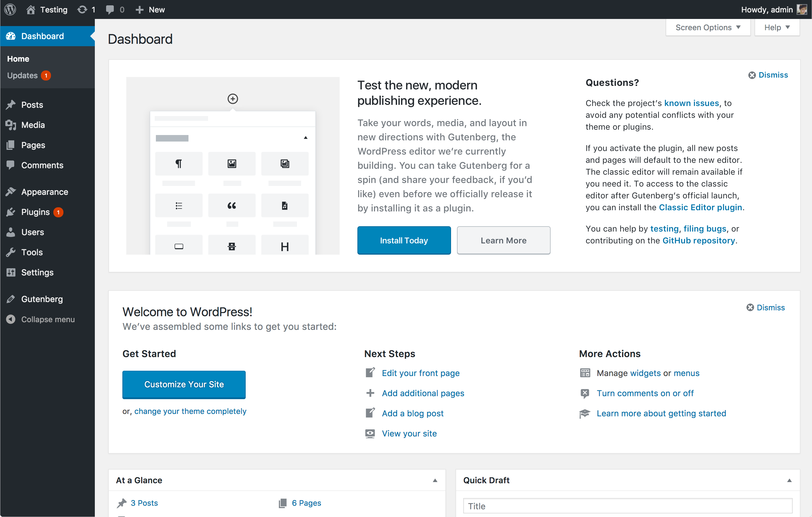
Mobile mockup: https://cloudup.com/iQi5c583-li
- If we'd like the classic editor link to be more prominent, we could add a second layer/section to the callout. Perhaps something like this:
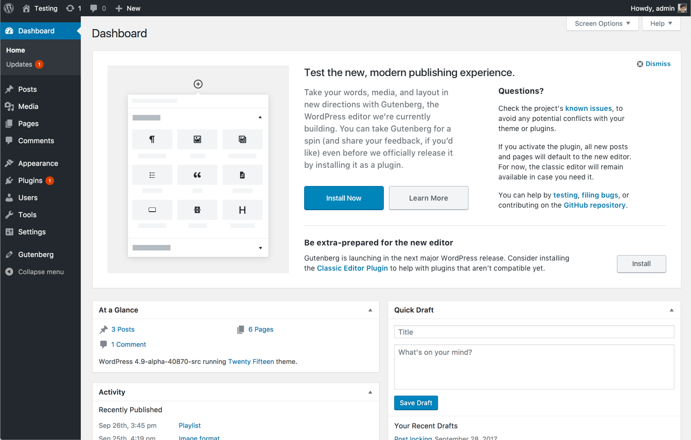
Mobile mockup: https://cloudup.com/iNAPxMAvWLO
This direction makes sense if we want to maintain "Try Gutenberg" as the primary message, but we'd also like to alert people to the fact that they can also install the classic editor plugin to prepare for Gutenberg's launch.
- Alternatively, we could shift the hierarchy around more substantially. In this version, the callout first introduces you to the editor, then has dual sections to promote testing (via the Gutenberg plugin) and preparation (via the classic editor plugin). I think this dilutes the message somewhat, but if this callout is the best opportunity for us to highlight both plugins, this would do that.
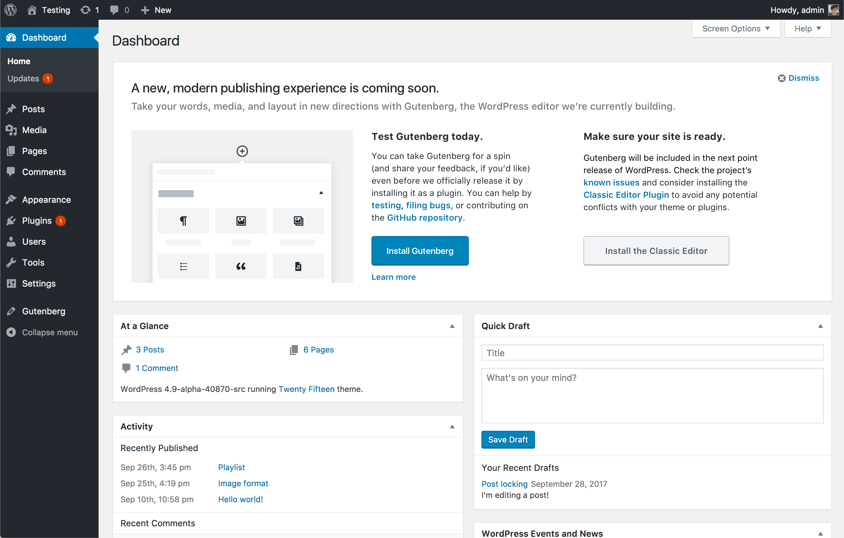
Mobile mockup: https://cloudup.com/ifpcg_RBq7C
In all of those cases, I'd like to have someone review (and improve!) the new copy. But in the meantime, I'd love to settle on a general direction.
#124
 @
@
2 years ago
I think the first option is closest to what we want, the 3rd one puts way too much emphasis on using the classic editor and felt like we didn't have much faith in the new editing experience.
The 2nd option with it's own full with section just felt wrong when looking at it, it didn't flow well.
I'd also throw in that I like the image used, and I much prefer it over an animated GIF.
#125
 @
@
2 years ago
As you can probably imagine, given my comments above, I like the third option the most, because it ensures that people who aren't steeped in Gutenberg understand that they have options. I understand that we have faith in it, and we want to express that, but with the coverage that WordPress has, across the globe, and all the possible dynamics of individual sites, making sure people know they have a way to try it but with an out (that won't break their site) feels way better. Just my .02.
#126
 @
@
2 years ago
The 2nd option is more visually intense but I think having the separate call out is a point worth considering. Failing that I do like v1 as a way forward. Thanks for all your hard work @kjellr on this. Content wise we can adapt but keeping to a regular column set up with so much dense information is more accessible for everyone. Ultimately I wouldn't be against any option, they all really have different qualities.
#127
 @
@
2 years ago
@chanthaboune + @matveb: Do you have any thoughts to add? We'd like to hopefully land on a direction before tomorrow's core chat.
Thank you!
#128
 @
@
2 years ago
1) I don't think it's very clear in any of the versions that this is a beta plugin, and has the potential to break a live site if there's incompatibilities. I think "Beta" and other commonly used terms should be loud and clear rather than buried inside a paragraph of copy. It should also be very clear that many of the plugins they use may not be compatible.
2) What will happen to the prompt once they have installed the plugin? Will it disappear or will "Install Gutenberg" change to something else?
3) If the prompt does remain, what if they install the plugin and dismiss the prompt? Are there additional, clear links inside the editor being added or a permanent admin notice to file bugs and get support?
#129
 @
@
2 years ago
Great to see these mockups! Going over the goals a bit so we can clarify the choices.
- Introduce users to the upcoming new editing experience.
- Allow them to be prepared before 5.0 happens.
There are two main goals, one which is informative, and one that might require some action from the user. The possible choices would be:
- Install the Gutenberg plugin.
- Install the Classic Editor plugin.
- Do nothing.
Let's go over how each should generally work.
Install the Gutenberg plugin — the user gets access to the new editor and potentially the notice disappears. I say potentially because we also need to consider what would happen when a site running Gutenberg is updated to 5.0 (like deactivating the plugin), which also depends on whether all the current features from Gutenberg are included. Maybe a small notice that you are running the plugin could be good?
Install the Classic Editor plugin — I think the emphasis should be on allowing people to set their sites up in advance of 5.0, so when it is released they don't have to rush or do anything at the last minute to retain the Classic experience if that's what they wanted. It's a sort of early opt-out that should give more confidence to site maintainers. Installing this should dismiss the admin notice.
Do Nothing — should be clear to people that with this option the editing experience will change when the site is upgraded to 5.0 but that they can install Classic at any point.
With these considerations, I like the last proposal.
However, without going too much on a tangent, perhaps it's worth considering a two-step approach. The informative notice and a "what do I need to do?" modal / action. This sounds potentially complex and not necessarily a better user experience, but wanted to mention it anyways.
How much do we want to show the term "Gutenberg" here? Maybe in titles we just say "Test the new editor today", for example.
#130
 @
@
2 years ago
Thanks @matveb, that's all helpful. Here are some fairly subtle edits with all that in mind.
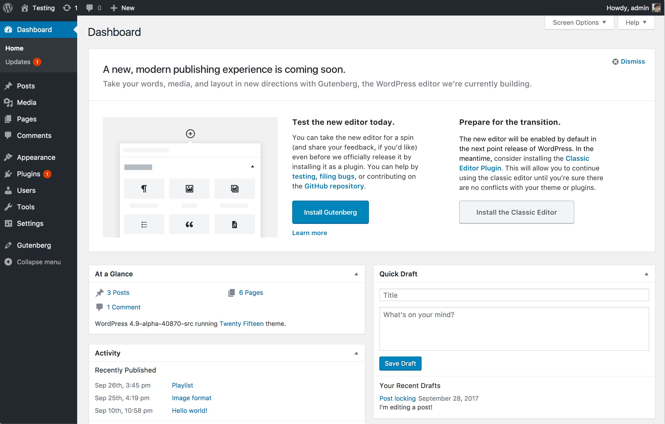
Mobile: https://cloudup.com/cjNxnykw8SC
Revisions:
- Added "is coming soon" to the main headline to make it clear that they should be expecting this soon. (I considered changing the sub headline to something along the lines of "Make sure your site is ready" but I wasn't sure if that was too scary or not?)
- In the second column, revised the headline so that it sounds a little more serious: "Prepare for the transition."
- In the second column, clarified that Gutenberg will be enabled by default in 5.0. More clearly explained the benefit of installing the Classic Editor plugin in advance.
Is this enough?
For simplicity's sake, if someone has already accomplished any of those actions, but not specifically dismissed the notice, I suggest we replace the appropriate column with an alternate set of content. Swapping out each column individually allows us to continue messaging the user regarding Gutenberg plugin if they've already installed the Custom Editor plugin, and vice versa. For example:
Left column:
Right column:
(Note that we don't currently have a "compatibility guide", but I think we should. 😄 I think to start, this could just be the "Compatibility" section from wordpress.org/gutenberg, moved into a dedicated section of the handbook.)
Do Nothing — should be clear to people that with this option the editing experience will change when the site is upgraded to 5.0 but that they can install Classic at any point.
However, without going too much on a tangent, perhaps it's worth considering a two-step approach. The informative notice and a "what do I need to do?" modal / action. This sounds potentially complex and not necessarily a better user experience, but wanted to mention it anyways.
I think the "Do Nothing" option is handled by dismissing the callout. If we want to be especially persistent, maybe we could adopt a modal or a follow-up callout when they dismiss the message:
(Though I agree that's not a great experience.)
#131
 @
@
2 years ago
I think lets go ahead with the edits in https://core.trac.wordpress.org/ticket/41316#comment:130 as a version. We need to get it coded up next as it does include some changes to the latest PR.
#132
 @
@
2 years ago
Looking at the mockup in the comment 130, all the links need to be underlined. Color alone is not sufficient to distinguish them from normal text. Please refer to the Links: underline or no underline? coding standards.
Also, it would be great to clarify the "Learn more" link. Ideally, the links text should be meaningful also when read out of context. While for the links within the paragraphs a bit of exploration of the surrounding content is acceptable, the "Learn more" link is basically equivalent to a "Read more" link. It needs to be expanded with a reference to the what. Something like "Learn more about Gutenberg".
#133
 @
@
2 years ago
Thanks @afercia.
It needs to be expanded with a reference to the what. Something like "Learn more about Gutenberg".
That seems reasonable. Updated.
Looking at the mockup in the comment 130, all the links need to be underlined. Color alone is not sufficient to distinguish them from normal text. Please refer to the Links: underline or no underline? coding standards.
Underlining the text within the paragraph makes sense. It was previously blue and bold, but if underlined text is more the standard, we should use that instead of the bold.
For the "Learn more about Gutenberg" link however, I'd suggest we do not underline it. Secondary text call to actions in the dashboard do not currently get underlined, so I'd stick to that standard for now. For example:
Updated comp:
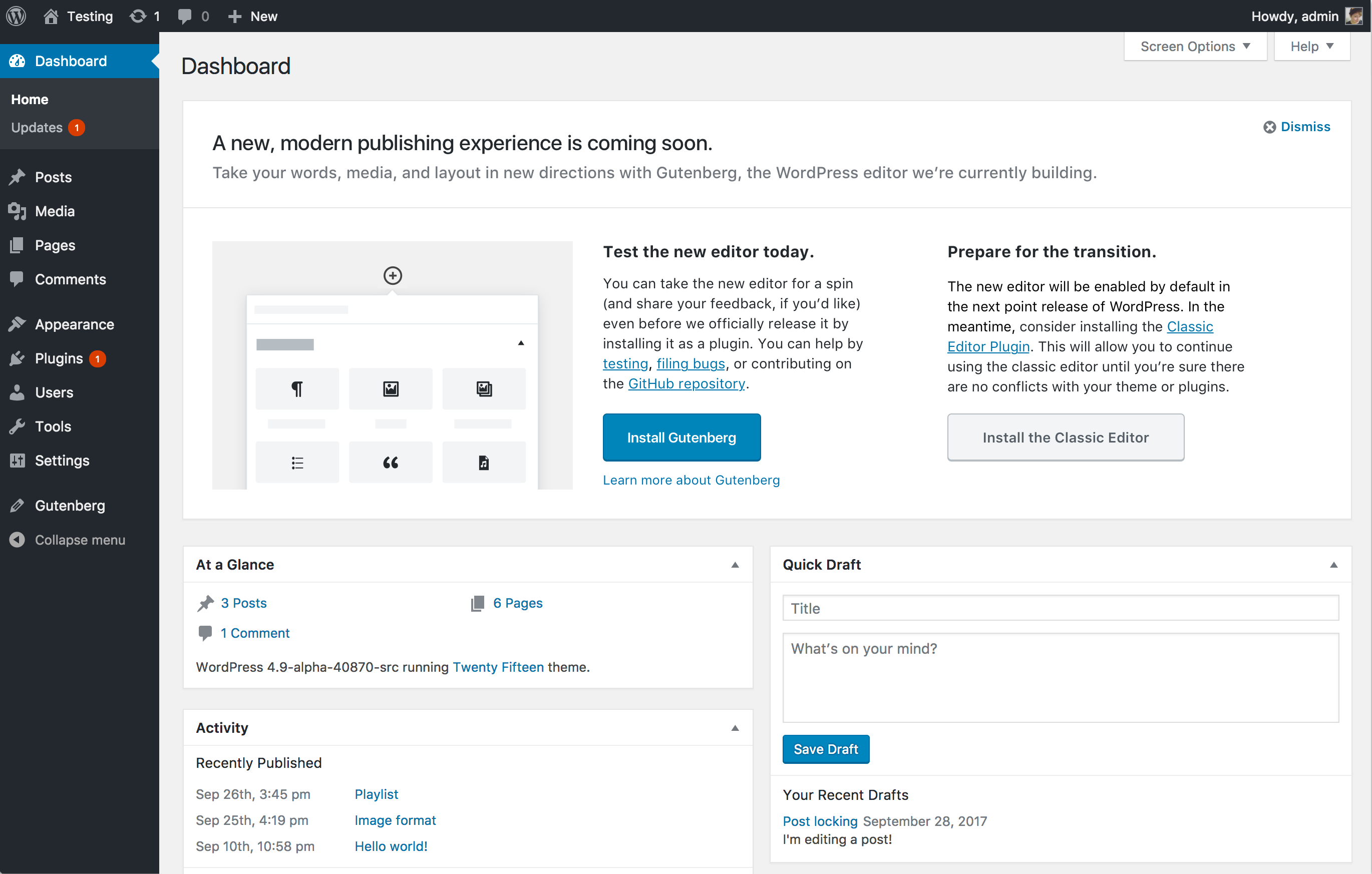
Mobile: https://cloudup.com/cIIXNLfAmjZ

This ticket was mentioned in Slack in #core by joshuawold. View the logs.
2 years ago
#135
 @
@
2 years ago
41316.13.diff is a first pass at implementing @kjellr's design.
Styling TODO:
- Fix the column widths.
- Subheading paragraph spacing.
- Link underlining.
- Action button alignment.
Functionality TODO:
- Implement Classic Editor plugin installation.
If someone feels like continuing with this, please feel free. I'll pick it up again on Monday.
Note that this patch has been written against the 4.9 branch, not against trunk. 🙂
#136
 @
@
2 years ago
- Focuses privacy added
As already explained, callout image can not be hosted on third party server, leaks user IP, browserinfo, website-url via referer, voids #core-privacy (formerly known as #gdpr-compliance).
#137
follow-up:
↓ 140
 @
@
2 years ago
I've got some suggested copy edits for that third column.
- The title seems ill-suited to the action we want people to take. I can't put my finger on why, though.
- I think "point release" vs "major release" is an important distinction here. I think major release makes it clear for technical and non-technical people alike.
- I wouldn't refer to adding the classic editor as a thing to do "in the meantime" which makes it seem like Gutenberg lite or something.
- I would also put the ask at the bottom, and move the contextual info above it.
The new editor will be enabled by default in the next major release of WordPress. If you're not sure about how compatible your current themes and plugins are, we've got you covered. You can install the Classic Editor Plugin now which will allow you to continue using the classic editor until everything is ready.
#138
 @
@
2 years ago
41316.14.diff implements @kjellr's design, with @chanthaboune's wording changes.
Here's a video of the Gutenberg and Classic Editor flows, showing what happens when you install and activate each of them.
I've attached screenshots of the Desktop, Tablet, and Mobile variations of the design.
Things I haven't done, that've appear in this thread:
- @kjellr's tablet/mobile designs from 122 seem to be based on the earlier designs, so I haven't tried to implement them. The responsive CSS is currently super tiny, so there's no issue with deleting that and doing something completely different. 🙂
- We're still using the old image in the first column. @kjellr, could you upload a copy of the image you'd like to appear there? It can be static or animated.
- I'm inclined to agree with @chanthaboune's comment that the third column heading needs work, but nothing was jumping out at me, so I left it as is.
- I haven't implemented the extra notice when the box is dismissed. I'm wondering if a better option for a "second chance opt out" here would be to implement it into the 5.0 upgrade flow, or when someone first visits the block editor after upgrading.
As already explained, callout image can not be hosted on third party server, leaks user IP, browserinfo, website-url via referer
Yes, it can be hosted on s.w.org, for the same reason that #43631 was closed.
#139
 @
@
2 years ago
Just realised I uploaded an old version of the patch. 41316.15.diff is the latest. 🙂
#140
in reply to:
↑ 137
 @
@
2 years ago
Replying to chanthaboune:
Suggestion: I'd go a little less formal in the heading, and edit the copy a bit to make it a little more active and a little clearer, like:
Prep for the switch. or Get your site ready for the switch.
The next major release of WordPress will enable Gutenberg by default, and version 5.0 will get rid of the classic editor entirely. Prepare for the switch now: Install the Classic Editor Plugin to continue using the classic editor while you explore how Gutenberg works with the themes and plugins on your site.
I've got some suggested copy edits for that third column.
- The title seems ill-suited to the action we want people to take. I can't put my finger on why, though.
- I think "point release" vs "major release" is an important distinction here. I think major release makes it clear for technical and non-technical people alike.
- I wouldn't refer to adding the classic editor as a thing to do "in the meantime" which makes it seem like Gutenberg lite or something.
- I would also put the ask at the bottom, and move the contextual info above it.
#141
 @
@
2 years ago
@kjellr's tablet/mobile designs from 122 seem to be based on the earlier designs, so I haven't tried to implement them. The responsive CSS is currently super tiny, so there's no issue with deleting that and doing something completely different. 🙂
Now that we're working with those two columns, I think removing the image at tablet breakpoints makes sense. We could keep it in on small screens, but I like the idea of leaving it out to save people some scrolling. So what you've got above looks good to me!
We're still using the old image in the first column. @kjellr, could you upload a copy of the image you'd like to appear there? It can be static or animated.
Here you go!
I think that version should work ok if we're only using it on desktop screens, but here's an even higher res version just in case: https://cloudup.com/ifFhSdLadMG
I'm inclined to agree with @chanthaboune's comment that the third column heading needs work, but nothing was jumping out at me, so I left it as is.
I like @michelleweber's suggestion: "Get your site ready for the switch.", through we could possibly remove "for the switch" and keep it more concise. I also like the new body copy for that column.
I haven't implemented the extra notice when the box is dismissed. I'm wondering if a better option for a "second chance opt out" here would be to implement it into the 5.0 upgrade flow, or when someone first visits the block editor after upgrading.
Agreed – integrating that message elsewhere sounds like a more elegant solution.

This ticket was mentioned in Slack in #core-editor by pbiron. View the logs.
2 years ago
#143
 @
@
2 years ago
Here's the latest update. @michelleweber helped revise copy in the right column so that it's more clear that activating the Classic Editor plugin will opt you out of Gutenberg when 5.0 lands.
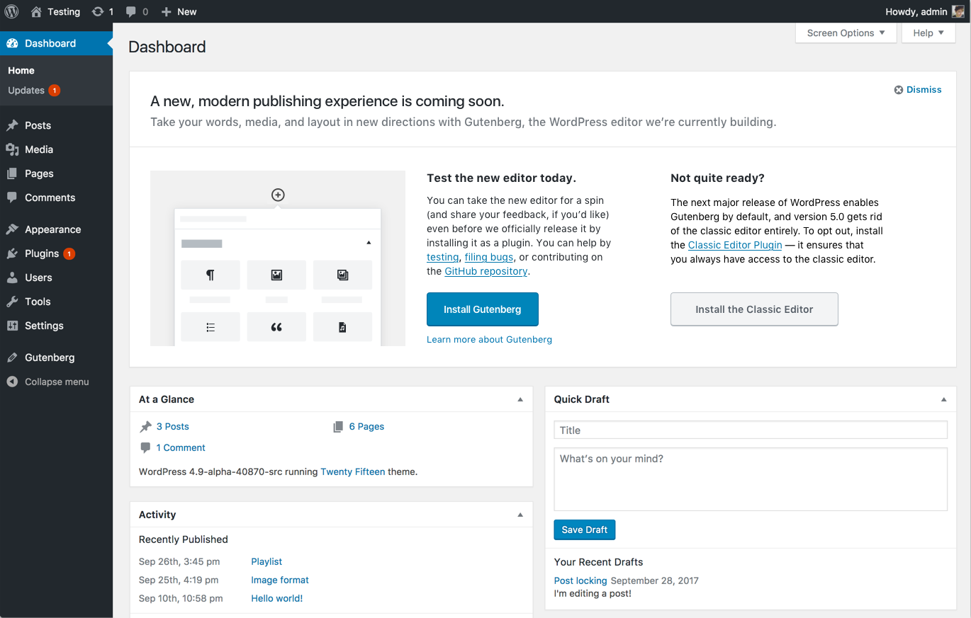
Mobile: https://cloudup.com/iNvdtHerzjZ

This ticket was mentioned in Slack in #core by pbiron. View the logs.
2 years ago
#145
 @
@
2 years ago
Thanks for the work on the text, @michelleweber and @kjellr! It seems like there's a little confusion here, hopefully I can clarify it a bit. 🙂
The next major release of WordPress enables Gutenberg by default, and version 5.0 gets rid of the classic editor entirely.
The next major release of WordPress is version 5.0. We'll be enabling the block editor by default, but we won't be getting rid of the classic editor: it'll still be heavily used as a fallback when the block editor doesn't work. (Say, for a particular custom post type, or when an incompatible plugin is being used.) It just won't be the default option.
To opt out, install the Classic editor plugin—it ensures that you always have access to the classic editor.
This is kind of correct, but not really what we want to convey. The Classic Editor is about giving people the option to continue using the editing experience they're familiar with, particularly for more complex sites that may have plugins that aren't ready for Gutenberg yet.
@chanthaboune's earlier suggestion conveyed the correct information, here it is in a more active format:
The next major release of WordPress enables Gutenberg by default, but we understand if you need some extra time. To opt out, install the Classic Editor plugin—you can continue using the classic editor while you ensure your plugins work correctly with Gutenberg.
I'll have a patch with this in a bit, we can tweak the language between now and RC1.
#146
 @
@
2 years ago
In 41316.16.diff:
- Update the image URL in the first column.
- Update the heading and text for the third column.
Desktop.4.png is a screenshot of how it now looks, design/flow remains the same as the previous iteration.

This ticket was mentioned in Slack in #core by joshuawold. View the logs.
2 years ago
#148
 @
@
2 years ago
Thanks @pento! The page is looking good so far. Design-wise, my only note so far is that the top & bottom margin of the bottom section should match the current left margin (23px):
For that copy, let's use a very slightly polished up version of @chanthaboune's original suggestion:
The new editor will be enabled by default in the next major release of WordPress. If you’re not sure how compatible your current themes and plugins are, we’ve got you covered. Install the Classic Editor plugin to keep using the current editor until you’re ready to make the switch.
This hits on all the points we need, and is simple and clear:
- Gutenberg is coming in the next major release
- If you’re worried about compatibility, there’s a plugin to help ease the transition.
- The plugin lets you use the editor you’re used to until you’re ready to switch.
#149
 @
@
2 years ago
In 41316.17.diff:
- Tweak the margins to even things up.
- Reword the third column, per @kjellr's suggestion.
Let's go with this.
#151
 @
@
2 years ago
Really love the most recent revisions here. The early opt-in/opt-out buttons work really well. Nice work folks!

This ticket was mentioned in Slack in #hosting-community by jadonn. View the logs.
2 years ago

This ticket was mentioned in Slack in #core by karmatosed. View the logs.
2 years ago
#154
 @
@
2 years ago
Patch 41316.18.diff makes links to Gutenberg and Classic Editor translatable, and changes second link to use HTTPS.

This ticket was mentioned in Slack in #core by dimadin. View the logs.
2 years ago

This ticket was mentioned in Slack in #accessibility by afercia. View the logs.
2 years ago

This ticket was mentioned in Slack in #hosting-community by ataylorme. View the logs.
2 years ago
#159
 @
@
2 years ago
Howdy,
I've been testing WordPress 4.9.8 on Pantheon in preparation for the release at the end of the month. First, I would like to say that I appreciate the work that has gone into this initiative. The thoughtful design and desire to give users a great experience is inspiring.
In this testing I noticed two items I would like to provide feedback and have a discussion around.
How do others plan to handle the call to action to install Gutenberg when users have another environment, such as a staging environment, available? I think ideally users should test Gutenberg outside of production, rather than on the live site.
Currently, the options I see, are to append more panel content with the try_gutenberg_panel action or use that same action to completely remove the existing panel. I am leaning towards the latter in our production environments.
However, removing the call to action all together does not seem ideal so I welcome feedback on how to best address this situation for our users.
Perhaps we can still inform users of Gutenberg in production but keep the call to action to install Gutenberg limited to non-production environments.
I recognize some users don't have access to multiple environments and when they do each host has a different setup. While I don't expect core to address every case some additional filters hosts can use for these different scenarios would be most welcome.
The second thing that will be very confusing for our users is that the Try Gutenberg callout suggests installing Gutenberg even when WordPress cannot write to the plugin directory (see https://wordpress.slack.com/files/U02RRBCRW/FBW485Q9K/try-gutenberg-no-write-access-failure.mp4).
Pantheon test/staging and production environments, as well as development environments in Git mode, are not writeable outside of wp-content/uploads. Additionally, in our test/staging and production environments, users can not make changes without doing a deployment from a development environment so asking them to provide FTP credentials would be equally confusing.
#160
 @
@
2 years ago
- Resolution fixed deleted
- Status changed from closed to reopened
Thank you for the feedback, @andrew.taylor!
41316.20.diff does two things:
- It only displays the "Install" buttons if we're able to directly write to disk to install the plugins. This does exclude FTP/SFTP users, but we're not loading the credentials dialog, so the Install button doesn't work actually for them.
- It adds a
try_gutenberg_after_install_buttonaction, which hosts can use to add their own information link to the dialog. It's important to note that you will probably need to adjust the CSS, as adding more lines to this block causes some overflow.
For example:
<?php
add_action( 'try_gutenberg_after_install_button', function() {
?>
        <style type="text/css">
                .try-gutenberg-panel .try-gutenberg-panel-column:not(.try-gutenberg-panel-image-column) {
                        grid-template-rows: auto 120px;
                }
        </style>
        <p><a href="https://support.my.host/gutenberg">Learn more about Gutenberg on My Host</a></p>
<?php
} );
I've attached some screenshots above of what it would look like with this simple link: the HTML you choose to add is entirely up to you. 🙂
Do you think this setup would work for your case?

This ticket was mentioned in Slack in #hosting-community by pento. View the logs.
2 years ago
#162
 @
@
2 years ago
Tried 4.9.8 RC1 today and I noticed that even if I click the "Dismiss" button in the "Try Gutenberg" callout, the metabox reappears again when I reload the page. Is this the expected behavior?
#163
 @
@
2 years ago
Good catch, thanks @leemon!
41316.21.diff fixes this, along with the bits added in 41316.20.diff.
#164
follow-up:
↓ 171
 @
@
2 years ago
Why is the callout even shown to users without the necessary capabilities in the first place?

This ticket was mentioned in Slack in #core-editor by youknowriad. View the logs.
2 years ago
#166
 @
@
2 years ago
I was looking at how the call out would look to users who can not install plugins "editors" or even write posts like subscribers. I raised this at the Gutenberg meeting.
https://wordpress.slack.com/archives/C02QB2JS7/p1532523769000342
Here is a screenshot with a role that can't install plugins and does not have Gutenberg installed.
https://slack-files.com/T024MFP4J-FBXN7TVFH-a02fafd0f1
Here is a screenshot with a role that can't install plugins and has Gutenberg installed.
https://slack-files.com/T024MFP4J-FBW081Z8Q-42c1dfb459

This ticket was mentioned in Slack in #hosting-community by ataylorme. View the logs.
2 years ago
#168
 @
@
2 years ago
@pento thank you for not only being receptive to feedback but acting on it so quickly! After discussing in the hosting meeting there is some additional feedback on the new try_gutenberg_after_install_button action.
Having "Learn more about Gutenberg" immediately followed by "Learn more about Gutenberg on <host>" is a bit confusing. Rather than an action, it would be much preferred that the entire link (the output of the printf) be filterable instead.
This would allow us to change "Learn more about Gutenberg" immediately to "Learn more about Gutenberg on <host>" and link to our own page. Such a page could explain Gutenberg, link to https://wordpress.org/gutenberg/, describe the proper way to test Gutenberg on the host (e.g. a staging environment), have additional resources (blog posts, webinars, etc). and so on.
This would allow us to keep the integrity of the existing Try Gutenberg panel while adding a slight modification to direct users to the resource most relevant for them to learn more.
#169
 @
@
2 years ago
I'm a bit concerned that, as far as I can tell, there isn't a way for WordPress.org to remotely toggle this metabox.
In the case that there are widespread issues with particular themes or plugins, for instance, it's not helpful for WordPress.org and hosting support teams to receive hundreds or thousands of the same request.
It's also not good for Gutenberg or WordPress auto-update adoption for WordPress sites to continue to suggest that users install Gutenberg only to run into the same widespread bug, causing folks to be avoidably soured on Gutenberg before its release.
At the moment, if this were to occur (and hopefully it won't!), my understanding is that an additional WordPress update would have to be rolled out, or every install at every updated host would have to have code injected somehow -- something that's difficult at many hosts, and not going to be possible with the long tail.
Is there any chance that a way for it to be remotely enabled/disabled could be added? It's also possible that I'm missing something, and if there is already a workaround, apologies, and I'll be happy to learn about it.

This ticket was mentioned in Slack in #core by ocean90. View the logs.
2 years ago
#171
in reply to:
↑ 164
 @
@
2 years ago
Replying to swissspidy:
Why is the callout even shown to users without the necessary capabilities in the first place?
Looks like the cases with different capabilities are outlined in comment:29.
That said, "Install the Classic Editor" button might be hidden for users who cannot install plugins, but the text still says "Install the Classic Editor plugin to keep using the current editor until you’re ready to make the switch" regardless of the capabilities, which doesn't make much sense.
#172
 @
@
2 years ago
Thanks for the comments, y'all! 🙂
Why is the callout even shown to users without the necessary capabilities in the first place?
@SergeyBiryukov linked to where the button behaviour based on capabilities was discussed, but for the larger question of why we're showing the callout to everyone, it's because Gutenberg affects everyone, even if they don't have the capability to install the plugin. Site users should be aware that this change is coming.
On top of that, for many sites, the people who use the site on a daily basis won't necessarily be site admins, so won't have the capability to install the plugins: they need to be aware of Gutenberg, so they can speak to their site admin about it.
That said, it'd be nice to have somewhere to direct folks who can't install the plugin, or use the block editor locally. https://wordpress.org/gutenberg/ is currently being revised, and a feature that will hopefully be implemented is to add Frontenberg to it, so visitors can try out Gutenberg right there. If that makes it before 4.9.8, the "Try Gutenberg" button could link to https://wordpress.org/gutenberg/ for everyone who currently doesn't see a button. This is easy to add at the last minute, once the meta team are certain they can have it ready in time.
Having "Learn more about Gutenberg" immediately followed by "Learn more about Gutenberg on <host>" is a bit confusing. Rather than an action, it would be much preferred that the entire link (the output of the printf) be filterable instead.
Good suggestion, thanks @andrew.taylor! 41316.22.diff removes the try_gutenberg_after_install_button action, and replaces it with a try_gutenberg_learn_more_link filter, which can be used like so:
<?php
add_filter( 'try_gutenberg_learn_more_link', function( $learnmore ) {
        return '<a href="https://support.my.host/gutenberg">Learn more about Gutenberg on My Host</a>';
} );
I'm a bit concerned that, as far as I can tell, there isn't a way for WordPress.org to remotely toggle this metabox.
That's correct, it isn't possible to remotely toggle it, I don't believe that adding such a flag would give us any practical benefit. The flag would have to be provided by the w.org update API, which sites check every 12 hours. If there were some dire emergency, we would be able to push out a 4.9.9 release with the meta box hidden, and because of the lag time in sites checking the API, it would have approximately the same rate of uptake as an API flag would. (We would presumably drop the update check TTL as soon as we decided to push out 4.9.9, so all sites would be updated in 12 hours from that point, the only practical difference would be the earliest set of sites to check the API would hide the meta box a little later.)
While the option exists to push out a rapid 4.9.9 release, I would be extremely reticent to use it. I expect that there will be sites that Gutenberg doesn't really work for, yet, but the proper response to that is not to panic and shutdown the callout, it's to ensure that the site user can easily keep using Classic, so we can focus on fixing the problem in Gutenberg. There are several levels of opting in to Gutenberg here: install the plugin, activate the plugin, and then for every post that you edit, choose the "Edit" button instead of the "Classic Editor" button. People can very easily back out of using Gutenberg at any time.
It's also worth remembering that the Gutenberg plugin is currently installed on over 20,000 sites, it's organically growing by more than 1000 installs per week, and that rate is accelerating. There will be incompatibilities with unusual site configurations, of course, but it's reasonable to assume that, given Gutenberg's existing install base, a catastrophic incompatibility would likely have been reported already. (I do realise how much I'm tempting fate by stating this aloud! 😉)
In order to leave the option of a rapid 4.9.9 release open, however, I think it's reasonable for us to have a 48 hour code freeze on the 4.9 branch after the release of 4.9.8. This will ensure it's in a clean state for us to get a 4.9.9 release out as quickly as possible.
That said, "Install the Classic Editor" button might be hidden for users who cannot install plugins, but the text still says "Install the Classic Editor plugin to keep using the current editor until you’re ready to make the switch" regardless of the capabilities, which doesn't make much sense.
"Install the Classic Editor" doesn't necessarily mean "click the install button below to install it now". It can mean "speak to your site admin, discuss your migration plan, and decided whether the Classic Editor plugin is the correction option for your site". 🙂 It's impossible for us to specify the exact steps every site user should take to respond to the callout, but we're providing a combination of immediately actionable buttons to click, information about the two options available, and links to read more, that should inform folks to the point that they can take the right next step for their site.
#173
 @
@
2 years ago
During the core dev-chat earlier today we discussed whether we need to release 4.9.8 RC2 to address the comments/patches on this ticket that have been made after beta2 was released, see https://wordpress.slack.com/archives/C02RQBWTW/p1532549919000332.
@pento what is your current thinking on that? If we are going to do an RC2 we need to do so ASAP.
#174
 @
@
2 years ago
I'm fine with 41316.22.diff being committed for RC2, if another committer wants to +1 and commit it while I'm asleep. 🙂
#175
follow-up:
↓ 180
 @
@
2 years ago
Tested 41316.22.diff, looks good except for return 'lol' at the end :)
#177
 @
@
2 years ago
Good suggestion, thanks @andrew.taylor! 41316.22.diff removes the try_gutenberg_after_install_button action, and replaces it with a try_gutenberg_learn_more_link filter
Thank you @pento for switching to a filter and @SergeyBiryukov for removing the return 'lol'. I've tested 43537 and it works well.

This ticket was mentioned in Slack in #core by pbiron. View the logs.
2 years ago

This ticket was mentioned in Slack in #core by pbiron. View the logs.
2 years ago
#180
in reply to:
↑ 175
 @
@
2 years ago
Replying to SergeyBiryukov:
Tested 41316.22.diff, looks good except for
return 'lol'at the end :)
🙃

This ticket was mentioned in Slack in #core by pento. View the logs.
2 years ago
#182
follow-ups:
↓ 183
↓ 186
 @
@
2 years ago
@pento
for the larger question of why we're showing the callout to everyone, it's because Gutenberg affects everyone, even if they don't have the capability to install the plugin. Site users should be aware that this change is coming.
I respectfully disagree with this. If user's don't have the capability of creating/editing/deleting posts then there's no need for them to see the callout because they can't actually do anything about it. To a person who can only edit a profile, it doesn't given them any useful information to act upon.
If they happen to have their own sites that they manage then they'd see it over there. I honestly think it's a bad idea to add this confusion to the UI when it doesn't effect certain people.
I'm strongly against having the callout shown to everyone.
#183
in reply to:
↑ 182
 @
@
2 years ago
Replying to danieltj:
@pento
for the larger question of why we're showing the callout to everyone, it's because Gutenberg affects everyone, even if they don't have the capability to install the plugin. Site users should be aware that this change is coming.
I respectfully disagree with this. If user's don't have the capability of creating/editing/deleting posts then there's no need for them to see the callout because they can't actually do anything about it. To a person who can only edit a profile, it doesn't given them any useful information to act upon.
If they happen to have their own sites that they manage then they'd see it over there. I honestly think it's a bad idea to add this confusion to the UI when it doesn't effect certain people.
I'm strongly against having the callout shown to everyone.
I totally agree this!
I would add that "suggesting" the installation of a plugin "potentially" very different from its final version, which will be included in the core, could contribute to the addition of options that once become obsolete, as a result of changes in its development, will remain orphans in the database.
I am not totally against it, but I hope for a different approach, and an extra reflection.
#184
 @
@
2 years ago
- Keywords 2nd-opinion added
- Resolution fixed deleted
- Status changed from closed to reopened

This ticket was mentioned in Slack in #core by danieltj. View the logs.
2 years ago
#186
in reply to:
↑ 182
 @
@
2 years ago
- Keywords 2nd-opinion removed
- Resolution set to fixed
- Status changed from reopened to closed
Replying to danieltj:
If user's don't have the capability of creating/editing/deleting posts then there's no need for them to see the callout because they can't actually do anything about it.
It's not just people with edit_posts that will be able to use the block editor. Many CPTs use custom capabilities that don't tie directly to core capabilities, for example.
Replying to Luciano Croce:
I would add that "suggesting" the installation of a plugin "potentially" very different from its final version, which will be included in the core, could contribute to the addition of options that once become obsolete, as a result of changes in its development, will remain orphans in the database.
Gutenberg doesn't create extra options in the database, it just works with posts.
Please don't reopen tickets that have been resolved. You're welcome to comment, of course, and we can open a new ticket if there are additional changes to make.
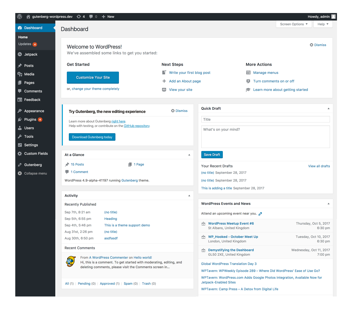
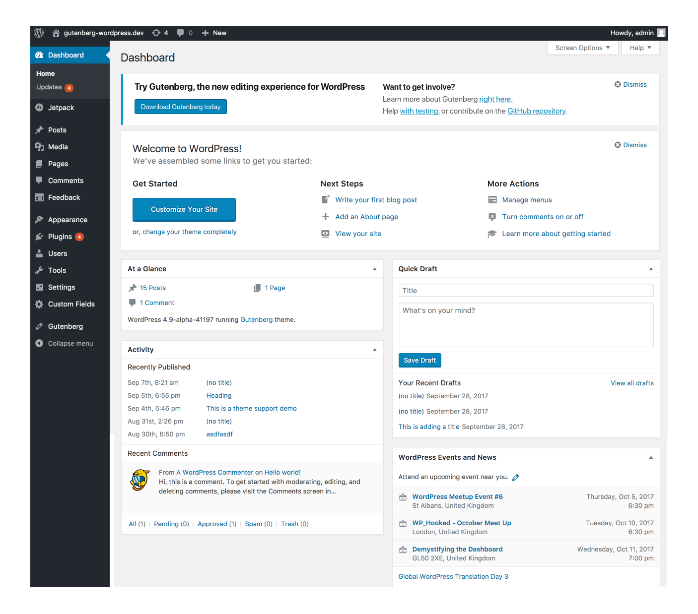
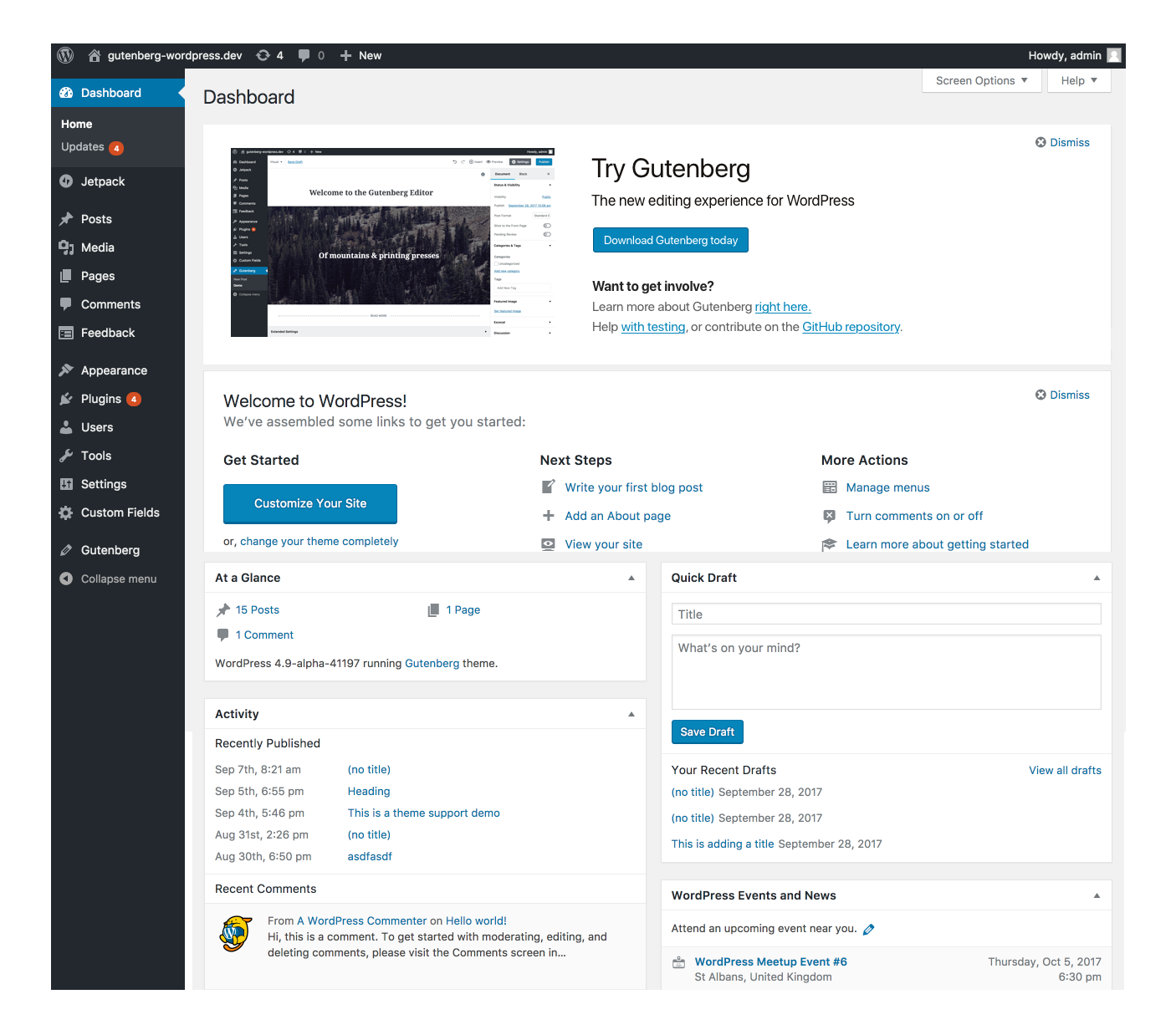
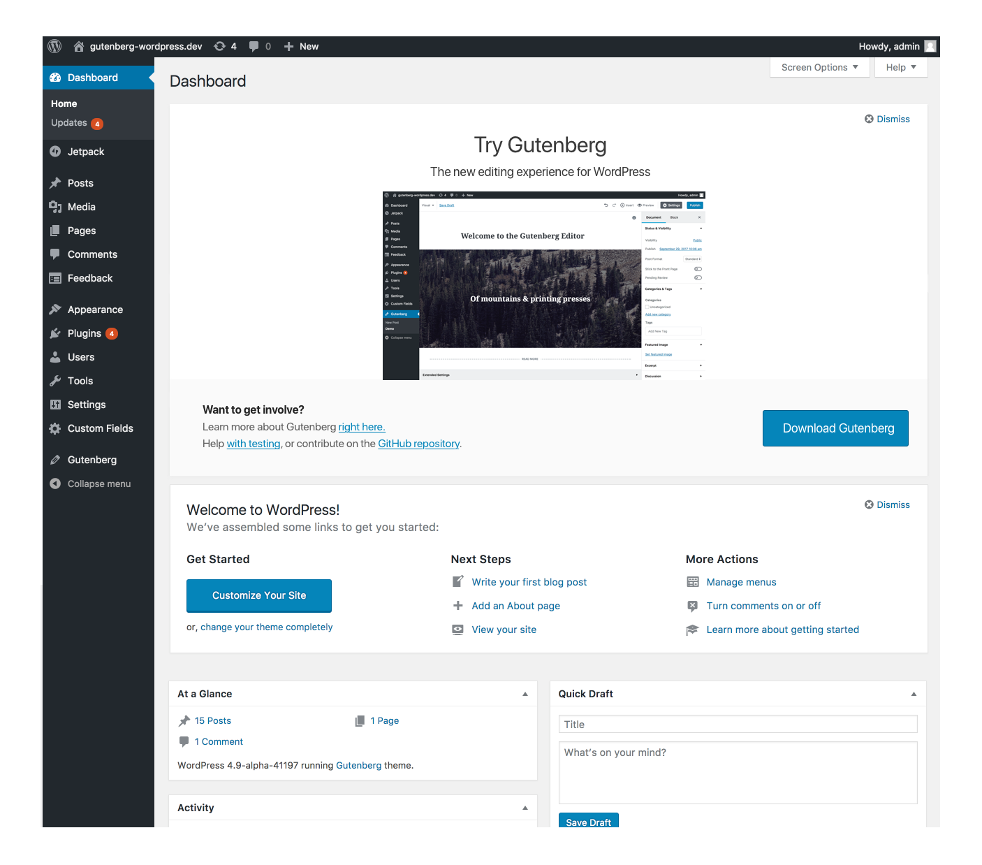
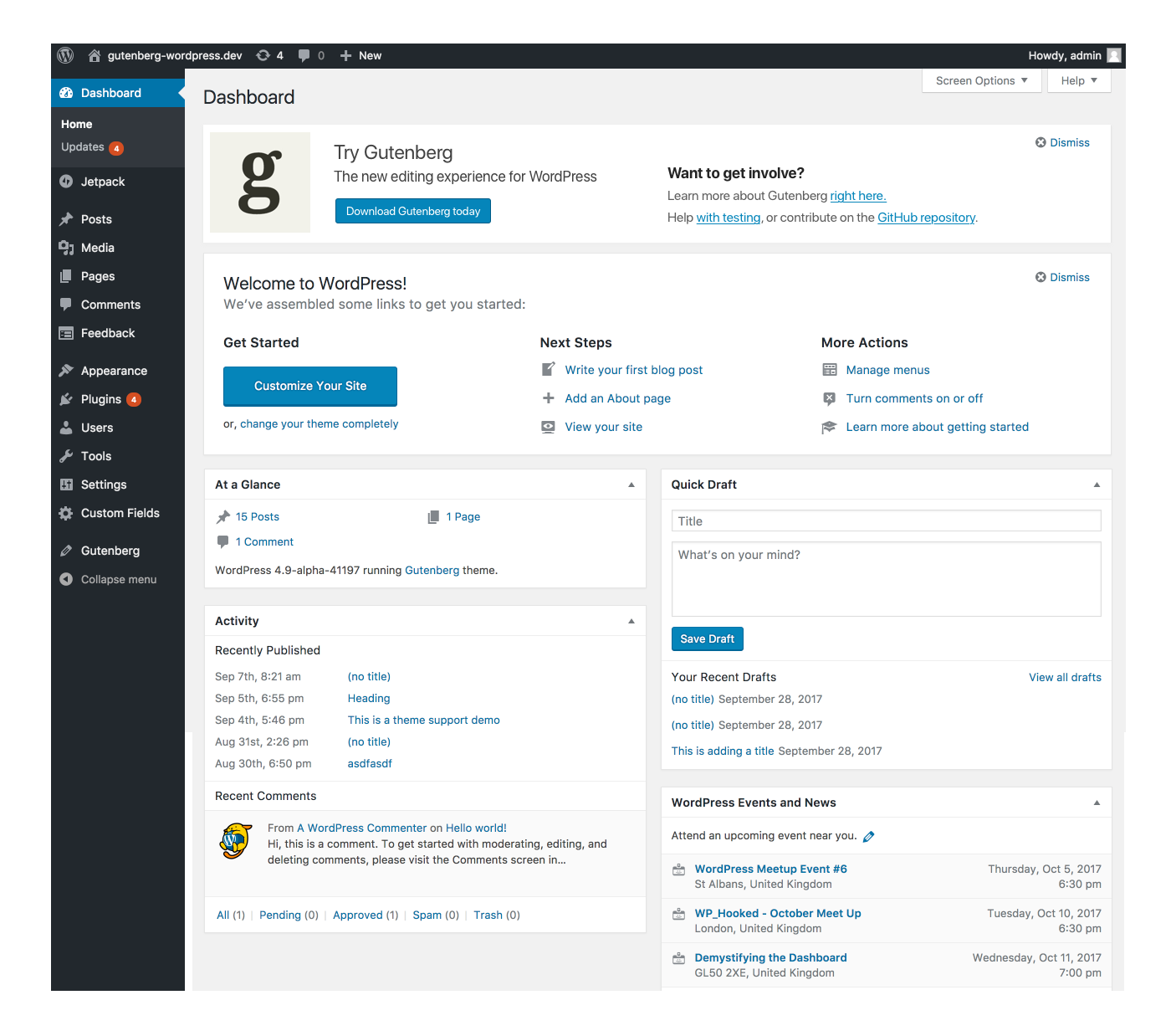


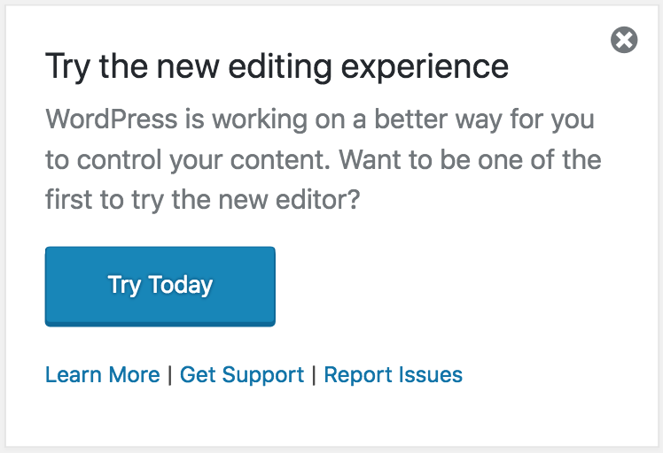
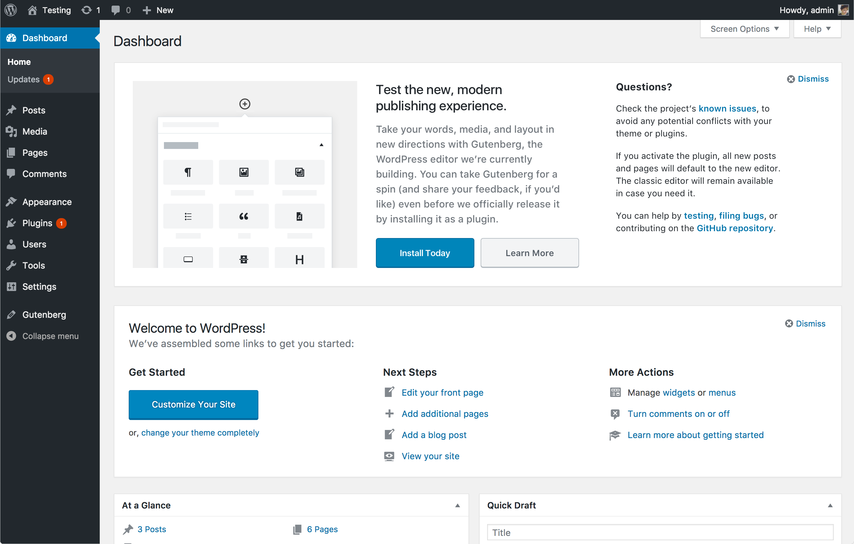
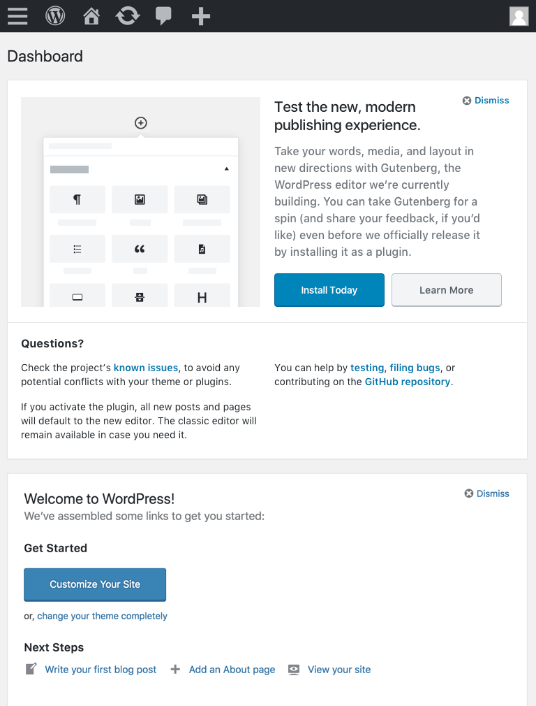
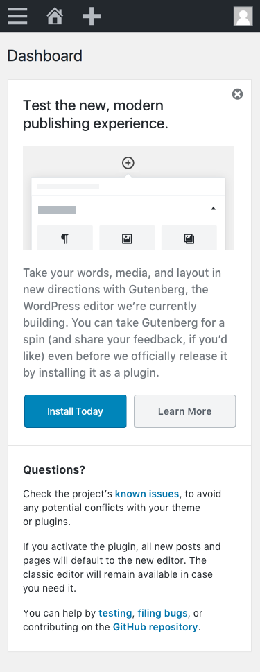
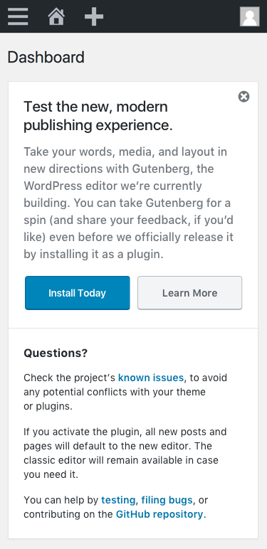
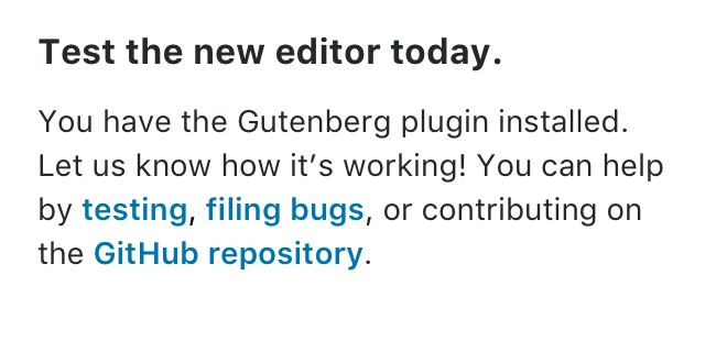
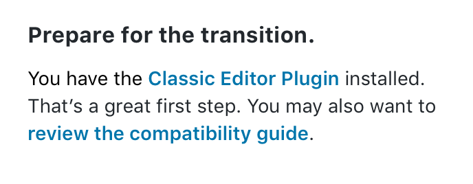
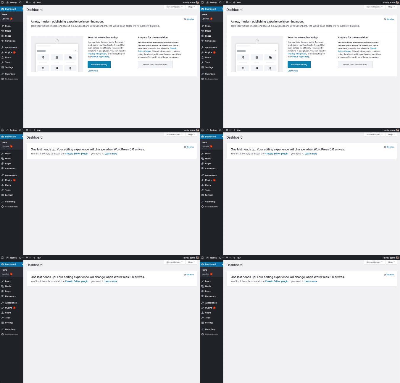
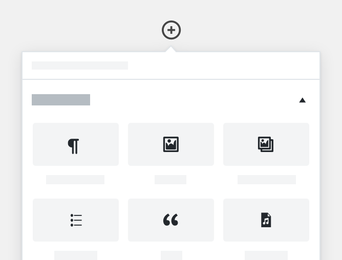
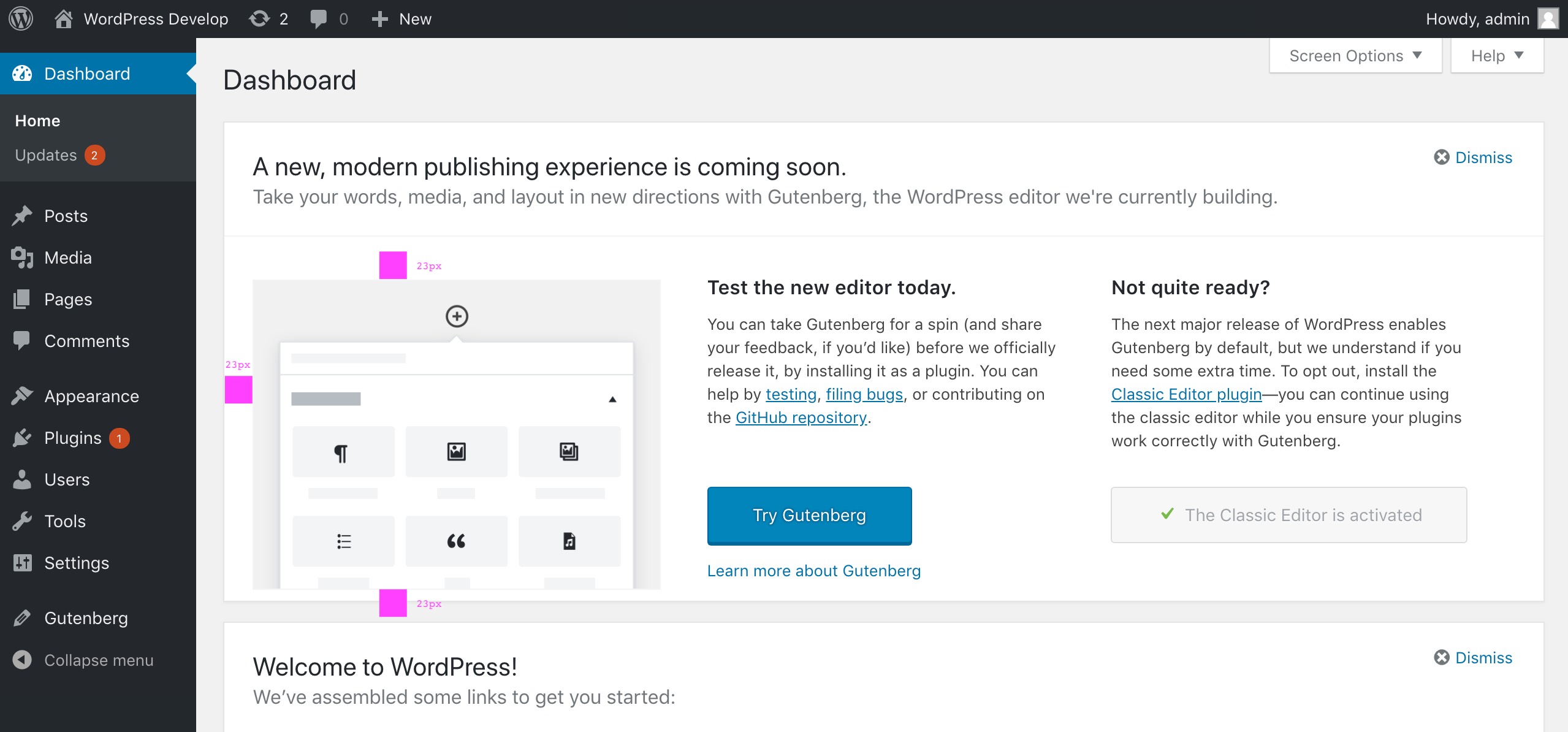
Related/Previously: #29631 The 'Beta Testing' tab should be first in plugin installer
This is still the case, currently Gutenberg appears in the list of plugins from the Add plugin dashboard panel
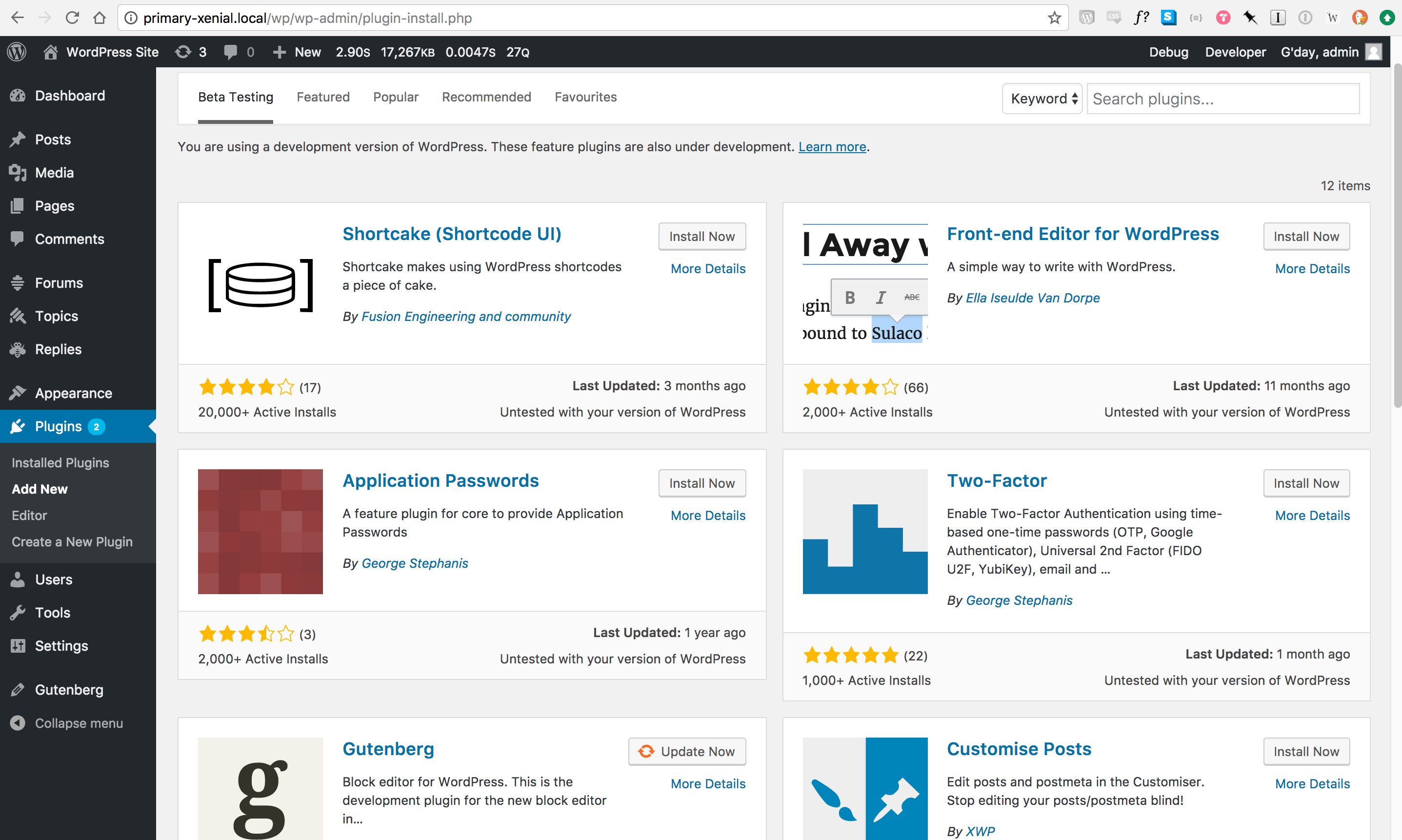
: