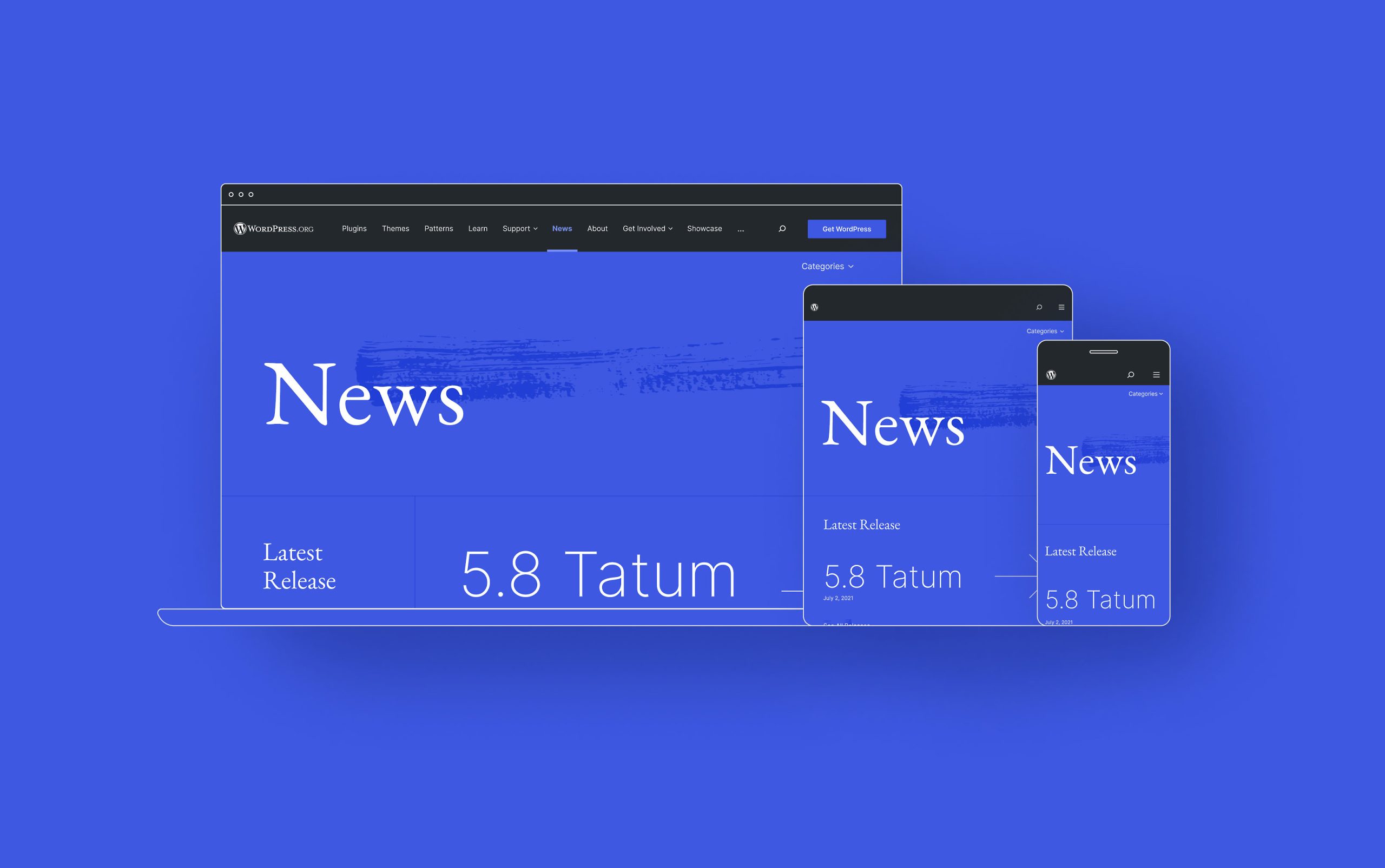
In June 2021, @beafialho in collaboration with @pablohoney floated the idea of giving WordPress News a new look. Today, those ideas become a reality—we’re excited to share that redesign of WordPress News is live!
The new design leans on the aesthetics of jazz, intrinsically connected to WordPress and which ultimately translates its uniqueness, historic significance and future potential. Among other improvements, the new design leaves more space for content and includes new typefaces for better readability. It also uses a color palette intended to reflect the evolving Gutenberg language.


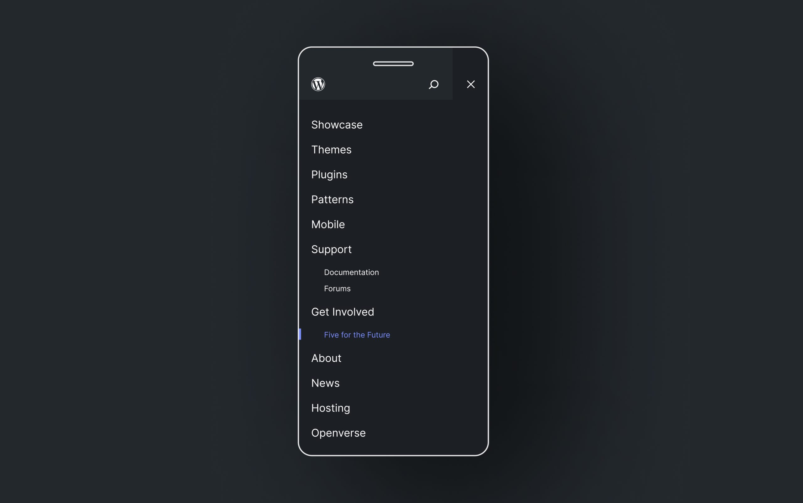
The revamp of the WordPress News page includes the header and footer of the page. We also shipped those two global elements to all pages of WordPress.org. However, there’s more work to do within the header to improve the information architecture. This new design is just the first, small step to modernize and improve the site iteratively. Any further discussion on future redesigns will occur in the #design channel on Slack.

Take a look around and subscribe to WordPress News if you haven’t already. If you see something in the design that doesn’t look right, please submit an issue on GitHub.